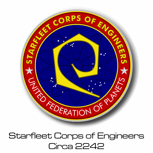
These are for all you people out there who are sick of those tiny, low-res logos from the Omnipedia. Feel free to use them where you will.
[ April 17, 2003, 11:25 AM: Message edited by: Reverend ]
Posted by The_Tom (Member # 38) on :
The Tholian logo the Mandel used in the Star Charts is something of an in-joke, actually... he reused the emblem that he designed for the Chig aliens for Space: Above and Beyond.
Interestingly, your Breen logo is tinted green. The Star Charts has it as gold, and it appeared on the war maps on Cardassia as a sort of neon orange.
Posted by Topher (Member # 71) on :
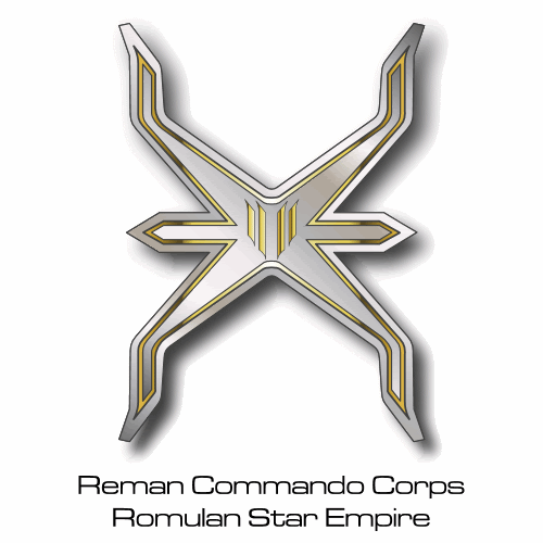
A couple of things: What about the multicolour Klingon logo? You know, with the yellow circle and red, green, and blue limbs? Also, how about the new Romulan logo?
Posted by MinutiaeMan (Member # 444) on :
*gasp* Those are beautiful, Kris!
Small request: could you do them on a plain background, and perhaps with an outline to prevent bleed-over for those who use bitmap editing? I'm thinking I could use some of those in my own maps, but they'd be a little difficult to work with because some of them have near-white colors on the edges (where they look "shiny") and the drop shadow, while good looking for the original examples, would also be difficult to edit.
Thanks, and great work!
Posted by Malnurtured Snay (Member # 411) on :
Reverend:
I'm "stealing" your Federation 2270-2289 to use as a backdrop in the Okazaki's conference room.
Posted by Reverend (Member # 335) on :
quote: A couple of things: What about the multicolour Klingon logo? You know, with the yellow circle and red, green, and blue limbs?
Ack. This one is better.
quote: Also, how about the new Romulan logo?
What about it?
quote: Small request: could you do them on a plain background, and perhaps with an outline to prevent bleed-over for those who use bitmap editing? I'm thinking I could use some of those in my own maps, but they'd be a little difficult to work with because some of them have near-white colors on the edges (where they look "shiny") and the drop shadow, while good looking for the original examples, would also be difficult to edit.
Name the ones you want and I'll e-mail them to you.
quote: Reverend:
I'm "stealing" your Federation 2270-2289 to use as a backdrop in the Okazaki's conference room.
Steal away. Although I do have a propper grey-blue/white version that'd probably look better.
Posted by Reverend (Member # 335) on :
quote:Originally posted by The_Tom: The Tholian logo the Mandel used in the Star Charts is something of an in-joke, actually... he reused the emblem that he designed for the Chig aliens for Space: Above and Beyond.
Interestingly, your Breen logo is tinted green. The Star Charts has it as gold, and it appeared on the war maps on Cardassia as a sort of neon orange.
You're correct. For some reason it came out looking greenish on the scan and I didn't think to double check the original. I have now given it the red/orange/yellow-ish colour that it seamed to have on the war maps.
As for the Tholian logo; not being someone who has ever bothered with "Space: Above and Beyond" I didn't pick up on that reference. Still I think it works well as the Tholian logo, with it's dark red tint and it's hard faceted edges it's certainly better than the old "two crystals on a grid" version.
Posted by Spike (Member # 322) on :
I especially like the TUC Earth logo. Always wanted to have a clear picture of it.
Posted by MinutiaeMan (Member # 444) on :
quote:Originally posted by Reverend: Name the ones you want and I'll e-mail them to you.
The Breen, Klingon, Romulan, Vulcan, and the TNG Federation logos would be great, thank you.
My e-mail is in my profile.
Posted by Aban Rune (Member # 226) on :
Very cool.
I've always wondered if the Ferengi logo is supposed to be a stylized version of their ears. Using a pseudo-sexual organ as an identifier for your species doesn't seem like a great idea... It's be like using a stylized boob to represent humanity...
Anyway... I've always wondered that...
Posted by Malnurtured Snay (Member # 411) on :
It always looked to me like "dog eats dog" ...
Posted by Topher (Member # 71) on :
Yeah, that's what the old TNG trading card set said about the Ferengi logo.
Posted by SoundEffect (Member # 926) on :
Are we sure about the supposed Tholian logo?? It was printed in the Star Charts as the Tholian logo, but that design appeared first in the Starship Spotter recolored as the Species 8472 logo. Which is it??
Posted by Topher (Member # 71) on :
I was unaware Species 8472 had a logo...
Posted by MinutiaeMan (Member # 444) on :
I was unaware Species 8472 had a written language... I thought they were supposed to be very telepathic?
Posted by Reverend (Member # 335) on :
I just checked and you're right, the 8472 logo is basically a purple version of the Tholian one.
As others have pointed out 8472 don't appear to have a verbal or written language, hell they don't even have a name for themselves! So I'd be inclined to ignore the Starship Spotter and keep the logo for the Tholians. At least until ENT provides us with something different.
Posted by SoundEffect (Member # 926) on :
Didn't anyone else notice from Starship Spotter? I'm not debating whether 8472 has a language or anything. I just know when I saw the Star Charts for the first time, I knew the Tholian symbol was one I had seen somewhere before. The shape is blue but the language marks are identical. I don't know if the Bioships sported this marking or not. I don't remember seeing it...
Posted by AndrewR (Member # 44) on :
Um - OK, I've just looked at the Borg logo so far - nice but I thought there was a large 'oval' at the bottom - things look out of proportion.
I haven't gotten to the Breen logo but ABOUT TIME!!
I remember seeing a flash of it on DS9 - so did you take it from this - cause things from the ST:star charts don't count.
Andrew
P.S. Did they ever have a Kazon Logo - cause I noticed it used to be on their bridges. ALthough it could have been a Trabe logo - but if they Kazon hated the Trabe - they would have gotten rid of any Trabe emblems.
Andrew
Posted by AndrewR (Member # 44) on :
OK I've just looked at the Doug Drexler Borg symbol - you've got it spot on - don't know what I was thinking. He though has a square yellow and black background (that sorta looks like the insides of a computer junction/panel on TNG/DS9/Voyager!
Andrew
Posted by AndrewR (Member # 44) on :
Ok I've looked at ALL of them. Can I just say this FRELL! They're FRELLING AWESOME!!
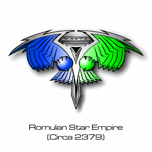
What program did you use? How'd you do all the intracacies of the Romulan Logo (I prefer this one to the Nemesis one).
Now for me to blow my own trumpet - I did something like this a (few years ago now I think!!) I never posted it. I wasn't happy with how the Klingon one had the non-smooth edges.
I just looked September/October 1999! Posted by Malnurtured Snay (Member # 411) on :
Reverend,
I actually like the stylistic design of the logo you orginally posted! It's fantastic!
Posted by AndrewR (Member # 44) on :
Snay, was that in response to what I said?? Cause I'm saying I love his work too!
Posted by Malnurtured Snay (Member # 411) on :
Hmmm? No.
I enjoyed his second design of a Federation logo and told him I was going to use it in my Okazaki project (lego mini-fig scale starship). He posted another version of the logo, but I much prefer the first. Posted by AndrewR (Member # 44) on :
Ahhh yes - the one with the blue background? Me too.
Andrew
Posted by Reverend (Member # 335) on :
Just because Topher likes that kind of thing, here's the pansy version of the Klingon logo.
Personally I prefer the TUC black white and red version...infact I like just about all the graphics work done on that movie.
quote:What program did you use? How'd you do all the intracacies of the Romulan Logo (I prefer this one to the Nemesis one).
Same one that I always use. I traced the Romulan logo and it was most tedious and took alot of patience.
I have made a start of the Nemesis one but it's proving even more difficult and I'm having trouble getting good reference material.
quote: I enjoyed his second design of a Federation logo and told him I was going to use it in my Okazaki project (lego mini-fig scale starship). He posted another version of the logo, but I much prefer the first.
I posed the non-stylised version simply because that is the correct one that was seen on screen, plus it would probably come out clearer on those stickers than the version with the high contrast gradient.
Posted by MrNeutron (Member # 524) on :
quote:Originally posted by Aban Rune: Very cool.
I've always wondered if the Ferengi logo is supposed to be a stylized version of their ears. Using a pseudo-sexual organ as an identifier for your species doesn't seem like a great idea... It's be like using a stylized boob to represent humanity...
Anyway... I've always wondered that...
I think Andy Probert designed that Logo, as it was on his early sketches of the Ferengi. I'll try to remember to ask him about it.
Posted by Masao (Member # 232) on :
This artwork ( a decal or sticker I think) is being auctioned at eBay from Rick Sternbach Posted by AndrewR (Member # 44) on :
Wasn't the TOS Klingon Symbol Red, Yellow and Green on each of the points? Or was one of them blue?
Posted by SoundEffect (Member # 926) on :
Here are some symbols I made in Illustrator some time ago. I have all the ones shown previously, so I've only added a few new ones to the mix of what we've seen here.
Here's the asked about Kazon symbol. It's depicted on their spacecraft:
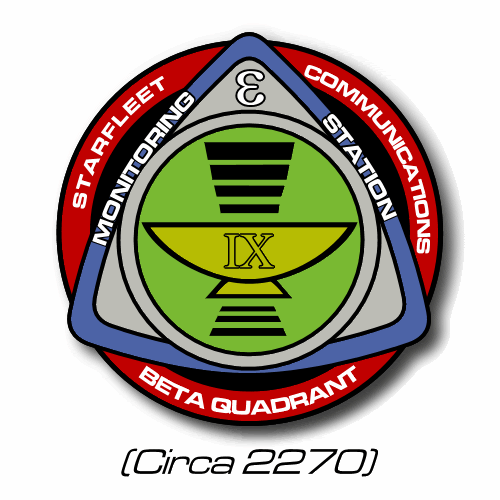
And lastly, just for fun, here's the Subspace Relay symbol first used for Epsilon IX and later used for the relay graphic showing communication across the Bajoran Wormhole:
That makes a total of SIX different variations!
Posted by Reverend (Member # 335) on :
Damn naggit, just found ANOTHER one. Those Klingons must really like variety...either that or the different colour schemes each have a specific meaning.
Number seven Posted by Sol System (Member # 30) on :
That or, over the centuries, the Klingons have produced at least a handful of graphic designers who like to tinker with things. Unthinkable! perhaps.
Posted by Topher (Member # 71) on :
Then there's the upside down one from the Klingon hell...
And I just thought about this, but in the Mirror Universe, the Klingons seem to be the predominant power lording over the Cardassians in their alliance, but the logo for them is the Cardassian logo with a little Klingon logo at the bottom.
Posted by MinutiaeMan (Member # 444) on :
quote:Originally posted by Reverend: Damn naggit, just found ANOTHER one. Those Klingons must really like variety...either that or the different colour schemes each have a specific meaning.
Maybe the Klingons like variety in their symbols the way Starfleet likes variety in their starship designs. Posted by Masao (Member # 232) on :
Remember too that in TOS the Klingon symbol used as a ship insignia was rotated 90 degrees clockwise from vertical. When was it first shown vertically?
Posted by AndrewR (Member # 44) on :
Maybe the Klingons are a bunch of interior decorators at heart?
"Mmmmmm I think we could take out that wall and put in some french windows and throw a few furs and skulls here and there - the place would be just delish!" "Q'Plah!"
Posted by Reverend (Member # 335) on :
That would be like changing the colour of a national flag everyonce in a while.
I think I'll go for the colour code theory, either that or each variation is specific to a certain house or fleet.
Posted by AndrewR (Member # 44) on :
Maybe it's an indication of which is the ruling house in power at the time?
Posted by Jason Abbadon (Member # 882) on :
Mabye the symbol's orientation designated weither the Klingons are crabheads or mexicans. Posted by Sol System (Member # 30) on :
There are as many different logos featuring the U.S. flag's motifs as there are, uh, a series of numerous things. So, this does not strike me as a problem. We're talking about a star-spanning empire. There's enough room for a little variety.
Posted by Reverend (Member # 335) on :
..and this is my concept for a TOS era UFP seal. (that red flag never really cut it for me)
Posted by Topher (Member # 71) on :
That's a pretty sweet TOS logo.... Posted by MinutiaeMan (Member # 444) on :
Sweet!
Y'know, it's occurred to me that the Federation changes its symbols pretty damn often, too. Almost as often as Georgia, which says a lot. Posted by Reverend (Member # 335) on :
Because the UFP is by it's very nature an ever expanding organisation then it stands to reason that it would change it's main seal whenever it reaches a certain milestone in the number of member worlds. Since the original TOS Flag had those 13 stars then perhaps at that time there were only 13 member worlds in the Federation, either that or 13 was the last milestone and there was actually 23 at the time. Of course it could just as easily represent the 13 original founding members, or the 13 chapters of the Federation charter.
Anyway, here's another speculative UFP seal, this time it's a possible future logo.
Posted by Jason Abbadon (Member # 882) on :
How 'bout a nice Gorn logo for my new ship?
Posted by Fleet-Admiral Michael T. Colorge (Member # 144) on :
Well, since people are requesting... how about a Red Squad logo.
Posted by AndrewR (Member # 44) on :
There IS no Gorn Logo though. We never even got to see a ship.
Why does that future Federation logo have the laurel leaves clutching at... something like the Romulan seal where the bird clutches at the twin worlds of the Romulan Star Empire!?!
Andrew
Posted by Reverend (Member # 335) on :
quote: Well, since people are requesting... how about a Red Squad logo.
Lemon squeezy...
quote: There IS no Gorn Logo though. We never even got to see a ship.
I'm sure I can come up with something...
quote: Why does that future Federation logo have the laurel leaves clutching at... something like the Romulan seal where the bird clutches at the twin worlds of the Romulan Star Empire!?!
Why not?
Posted by Phoenix (Member # 966) on :
The future UFP logo looks lovely.
Only problem is that in the future the UFP has rubbish uniforms and rubbish comm badges (as well as funny 3-nacelled Enterprises), so I see no reason for the logo to go against this pattern and be nice. Posted by Reverend (Member # 335) on :
quote:Originally posted by Jason Abbadon: How 'bout a nice Gorn logo for my new ship?
If you're gonna stick it on the side of a ship then something a little less elaborate might look better.
Posted by Topher (Member # 71) on :
quote:Originally posted by Phoenix: Only problem is that in the future the UFP has rubbish uniforms and rubbish comm badges (as well as funny 3-nacelled Enterprises), so I see no reason for the logo to go against this pattern and be nice.
Hey I like those commbadges. Posted by Phoenix (Member # 966) on :
quote:Originally posted by Topher: Hey I like those commbadges.
Well the combadges aren't too bad I suppose. I'd still rate them bottom of my list though.
1) 2370s 2) 29th Century 3) 2360s 4) 2390s
The uniforms are just dreadful though. Even the TOS uniforms are better.
And the Enterprise... How they managed to turn such a beautiful ship into that thing is beyond me.
I'm hoping/assuming (depending on whether we get another series) that in the new timeline started by Endgame that Janeway (as Chief of SF Ops) realises that they are dreadful (she saw herself in one, after all) and refuses to use them. Posted by Reverend (Member # 335) on :
quote: Hey I like those commbadges.
Me too.
UPDATE
A slightly more interesting Gorn Logo. Plus a sample of Gorn language.
and just for fun, a pair of logos for two random UFP member worlds. Berengaria Tiburon Posted by Phoenix (Member # 966) on :
I'm glad I don't have to write Gorn.
Although I suppose the same could be said about most ST writing...
Posted by Sol System (Member # 30) on :
With a symbol like that, I would not be so anxious to visit Tiburon.
Posted by Ultra Magnus (Member # 239) on :
It is the Toronto of the stars.
Posted by Jason Abbadon (Member # 882) on :
quote:Originally posted by Reverend: [qb]
quote: Hey I like those commbadges.
Me too.
UPDATE
A slightly more interesting Gorn Logo. ]
Awesome guys! I'm going with the second logo and the text for sure!
Posted by Reverend (Member # 335) on :
Apparantly Epsilon Indii was settled by members of the gay and lesbian community. Posted by AndrewR (Member # 44) on :
Hey I LIKE the future uniforms!! I was so glad to see them in "The Visitor"
I REALLY like the snazzy 29th century uniforms.
OMG Rev, those seals for the Gorn and Berengaria and Tiburon are FANTASMAGORICAL!
Did you make them up yourself - or are they a fan thing?
Andrew
I wonder if there is a ferengi secret intelligence? Would that be the FCA?
I would seriously buy a poster of all your symbols on a white background Reverend! Really.
You'd have to add a few more too
The Obsidian Order, The Tal-shiar (which I'm not TOO wrapped with). I wonder what the Klingon intellegence symbol looks like?
The Alliance from the Mirror universe that incorporates the Klingon, Bajoran and Cardassian logos.
Posted by SoundEffect (Member # 926) on :
It's neat to see those FJ designed banners in color, rather than the interpretive color you have to imagine in your head from the Tech Manual.
I realized a while ago that those designs are canon. They look like commemorative plates mounted inside the sides of the Travel Pod. I can't remember if it was the Travel Pod from TMP or TWOK.
Posted by Fleet-Admiral Michael T. Colorge (Member # 144) on :
Thanks for the Red Squad logo. It looks great.
Posted by CaptainMike (Member # 709) on :
BTW, according to FASA this is what the Gorn logo looks like.. i like it a little better than fan-speculation ones:
Posted by Phoenix (Member # 966) on :
Didn't the game Starfleet Command have the Gorn in it? If it did, they probably have a logo in that.
(I know it's not in the slightest bit canon, but what the hey)
Posted by Spike (Member # 322) on :
"Starfleet Academy" also had a logo for the Gorn.
Posted by Phoenix (Member # 966) on :
(P.S. Here is a Gorn )
Posted by Jason Abbadon (Member # 882) on :
All three Gorn logos are shown here: http://www.sub-odeon.com/stsstcsmua/ The FASA one os two hands holdinga sword in the inverted position in a like of shield crest design.
Posted by MinutiaeMan (Member # 444) on :
*bump*
I just knew that I had an image of the Romulan crest from "Nemesis" somewhere on my hard drive... turns out that it was just filed away in a weird place.
Posted by NeghVar (Member # 62) on :
quote:Originally posted by MinutiaeMan: *bump*
I just knew that I had an image of the Romulan crest from "Nemesis" somewhere on my hard drive... turns out that it was just filed away in a weird place.
Anybody have a larger, cleaner version of the "new and improved" romulan crest?
Danke! Art
Posted by Reverend (Member # 335) on :
Another conjectural logo. Although I'm sure that "Enterprise" will soon render that font obselete.
You could call it the counterpart to this old one.
Posted by Dr. Jonas Bashir (Member # 481) on :
Neat, Reverend... for sure that Graalen font from Last Unicorn Games' RPGs will get outdated soon, but it still looks great.
Posted by Reverend (Member # 335) on :
I think I'd better just disgourge all these new logos before my ISP gets blocked once more. Dominion Aries Program ISA Kazon Maquis Mirror Alliance UFB *Puts on best James Earl Jones voice* "This is GNN." Earth Starfleet Triskelion (the three brains with the gambling problem) Office of the President...Not his actual office, just the thing he hangs on his wall and is probably stenciled onto his PJs too. Bajor These two are probably dicing with a legal smiting but I doubt the good people at the Monerey Bay Aquarium frequent this board so here they are anyway.
Wow that enterprise ufp logo is cool... I know I seen it some where before... Posted by Reverend (Member # 335) on :
quote:Originally posted by Resistance: Wow that enterprise ufp logo is cool... I know I seen it some where before...
It's a fair cop Posted by Reverend (Member # 335) on :
UPDATE Only two new ones today, the first inspired by one of Ahkileez's custom uniforms.
Plus yet another not so original one.
Posted by AndrewR (Member # 44) on :
Very nice on such an intricate logo - but it's Vidiian - sorry
Were logos given to the Krenim, Malon, Vaduaar or even the Ocampa and Talaxians?
Posted by SoundEffect (Member # 926) on :
quote:Originally posted by AndrewR: Were logos given to the Krenim, Malon, Vaduaar or even the Ocampa and Talaxians?
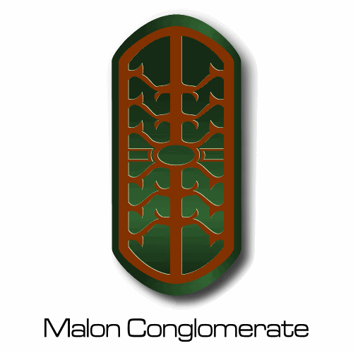
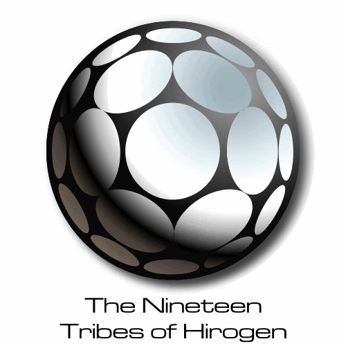
The Malon, Hirogen, and Tsunkatse people have logos according to the Starship Spotter book (not sure which of those were confirmed onscreen) and the Star Charts book includes logos for Talaxians, Vaadwaur, Dinaal, Uxal, and the Antarians.
Posted by Reverend (Member # 335) on :
quote:Originally posted by AndrewR: Very nice on such an intricate logo - but it's Vidiian - sorry
Were logos given to the Krenim, Malon, Vaduaar or even the Ocampa and Talaxians?
Easily corrected. I don't know, but if there is I'm sure I'll get to them eventually.
Posted by Reverend (Member # 335) on :
And just to make sure it doesn't look like I'm totally ripping of Resistance's fine work, here is an updated and (I hope) more acurate version of the ESFC logo.
Posted by Shik (Member # 343) on :
Starfighter Command? But I thought it was destroyed thanks to a Xurian spy?
Posted by Spike (Member # 322) on :
Do you have a version of the UESC-patch without that shadow? With your permission, I'd like to use it on my page.
Posted by Reverend (Member # 335) on :
Would you like it on a black or white background?
Posted by Spike (Member # 322) on :
On a black background please.
Posted by Reverend (Member # 335) on :
Done and done.
Posted by AndrewR (Member # 44) on :
Has anyone ever done a United Earth Space Probe Agency Logo (UESPA)?
Posted by Reverend (Member # 335) on :
Possibly. Posted by coatlantis1745 (Member # 1034) on :
Nice UESPA logo, Reverend, though I think I preferred it more with a less than "scrunched" globe hehe.
While we are on logos, would you consider designing a hypothetical, and I do stress, hypothetical logo for the S.S. Bonaventure?. Realistically speaking, I believe that the conjectural design for Valiant would best fit the Bonny. Perhaps a mission patch similar to your Valiant one, with any registry number you think would fit best.
Posted by Masao (Member # 232) on :
There is a possible design for the Bonaventure emblem. In the TAS episode the Elysium Council is shown. One of the members is a human woman with an old-style cowl-neck tunic and a breast insignia. She might be a Bonaventure crewman. Use can see my version on this pic (200 kb): http://lobotomy.pleh.net/~flareupload/uploads/232/TAS.jpg Posted by coatlantis1745 (Member # 1034) on :
quote:Originally posted by Masao: There is a possible design for the Bonaventure emblem. In the TAS episode the Elysium Council is shown. One of the members is a human woman with an old-style cowl-neck tunic and a breast insignia. She might be a Bonaventure crewman. Use can see my version on this pic (200 kb): http://lobotomy.pleh.net/~flareupload/uploads/232/TAS.jpg
Thanks Masao! I had forgotten that insignia element was there.
As such, I can see this insignia being an element of the proposed mission patch, or perhaps even a development project logo.
Now I am a die-hard TAS fan, but even I have difficulty accepting the old Bonaventure as shown on screen as the first space vessel equipped with warp drive. With great reservation, I could see the Bonaventure of TAS as being the first Federation starship equipped with warp drive. Now what if Valiant of 2065 had a sister vessel also named Bonaventure (a homage to Spaceflight Chronology, technical fiction, etc). Then perhaps, we could have a companion mission patch similar to Rev's design for this class?
So in a nutshell, lets have two mission patches, one for each incarnation of Bonaventure. Posted by AndrewR (Member # 44) on :
Nice UESPA logo - pity you left out New Zealand on the globe! Or is it? Posted by Reverend (Member # 335) on :
quote: Nice UESPA logo - pity you left out New Zealand on the globe! Or is it?
It's there, the image is just too small for it to be visible at that scale.
UPDATED After watching "First Flight" last night I made a few observations to revise the UESC logo. Mostly concerning the shade of yellow and the presence of a black outline.
NEW
I also have some new stuff here too.
First up is the UFP Press and Information logo. This one was very tricky and I may yet go back and correct some apparant errors made by the original artist.
Next I have two versions of the Starfleet Academy logo, a gold version seen on one of Picard's certificates. Which I presume to be an earlier incarnation of the more familiar red version. I don't know about anyone else but I think I much perfer the gold one.
As for a Bonaventure logo, we'll see but it's not high on my list of priorities at the moment. I've been dragged into doing TAS based work before and the results have been somewhat questionable.
[EDIT: link fixed]
[ June 03, 2003, 12:01 PM: Message edited by: Reverend ]
Posted by Sarvek (Member # 910) on :
Reverend, since seeing "First Flight" have you considered designing the NX Project Logo?
I totally understand about TAS. You do an excellent job on all your work. It would be interesting to see what you come up with for the Bonaventure. I have always appreciated what you did on the Aquashuttle. It is still on of my favorite shuttles and you represented it quite well.
Great job on the Starfleet Command logo from Enterprise. It looks great. Keep it up. The other logos look good to. You might want to check your second link for the Starfleet Academy logo. I think they are one and the same.
Posted by AndrewR (Member # 44) on :
quote:Originally posted by Reverend:
quote: Nice UESPA logo - pity you left out New Zealand on the globe! Or is it?
It's there, the image is just too small for it to be visible at that scale.
Not wanting to be pedantic - but I can see Tasmania... if you can see Tasmania on there you should EASILY seen New Zealand - it's not THAT small a country! Tis not there. Just saying - that's all. Posted by Reverend (Member # 335) on :
quote:Originally posted by AndrewR:
quote:Originally posted by Reverend:
quote: Nice UESPA logo - pity you left out New Zealand on the globe! Or is it?
It's there, the image is just too small for it to be visible at that scale.
Not wanting to be pedantic - but I can see Tasmania... if you can see Tasmania on there you should EASILY seen New Zealand - it's not THAT small a country! Tis not there. Just saying - that's all.
Trust me, it's there.
Posted by Spike (Member # 322) on :
quote:After watching "First Flight" last night I made a few observations to revise the UESC logo.
Could you please send me the revised one on a black background?
Posted by Reverend (Member # 335) on :
quote:Originally posted by Spike:
quote:After watching "First Flight" last night I made a few observations to revise the UESC logo.
Could you please send me the revised one on a black background?
Done and done.
Posted by Reverend (Member # 335) on :
Just when you thought I'd squeezed all the life out of this old thread!
Excellent graphic! Are you going to do the same for all the Starfleet logos?
Posted by Reverend (Member # 335) on :
Possibly.
NEW A TOS era Romulan logo. Posted by Reverend (Member # 335) on :
As someone asked to nicely, here is a Kzinti logo.
And just for kicks, the Romulan standard.
Posted by coatlantis1745 (Member # 1034) on :
Thanks very much for that Kzin insignia, Reverend. Posted by Reverend (Member # 335) on :
No problem.
Next up we have the Trill. I know that technically this is thought of as the logo for the symbiosis commission, but it's all we really have for the Trill. At least as far as I know.
Second today is the Borg symbol. A little closer to the real deal than the previous version, but still very much styalised.
Posted by Masao (Member # 232) on :
I think for the TOS Romulan symbol, the head and claws should look more like the wings and be angular. Also, the head should be much more prominent and strongly triangular and overlap the wings.
Posted by Capped in Mic (Member # 709) on :
use the FASA Romulan logo
Posted by AndrewR (Member # 44) on :
quote:Originally posted by Reverend: Just when you thought I'd squeezed all the life out of this old thread!
Is that intentional to have a shillohette of a man on the left and a woman on the right flanking the circle on the 2161 badge? I.e. look at the gold 'wreath' bits... they are shillhouettes.
Posted by Reverend (Member # 335) on :
quote:I think for the TOS Romulan symbol, the head and claws should look more like the wings and be angular. Also, the head should be much more prominent and strongly triangular and overlap the wings.
Point taken. How's this?
quote:use the FASA Romulan logo
That would defeat the purpose of design somthing original, besides I don't even know what it looks like.
quote:Is that intentional to have a shillohette of a man on the left and a woman on the right flanking the circle on the 2161 badge? I.e. look at the gold 'wreath' bits... they are shillhouettes.
I do belive that was FJ's intention.
P.S. Another, slightly more interesting version of the Borg symbol.
Posted by AndrewR (Member # 44) on :
quote:Originally posted by Reverend:
P.S. Another, slightly more interesting version of the Borg symbol.
Gold-pass Borg?
How about the Boomerang from the walls of TOS starbases? Or the Klingon emblem from the wall of Kor's office in Errand of Mercy (I think it showed up again). There was a thread about it here - many moons ago.
Obsidian Order/Tal'Shiar emblems? I wonder what the Klingon intelligence (and oxymoron??) and Section 31 emblems look like?
Posted by Topher (Member # 71) on :
For the last UFP logo, is that actually supposed to be 2830 or is it a typo for 2380?
Posted by Reverend (Member # 335) on :
quote:How about the Boomerang from the walls of TOS starbases?
Yeah...umm...there isn't much I can do with that one, but I'll give it a shot.
quote:Or the Klingon emblem from the wall of Kor's office in Errand of Mercy (I think it showed up again). There was a thread about it here - many moons ago.
Give me a link and I'll see what I can do.
quote:Obsidian Order/Tal'Shiar emblems? I wonder what the Klingon intelligence (and oxymoron??) and Section 31 emblems look like?
Both Obsidian Order and Tal'Shiar are on my to-do list, but the Tal'Shiar one is going to be a little bit tricky.
I imagine the Klingon Intelligence logo looks just like most Klingon logos; red, yellow and spiky. I seriously doubt that Section 31 has a logo and if they did it'd probably just be the old FJ Federation Seal with '31' superimposed on the star field, nothing spectacular.
quote:For the last UFP logo, is that actually supposed to be 2830 or is it a typo for 2380?
It's supposed to be 2830, which I randomly chose as the decade in which the U.S.S. Relativity is based.
Posted by Masao (Member # 232) on :
Rev, I'd go even larger and more angular with that head. Your wings in that emblem are very angular with no small details at all. However, the head has small eyes and beak details. Also, I think the head in the TNG logo is much larger, about half the width of the entire emblem. The head in your version should be at least that large. The talons should also be more angular.
Edit: I was watching "And the Children Shall Lead" yesterday and noticed that on the UFP standard/banner the lettering is actually gold, not white (The stars are white). I've been drawing this wrong for years!
Posted by Reverend (Member # 335) on :
Ok, I've enlarged the head about as much as I dare and made it a little less detailed and a little more stylised. I'm not sure how to make the claws look more angular without them looking disproportionate. I had a go but it looked just crap.
Posted by Masao (Member # 232) on :
That's better. But the wings are still visually overpowering the head and still look like they are in front of the head, especially since the wings' thick black border is intact all around. The head should be clearly standing out in front of the wings. Maybe the lines used to constuct it should be as dark as the lines in the wings? Another possible problem is that the head is now mirroring the knife blade-ish thing between the wings. Perhaps making the head half blue and half green would help.
The claws are the only organic-looking things on the whole emblem, so they look a bit out of place. If making them angular is too busy, think about reducing their number or enlarging the globe and claw.
Posted by Reverend (Member # 335) on :
Well that's good because the wings were supposed to be overpowering. My intention here was to cross the Romulan logo of the ST:VI/TNG era with the Nemesis version, while at the same time produce something distinctive and easily recognised as a stencil on the side of a hull.
Ok, I think I've about cracked it.
Posted by Masao (Member # 232) on :
The new talons are nice. I still think the head is a bit weak, because its outine is still much thinner than the outline of the wings. As a result the head look like it is between or behind the wings rather than being in front of them. But I won't say any more.
Posted by Reverend (Member # 335) on :
Yeah, I see what you mean now. Sometimes it's a little hard to take a step back from your own work.
Now lets do a comparison to see how far we've come. Posted by Jan (Member # 1133) on :
This looks very good, Reverend! The lines are clear and well placed now, as are the proportions of the head, wings and talons. Your first attempt wasn't bad, but the newest version is so much better! The Romulans would be proud! Posted by Reverend (Member # 335) on :
quote:Edit: I was watching "And the Children Shall Lead" yesterday and noticed that on the UFP standard/banner the lettering is actually gold, not white (The stars are white). I've been drawing this wrong for years!
Me too. I'd better rectify that.
And while I'm at it... The old version was a little too plain.
Posted by Masao (Member # 232) on :
That Romulan patch is much better. I think it might be made PERFECT (!) by isolating the head more from the body by extending the black border you have at the top of the head to enclose the entire head. A similar thick black line could be used around each talon/planet unit to make them stand out as well.
Posted by Reverend (Member # 335) on :
There. Let it never be said that I am unresponsive to criticism. It is officially perfect!
Posted by Masao (Member # 232) on :
Not "criticism," but "suggestions."
Posted by Spike (Member # 322) on :
quote:I know that technically this is thought of as the logo for the symbiosis commission, but it's all we really have for the Trill.
I think it's safe to assume that it is the Trill logo as it was also used at the reception for the Trill scientists in "Rejoined".
BTW: Do you have an image of the UESPA arrowhead?
Posted by Reverend (Member # 335) on :
I have this. Or did you mean the pennant that was painted on the side of the Friendship One probe? 'Coz I have that too.
Posted by Spike (Member # 322) on :
Yep, just the pennant. Thx.
Posted by Spike (Member # 322) on :
Regarding the six different Klingon logos. Does anyone know in which episodes they were used? I just remember the ones from TOS and TUC.
Posted by Fleet-Admiral Michael T. Colorge (Member # 144) on :
Why don't you just put all the logos on a website that people can browse and download at... just a thought. Posted by Reverend (Member # 335) on :
Yes, wonderful idea, wish I'd thought of that..but I don't have a website, and that's the beginning middle and end of it.
Spike: I'm pretty sure that the 'blade' version was from a DS9 era Klingon computer display. The version with the red background instead of white is from ST:VI, on the BRG Kurla (sp?) transmission IIRC. I'm almost certain that the version with the gold disc, one red spike and two greens is from one of the DS9 war maps. The grey & red one is probably from TNG, as for the rest I don't know off hand. Oh and there are SEVEN variations, not six. Posted by Capped in Mic (Member # 709) on :
i'd be willing to host you, i could start an art outgrowth of the galactopedia and forum
Posted by Masao (Member # 232) on :
Do it, Rev!
Posted by Reverend (Member # 335) on :
Sure Mike, go for it. Dan The Minutiae Man, has also offered to host and he is also welcome. Anyone else who has a website and wants to use any of these, feel free to ask.
While I'm here are there any Logos that I've missed? Not counting the later Voyager stuff since I know I haven't even touched them yet.
Any major TOS or TAS adversary that I haven't covered yet? Any requests for conjectural logos for memorable alien worlds or Federation members?
Posted by Harry (Member # 265) on :
I can't really think of any more. Unless you want to do conjectural logos for Federation divisions, departments and bureaus, like the Bureau of Industrialization (throughout TOS, according to the Concordance), the Burau of Planetary Treaties ("Mark of Gideon" [TOS]), the Department of Agricultural Affairs ("The Trouble with Tribbles" [TOS]).
Posted by kiltedbear (Member # 1138) on :
How about the Tal Shiar or Obsidian Order insignias?
Posted by Spike (Member # 322) on :
Well, I'd like to get rid off the B/W logos on my page and use yours instead, but do you have them without shadow by any chance?
Ligon II (TNG Code of Honor) had a logo. I could make screenshots if you're interested.
Posted by kiltedbear (Member # 1138) on :
Reverend, have you ever thought of doing non-Trek insignias? I think if you did ones from B5, SeaQuest, or Star Wars they would look great
Posted by Reverend (Member # 335) on :
SeaQuest? You must be joking.
quote:I can't really think of any more. Unless you want to do conjectural logos for Federation divisions, departments and bureaus, like the Bureau of Industrialization (throughout TOS, according to the Concordance), the Bureau of Planetary Treaties ("Mark of Gideon" [TOS]), the Department of Agricultural Affairs ("The Trouble with Tribbles" [TOS]).
I think those would be very low on my list of priorities.
quote:Well, I'd like to get rid off the B/W logos on my page and use yours instead, but do you have them without shadow by any chance?
There is indeed a chance.
quote:Ligon II (TNG Code of Honor) had a logo. I could make screenshots if you're interested.
Sure, go for it.
Oh yeah, and here's Angosia. Posted by Harry (Member # 265) on :
Peliar Zel also has an emblem, and was also UFP member.
Posted by Sarvek (Member # 910) on :
How about the NX Project Logo, the Logo for Epsilon station from ST:TMP, and the MACO Logo from Enterprise. Those are the only ones that I could think of. Reverend, you do such a great job on the logos I would love to see more.
Unfortunately it's not very challenging. :-D
Posted by Reverend (Member # 335) on :
Done. Next!
Posted by Reverend (Member # 335) on :
quote:Peliar Zel also has an emblem, and was also UFP member.
Are there any shots of her where she is closer to the camera and/or on a set with better lighting? All I can make out from that is a triangle with some indistinguishable markings flanked by curly shapes.
quote:How about the NX Project Logo, the Logo for Epsilon station from ST:TMP, and the MACO Logo from Enterprise.
Given that season 2 of ENT isn't out in the UK yet and that I haven't seen any pictures of it yet, I'm afraid I can't draw the MACO logo. Again with the NX-Project, I can't draw what I can't see and I've yet to see any useable reference shots of that one. I have actually done a version of the Epsilon station logo, you can see it on my "Jupiter Outpost 92". I'll get around to presenting it properly sometime in the near future.
Posted by Sarvek (Member # 910) on :
Reverend, I do have some pics of a couple of those things that I pointed out. Would you like me to email them to you because I do not believe that I have enough posts to put up the pics?
Cheers,
Sarvek Posted by SoundEffect (Member # 926) on :
I have done the Epsilon IX / Relay station symbol.
Bit fat for a Mako shark, isn't it? Saying that, I can't draw for toffee so fair play to the guy for even getting that far.
Posted by Lee (Member # 393) on :
As far as we can tell, the shark is pretty much the same dimensions with regard to the rest of the patch. Which is more than can be said for the MACO lettering, which is too small. Compare it with the main image on my MACO page.
Posted by Reverend (Member # 335) on :
One obese shark coming right up!
Posted by Harry (Member # 265) on :
I don't know if you've done them yet, but there are a few different United Earth emblems too.
There's the current UN logo, also used in Masao's mid-22nd century.
There's the early TOS version: a blue americentric Earth and gold olive branches, with blue lettering. (note: there's also the plain black version, used on Class-B uniforms and office supplies).
And then there's the green TUC emblem with the white star.
Posted by Axeman 3D (Member # 1050) on :
quote:Originally posted by Lee: As far as we can tell, the shark is pretty much the same dimensions with regard to the rest of the patch. Which is more than can be said for the MACO lettering, which is too small. Compare it with the main image on my MACO page.
No, I meant it was rather tubby for a Mako shark, not relative to the patch. Mako's are ocean going sharks, streamlined for crossing huge distances and catching prey at speeds. They're from a group known as the mackerel sharks, all superbly adapted for sea-going life. I suppose the Long-finned variety can get a little portly, but the one on the patch appears to have eaten all the pies, as we say over here.
Posted by Lee (Member # 393) on :
Oh, I see. I guess they just wanted a generic shark look, something mean-looking. Could have been worse, they could have used a hammerhead, and the mere thought of THAT triggered SeaQuest flashbacks. . . *shudder*
Fucking hell, Kris, that was fast! And it's very nice too. I like your style and was looking forward to what kind of a polish you'd put on it. 8)
Posted by Sarvek (Member # 910) on :
Thank you Sound Effect for the Episilon Patch it looks really cool. Reverend, I do not know if I have seen your version.
Thank you Lee and Reverend for the MACO Patches they are totally awesome.
I still have some pics of the NX Project logo if you want to see those I could email them to you Reverend.
Cheers,
Sarvek
Posted by AndrewR (Member # 44) on :
I mentioned before... about any other emblems/logos...
Obsidian Order (which is really cool - looks like an obsidian dagger) and the Tal Shi'ar (which isn't so great... maybe a new Tal Shi'ar logo could... oh don't bother - there IS no more Tal Shi'ar!
What about a Klingon Intelligence logo?
Do we see any Andorian patches in Enterprise?
Posted by Reverend (Member # 335) on :
Posted by Sarvek (Member # 910) on :
Awesome work Reverend. I really like your Terran symbols. What are you going to do next?
Cheers,
Sarvek
Posted by Masao (Member # 232) on :
Going blind looking at the screencaps, I think I see the lighter color at the left rim (our left) of the shark's body, on the right part of the head, and on the fin to the right.
Posted by MinutiaeMan (Member # 444) on :
Well guys, here's the website for ya. It's not officially available yet, but since the logos are all up, feel free to take a look. (I mainly have to write new descriptive text and so forth. It'll be finished in the next day or two, probably.)
(I've still got to add the latest ones, though! )
Posted by Lee (Member # 393) on :
Nice. Since Kris has provioded some of the logos on my site, I've added a link to the new page on my credits page; not uploaded yet however.
Posted by Masao (Member # 232) on :
Dan, Thumbnails would be helpful! Posted by MinutiaeMan (Member # 444) on :
Masao, pester Kris for those. I've tried making thumbnails out of those images, but the shadows and gradients make it hard to remove the background without lopping out part of the actual logo.
Kris is already working on thumbnails, but it'll probably be a little while before they're up. Posted by Sarvek (Member # 910) on :
MinutiaeMan, you have an awesome site. It is the first time that I have been there and I am truly impressed. I can not wait until you get Anthropology 114 completely online.
Cheers,
Sarvek
Posted by Reverend (Member # 335) on :
quote:Well guys, here's the website for ya. It's not officially available yet, but since the logos are all up, feel free to take a look. (I mainly have to write new descriptive text and so forth. It'll be finished in the next day or two, probably.)
"Mission Patch of Ares IV Mission" should be "Ares Program Patch". The mission patch is red and hexagonal, something that I've yet to draw. I might also do a version with the correct spelling of 'Ares'.
The colour of the first Breen logo was a mistake since something funky happed when I scanned it and I didn't double check what the proper colours were.
"Deneva Colony Logo" Should be "Deneva-Class Development Project Patch".
The "Starfleet Command (Earth) Flag, ca. 2151" is probably inaccurate since it was based on a TINY screen cap and has been superseded by "First Flight" anyway.
"Sequoia Class Development Project Badge" Should be "Sequoia Class Construction Team Badge" Since it's for the yard worker who actually built the ship, not the ASDB lot who designed it. Something you'd probably find on the sides of workbees or spacesuits.
"Work Bee Development Project Patch" Is actually just a logo I did for a 3d modeller to put on the side of a workbee mesh, so it's just the logo for UP's Delta shift, on the ZZ2A construction platform.
For the "Trill Symbiosis Commission" I think it's been established that this is the actual logo for the Trill government. It's presence at the commission could be analogues to a high ranking US official, or doctor having the stars and strips hanging in their office. Being a Brit I don't know how common this practice is, but I've seen it in plenty of movies and TV shows.
For all the Federation planets, (Earth, Bajor, Tiburon etc.) it might be easier to group them if you add the prefix 'UFP Member:' I also suggest that you try and group the different types of logos together. For example, have all the mission patches grouped and sorted in chronological order, the independent aliens (Klingon, Vidians, Dominon, Cardassians) should be grouped in order of their quadrant of origin...you get the idea
Posted by MinutiaeMan (Member # 444) on :
Okay Kris, I'll fix these.
(Just FYI, it'll probably have to wait until late this weekend, because there's going to be a Panther waiting for me when I get home tomorrow, and I'll be busy with an install for a little while, getting my hard drive reorganized... Sad, I know. )
Posted by AndrewR (Member # 44) on :
Risa? Andoria? Telleria? Tal Shi'ar? F.C.A.? Idania, Bole, Acamaria, Shelliak, Betazed, Hurq, Children of Tama, Lore-Borg? Daystrom Institute? House of Mogh, House of Martok, House of Duras, The Asgaard. Posted by SoundEffect (Member # 926) on :
quote:Originally posted by AndrewR: Lore-Borg?
Wasn't that the same Borg symbol, just placed on a flag? The filming miniature of the Lore-Borg starship had tiny black Borg symbols on several sides.
Posted by The Mighty Monkey of Mim (Member # 646) on :
quote:Originally posted by AndrewR: Telleria?
You mean Tellar, surely...or Talaria...
Posted by Reverend (Member # 335) on :
What is it with some people and the Tal Shi'ar logo? It's in my to-do list already!
As for the rest Andrew, I'd be happy to if you can provide the reference materials.
Posted by AndrewR (Member # 44) on :
Yes Teller
Sorry didn't know it was on your list
The rest was brain storming - where did you get things like Tiburon's emblem?
What about some of the Starship emblems from TOS - the Intrepid etc.
Andrew
Posted by Harry (Member # 265) on :
Some Klingon emblem from TMP (More and more). It's not THE Klingon logo, since the usual Klingon emblem is also on it. So it could be a major Klingon House or some Defense Force subdivision.
Posted by MinutiaeMan (Member # 444) on :
Hey, that same logo that Harry linked to is on the decals for the old AMT/ERTL Bird-of-Prey model! I'll be darned... THAT was supposed to be the old Klingon insignia?!?
(Likewise, there's also a logo/image-thing that I saw repeated a couple of times while I was watching my DVD of "Errand of Mercy." It was shown at the top of Kor's list of rules and regulations, and was also seen as a sort of 3D item on the wall in the same scene. It could easily be mistaken for native artwork, but I think it could be a logo of some sort.
I'll get some screenshots in a little while...
Posted by SoundEffect (Member # 926) on :
quote:Originally posted by MinutiaeMan: Hey, that same logo that Harry linked to is on the decals for the old AMT/ERTL Bird-of-Prey model! I'll be darned... THAT was supposed to be the old Klingon insignia?!?
Nope. The Bird of Prey had a grayish dagger mark through a red circle with Klingon lettering through the gray.
The three linked images are specific to Kronos I, Chancellor Gorkon's flagship from Trek VI. (With the Fed-Klingon and USA-USSR parallels it was supposed to be a Klingon homage to the hammer-and-sicle emblem.) (Gorkon/Gorbechev, etc.)
Posted by AndrewR (Member # 44) on :
what is up with flare-upload? I want to upload a picture.
Posted by Spike (Member # 322) on :
So it's either the symbol of House Gorkon, the symbol of the office of chancellor, or the symbol for the KDF's first fleet. Hmm...
Posted by AndrewR (Member # 44) on :
Thanks, Spike.
Here's another curiosity - a strange emblem on a BOP - I've posted this pic here before. Is it possibly markings for when the BOP in STIII was going to be Romulan - and that that was going to be the Romulan symbol!?! Was there any Romulan symbol in TOS? Maybe the big bird on the undercarridge of the TOS BOP could be given a blue/green look like a TOS-y TNG emblem?
here's the pic:
ok flare upload doesn't seem to be working at the moment.
Posted by Reverend (Member # 335) on :
By popular demand, the Tal Shiar.
And our newly discovered Klingon logo, who's meaning I have arbitrarily selected as being the emblem of Gorkon's nobel family. Posted by Reverend (Member # 335) on :
As for possible TOS era Romulan logos, (aside from the one I spent all that time and effort on) I remember seeing something like this... On the side of a Romulan D-7 on some TAS image cap. Don't ask me which episode it was from because I don't recall.
Posted by SoundEffect (Member # 926) on :
I like the Gorkon symbol you did, but if I may suggest, I believe the symbol is intended to be on an angle, again the hammer and sicle thing...
Even on the Trek VI Klingon AMT model decal sheet the emblem was leaning at an angle like on Kronos I.
Also, are your emblems reversed? The Klingon writing looks 'backwards'.
Posted by Reverend (Member # 335) on :
Yeah I know, but it didn't look right! As for the script, I think I may have accidentally inverted it. I knew something didn't look right.
One more logo for today, this time a departmental one.
Posted by Spike (Member # 322) on :
Nice homage. But I'd omit the "4". That number just indicated the prison facility.
Posted by Lee (Member # 393) on :
You were pretty damn close on that MACO, Rev.
Posted by Reverend (Member # 335) on :
quote:Nice homage. But I'd omit the "4". That number just indicated the prison facility
I did wonder about that.
quote:Bloody typical. . .
Wow, some of those are surprisingly good. The Tholian ship is allot more detailed than I had suspected.
Posted by AndrewR (Member # 44) on :
[QUOTE]Originally posted by Reverend: [QB] As for possible TOS era Romulan logos, (aside from the one I spent all that time and effort on)
Oh, hey - no I thought that green and blue one was a TOS movie era emblem!!
Anyway of incorporating the big bird that's on the underneath of the BOP's into an emblem?
Andrew
Posted by Reverend (Member # 335) on :
*Double post*
Posted by Reverend (Member # 335) on :
UPDATE Corrected the Gorkon logos. And the Security logo. I also caught a labeling error with one of the Cardassian emblems. Then I made one up. Anyone have a list of all the Cardassian Orders & Battalions mentioned by any chance?
I've altered the Tiburon logo some more, I was never happy with my original version.
Finally here is a formatting WIP of some TOS-era ship patches that I'm toying with. It's just a concept test at the moment, nothing is set in stone.
Posted by MinutiaeMan (Member # 444) on :
quote:Anyone have a list of all the Cardassian Orders & Battalions mentioned by any chance?
Hmm...
Pretty sure they mentioned most of the numbers. But seeing as how BBEdit has a really nice search feature for all my DS9 scripts, here's my list:
Fourth Order, "Emissary" and "Ties of Blood and Water" and "In the Pale Moonlight" (Backup for Gul Jasad)
Second Order, "The Maquis, Part I" and "Defiant" (Gul Dukat's assignment)
Eighth Order, "Second Skin"
Sixth Order, "Defiant"
Fifth Order, "In Purgatory's Shadow"
Ninth Order, "Ties of Blood and Water"
First Order, "Empok Nor"
Third Order, "Image in the Sand"
Eleventh Order, "Strange Bedfellows"
Twelfth Order, "Tacking into the Wind"
Or, to put them in numerical order (pun not intended)... 1,2,3,4,5,6,7,8,9,11,12. So, the only one not mentioned was the Tenth Order.
Posted by SoundEffect (Member # 926) on :
Second Order was Dukat's Fourth Order was Gul Evek's (VOY: Caretaker)
Posted by AndrewR (Member # 44) on :
quote:Originally posted by MinutiaeMan:
quote:Anyone have a list of all the Cardassian Orders & Battalions mentioned by any chance?
Hmm...
1,2,3,4,5,6,7,8,9,11,12. So, the only one not mentioned was the Tenth Order.
The 10th order were on a Red-Leaf Tea break.
What are the 'orders' then? Like the Federation's "Fleets"?
Posted by MinutiaeMan (Member # 444) on :
Basically, yeah. Except that there were a lot more ground troops, since the Eleventh Order had 500,000 soldiers on some planet in "Tacking into the Wind."
Posted by Sarvek (Member # 910) on :
Reverend, I really like your TOS Ship Logos. Are they the Exeter, the Constellation, the Huron, and the Enterprise? They look totally awesome. Great job. I can not wait to see you final versions.
Cheers,
Sarvek Posted by Reverend (Member # 335) on :
Minor update. Yet another UFP member logo. Posted by AndrewR (Member # 44) on :
Very interesting! I like it... although it sorta looks like Scratchy from Itchy and Scratchy!
What about a Bank of Bolarus symbol?
Nice work.
Posted by Reverend (Member # 335) on :
Just to let everyone know, it looks like FJ's UFP seal is 'cannon' after all.
When I get time, I'll do a comparison to prove the point.
Posted by SoundEffect (Member # 926) on :
Yeah, knew that one was there for decades. On the travel pod scene in Trek II, the travel pod has commemorative plates lining the walls which are the Federation Founding Members seals from the FJ Tech Manual. The swan-looking one is particularly evident.
Posted by Reverend (Member # 335) on :
Well it was news to me. I had always been led to belive that FJ's work had been largely ignored by the production people, supposedly under orders from GR. Now with the frying pan ships turning up in TWOK, the blueprints being used in TMP and the logos appearing in TVH, it seams to be quite the opposite.
Posted by The Mighty Monkey of Mim (Member # 646) on :
By TPTB, FJ's work was indeed ignored, but not by the Art Department. His material had a really profound impact on Trek art and design, and it shows through.
Posted by SoundEffect (Member # 926) on :
If my response sounded snooty Rev, I apologize. I had drawn out side and aerial view drawaings of the Trek IV Starfleet HQ buildings for a role-play game a long time ago and I had gone right to the old Tech Manual for the UFP symbol on the round building. I realize it probably wasn't generally known.
Posted by Spike (Member # 322) on :
IIRC the Son'a also had a logo, which appeared on almost every computer screen. I'll check my "Making of"-book ASAP.
Posted by Reverend (Member # 335) on :
quote:If my response sounded snooty Rev, I apologize. I had drawn out side and aerial view drawaings of the Trek IV Starfleet HQ buildings for a role-play game a long time ago and I had gone right to the old Tech Manual for the UFP symbol on the round building. I realize it probably wasn't generally known.
Don't fret SE, I just assumed that I had missed that tidbit. Wouldn't have been the first time I'd be very interested to see those drawings however. I've already prodded a couple of architects I know to try and get some reasonable extrapolations of the various San Francisco buildings.
quote:IIRC the Son'a also had a logo, which appeared on almost every computer screen. I'll check my "Making of"-book ASAP.
I vaguely remember it being hexagonal with a generic alien glyph at the centre. I'm sure I can do something with it.
Posted by MinutiaeMan (Member # 444) on :
Here's an old and rather grainy version of it I've had sitting on my hard drive for the past five years or so...
Posted by SoundEffect (Member # 926) on :
Here's a Son'a symbol I did in Illustrator shortly after Insurrection was out:
The symbol for mars is the "male" symbol... you've got the zodiac symbol for Aires the Ram!?!
Nice though.
What about The Venus station, Jupiter Station and I'm sure there is something around Saturn... the evac station on Mimas? Posted by AndrewR (Member # 44) on :
Did the Sheliak have a symbol?
Posted by Reverend (Member # 335) on :
quote:The symbol for mars is the "male" symbol... you've got the zodiac symbol for Aires the Ram!?!
The male symbol is in there, allbeit a little more compacted and stylised.
I'm shocked that you don't know the connection between Mars and Aries. What it the world coming to?
quote:What about The Venus station, Jupiter Station and I'm sure there is something around Saturn... the evac station on Mimas?
Did the Sheliak have a symbol?
There's just no satisfying some people.
Posted by Harry (Member # 265) on :
Connection between Aries and Mars? Aries was a Greek mythological ram after which the constellation was named. You were thinking of Ares, the Greek god of war, called Mars by the Romans.
According to "In the Cards" (DS9), "the flag of the first Martian colonies was inspired by a velvet painting of an ancient bullfighter".
Posted by Reverend (Member # 335) on :
Whoops. Oh well, simple mistake.
I am aware of the "in the cards" reference but I've never been able to get a good look at the painting so I had to settle for something a little simpler.
Still, bull fighting, ram there's still a connection there. Posted by Reverend (Member # 335) on :
I've refined the TOS ship patches somewhat, I think they suit the era a little better now. I've been trying to give the ship insignias the texture, but it's a little difficult without some good reference material.
Posted by Sarvek (Member # 910) on :
Rev, the ship patches look totally awesome. The registries are what need to be fixed:
He's a revisionist. He knows those are the generally accepted canonical numbers (even though the Bonaventure itself isn't canonical)
Posted by Sarvek (Member # 910) on :
I am just going by what is seen on screen. If it is on screen then it is true, canonical is another story. You should go to :
quote:I am just going by what is seen on screen. If it is on screen then it is true, canonical is another story.
You have a lot to learn about metaphysics, Sarvek.
Kris: The Constellation's real registry number is NCC-1710. (source) I helped write that list. Posted by Masao (Member # 232) on :
Bonaventure's registry is right on screen: http://www.startrekanimated.com/tas_tt_04.jpg The registry is completely nonsensical; if I ever did a museum article on Bonaventure, I'd probably change it.
Posted by Sarvek (Member # 910) on :
MinutiaeMan, I have seen the list but it does not match with what was seen on screen in TOS episode "The Doomsday Machine". Your list is probably what should have been put on the Constellation. Has this been confirmed with the art team at Paramount??
Sarvek
P.S. Check out the model of the Enterprise that is put out by Polar Lights. It has the backing of Mike Okuda, Doug Drexler, John Eaves and all the people at Paramount Pictures for the assistance in the model. It states the following registries:
USS Constellation NCC-1017 USS Exeter NCC-1672 USS Defiant NCC-1764
I do not have a problem with your registries. You have a problem with Paramount Pictures and their team.
Posted by MinutiaeMan (Member # 444) on :
Sarvek -- you apparently failed to understand my comment about metaphysics. I was talking about the philosophy of what is true and what isn't.
Posted by AndrewR (Member # 44) on :
quote:Originally posted by Harry: Connection between Aries and Mars? Aries was a Greek mythological ram after which the constellation was named. You were thinking of Ares, the Greek god of war, called Mars by the Romans.
Thankyou.
Posted by Sarvek (Member # 910) on :
quote:Originally posted by MinutiaeMan: Sarvek -- you apparently failed to understand my comment about metaphysics. I was talking about the philosophy of what is true and what isn't.
All this work that is done is done by the fans of Star Trek and it is not canon. We all design ships, logos, and shuttles as well as other vehicles that our our creation. That is what Reverend has done and I completely admire his work. He gives me inspiration to design ships and other things that are not canon. What I have learned is that what Paramount says goes and is canon. I have several reference books dealing with Star Trek. These books convey and confirm what the model kits says about the registries. What is the real registry then, the canon one??
Cheers,
Sarvek Posted by Wraith (Member # 779) on :
The canon registries are as you stated, however in this case they are irrelevant. Most people here know the canon numbers but Reverand and others are trying to produce a slightly more rational system. This has no canonical basis but frankly we don't care. Posted by Harry (Member # 265) on :
This is the Creativity forum. No need for canon here. It even says so on the door: "WARNING: Non-canon zone! Enter at your own risk!" Posted by Reverend (Member # 335) on :
quote:Kris: The Constellation's real registry number is NCC-1710. (source) I helped write that list.
I agree that's probably what the registry should have been, but I chose 1717 because it was closer to what was onscreen.
quote:Bonaventure's registry is right on screen: http://www.startrekanimated.com/tas_tt_04.jpg The registry is completely nonsensical; if I ever did a museum article on Bonaventure, I'd probably change it.
Exactly. Actually almost everything about the Bonaventure is nonsensical, the design, it's supposed place in history and of course the registy. None of it really fits in anywhere. So while I'm willing to make a reference or an homage to something from TAS, I will not compound an obvious error.
quote:Thankyou.
Ya whining oozy bastard.
quote:This has no canonical basis but frankly we don't care.
Here here.
Posted by Sarvek (Member # 910) on :
quote:Originally posted by Harry: This is the Creativity forum. No need for canon here. It even says so on the door: "WARNING: Non-canon zone! Enter at your own risk!"
Harry, you are absolutely correct. I stand corrected. I want to apologize to everyone, but especially to Reverend and MinutiaeMan. You are both correct in your views. This is a creativity forum and sometimes I get caught up in the accuracy of it all and sometimes Paramount calls the shots, but not here.
Cheers,
Sarvek Posted by Reverend (Member # 335) on :
Here's something from the Intrepid. And Mike, don't say I didn't warn ya!
And here's something from an upcoming project. Posted by Sarvek (Member # 910) on :
Reverend, it all looks good. What is the Memory Alpha?? What is that in reference to? I really like both logos, keep it up.
Cheers,
Sarvek Posted by Spike (Member # 322) on :
Memory Alpha is a library planetoid containing scientific and cultural informaton from each planet in the Federation. It was attacked by the non-corporeal Zetarians in 2269 (TOS The Lights of Zetar).
Posted by Masao (Member # 232) on :
Instead of Roman letters, maybe Greek letters (mu and alpha) should be used. You already have the name above, so mirroring the Roman initials below is a bit redundant.
Posted by MinutiaeMan (Member # 444) on :
I suppose so... but there's not really any difference between the Greek and Roman letters M and A. If they're uppercase, they're identical, and if they're lowercase, the "A" looks a little funny. I think it looks pretty good as is.
Besides, since when is a little redundancy in a logo a bad thing anyway? The Federation is a bureaucracy, after all... Posted by Jason Abbadon (Member # 882) on :
The Intrepid logo is amazing. The Memory Alpha logo kinda reminds me of the Earthdome TV logo from B5 though.
Posted by Reverend (Member # 335) on :
quote:Instead of Roman letters, maybe Greek letters (mu and alpha) should be used. You already have the name above, so mirroring the Roman initials below is a bit redundant.
I did actually look at the greek letters first, but as Dan points out the upper case letters are pretty much identical and the lower case don't give one much to work with. Still, it was a commisioned piece and the 'clients' are happy so I'll leave it as it is.
quote:The Intrepid logo is amazing. The Memory Alpha logo kinda reminds me of the Earthdome TV logo from B5 though.
ISN? But that was on oval!?
I'm surprised that knowone has yet noticed the little sideways reference I slipped into the ship patches. Think unique TOS uniform.
UPDATE
Posted by Fleet-Admiral Michael T. Colorge (Member # 144) on :
Wow... damn hot stuff there Reverend!!! I'm just waiting for the Utopia Planitia logo.
Posted by Reverend (Member # 335) on :
I did that one already.
Posted by coatlantis1745 (Member # 1034) on :
Could we have a black background no shadow view of that 2242 logo please Reverend?
Posted by AndrewR (Member # 44) on :
Was there a temporal investigations logo?
What about the All Good Things communicator, the Parallels/Future Imperfect communicator, and the 29th century communicator?
Posted by Reverend (Member # 335) on :
quote:Could we have a black background no shadow view of that 2242 logo please Reverend?
Nope. The shadow is there for a reason.
quote:Was there a temporal investigations logo?
Yes, I did that one too.
quote:What about the All Good Things communicator, the Parallels/Future Imperfect communicator, and the 29th century communicator?
They're not logos. They're uniform insignia and technology.
Posted by Spike (Member # 322) on :
Does the Risian tattoo count as a logo?
Posted by Reverend (Member # 335) on :
I think Risa has a logo all of it's own, a Horgon superimposed on a sunset/rise IIRC.
UPDATE
Posted by Harry (Member # 265) on :
Yeah! Squish the little pigeon! You know you want to!
Uhmm.. good stuff, Rev.
Posted by Reverend (Member # 335) on :
Nothing like a nice sunset and a wooden sex idol for all your jamaharon needs.
Posted by MinutiaeMan (Member # 444) on :
Y'know, I've been afraid to ask whether the Horga'hn is supposed to be some kind of abstract art, or if it's really just a giant alien dildo.
Er, I mean... nice logos again, Kris! Posted by Fleet-Admiral Michael T. Colorge (Member # 144) on :
When did you post the Utopia Planitia logo?
Posted by Reverend (Member # 335) on :
Ages ago. Posted by coatlantis1745 (Member # 1034) on :
quote:Originally posted by Reverend: [QB] [QUOTE]Could we have a black background no shadow view of that 2242 logo please Reverend?
Nope. The shadow is there for a reason.
Pity. . .
Posted by Sarvek (Member # 910) on :
Reverend is there a logo for the 2270 Starfleet Command?? I do not know if one exists.
Cheers,
Sarvek Posted by AndrewR (Member # 44) on :
Were there any other Voyager logos apart from the Kazon and the Vidiians?
The Malon? The Hirogen? The Vaadwaur?
Posted by Masao (Member # 232) on :
Hey, Rev. I just noticed on that ASDB page you have a logo for a "Clyde Band" Naval Yard. Should that be "Clyde Bank"?
Posted by Reverend (Member # 335) on :
Yeah that was a typo on my part. I corrected it but I don't think Bernd ever got around to updating the image.
Posted by Reverend (Member # 335) on :
Here's what it's supposed to look like. Posted by Reverend (Member # 335) on :
UPDATE
As requested, on SFC logo: circa 2270. And a better version of the 2240's logo, this time with the more period appropriate 'Futura' font, instead of the often over-used Serpentine. Posted by Reverend (Member # 335) on :
Just for fun.
Posted by Sarvek (Member # 910) on :
quote:Originally posted by Reverend: Just for fun.
Thank you Reverend. You truly do some awesome work. Thank you for posting a design of the 2270's Starfleet Command. I noticed that it has some design tie ins to the TUC Starfleet Command logo. Once again, thank you.
Cheers,
Sarvek Posted by Hunter (Member # 611) on :
quote:Originally posted by Reverend: Just for fun.
Is it just me or does anybody else think that the Earth Starfleet badge look like the symbol from Blakes 7?
Posted by Reverend (Member # 335) on :
UPDATE
I had to get the old pencils and inks out to do this one, which is something I haven't done in an age.
Posted by Harry (Member # 265) on :
Nice work as always, but I can't help saying that it probably should be Miradorn.
Posted by Reverend (Member # 335) on :
That was intentional, I figure Mirador in the name of their planet.
Posted by Sarvek (Member # 910) on :
Reverend, is there a Starfleet Command logo for the 29th century like the others ones that you have made? Posted by AndrewR (Member # 44) on :
BTW, is it Andor, or Andoria? (THANKS Kai Winn).
Posted by Masao (Member # 232) on :
quote:Originally posted by AndrewR: BTW, is it Andor, or Andoria?
Actually, it's "And/Or"
Posted by Jason Abbadon (Member # 882) on :
quote:Originally posted by AndrewR: BTW, is it Andor, or Andoria? (THANKS Kai Winn).
It's been called both on occasion....probably like jerks calling Earth "Terra".
Kira refered to it as Andor though.
Posted by Reverend (Member # 335) on :
Look in an atlas sometime chaps, most countries have at least two names. For instance, I live in the UK, Britain and England. For those would don't know that these are all the same country (ok, England is not Britain, but you get the idea) it can be quite confusing. OTOH Perhaps Andor is the name of the home planet while Andoria referes to all of the inhabited worlds of the Andorians?
UPDATE
Posted by Harry (Member # 265) on :
Fandom came up with Andor, the writers usually went with Andoria. Although DS9 writers managed to sneak in Andor a couple of times.. but it doesn't really matter. A planet can have many names.
Posted by kiltedbear (Member # 1138) on :
Are you going to do the current Romulan logo?
Posted by MinutiaeMan (Member # 444) on :
Maybe Andor and Andoria refer to Capital City and Planet... much like how Kling became a city in Kronos. Andoria is the planet while Andor is the Capital.
Posted by MinutiaeMan (Member # 444) on :
Sorry, my mistake. Kris should try something like this...
Posted by Harry (Member # 265) on :
Is this a deja vu?
Posted by Reverend (Member # 335) on :
That's just what I was thinking. Dan, where did you get that from? I ask because all the images of the new romulan logo that I've seen has it looking allot more rounded than that.
Posted by MinutiaeMan (Member # 444) on :
I have no idea where I got that from, but I've had it for quite a while. I seem to recall posting it here before, as Harry indicates... Posted by SoundEffect (Member # 926) on :
It was the one seen on screen when Shinzon's viewscreen terminates. The more rounded version is the Nemesis advertizing logo.
Posted by kiltedbear (Member # 1138) on :
I have seen the more rounded version used on some of the new CCG cards put out by Decipher, so I was under the impression that this was the new emblem of the Romulan Empire. But I must say, the new, more rounded version of the old symbol looks very cool.
Posted by Reverend (Member # 335) on :
Well chaps until someone gives me some usable screen caps of either logo there's nothing that I can do.
Posted by Kazeite (Member # 970) on :
I believe the patch that the outpost commander is wearing is supposed to be a stylized asteroid. Seeing that the outposts along the Neutral Zone were buried deep within asteroids it makes a lot of sense...
... even if it ain't pretty.
Posted by Masao (Member # 232) on :
quote:Originally posted by japol: I believe the patch that the outpost commander is wearing is supposed to be a stylized asteroid. Seeing that the outposts along the Neutral Zone were buried deep within asteroids it makes a lot of sense...
... even if it ain't pretty.
The survivor found at Cestus III has the same insignia.
Posted by japol (Member # 1149) on :
Masao -
Hmmm... here are two possible explanations.
A. Since the outposts date from the end of the Romulan War, perhaps Starfleet decided to use the asteroid symbol for all outpost personnel...
... and 2. Desilu and Paramount cheaped out and recycled uniforms without re-dressing them.
Posted by Reverend (Member # 335) on :
UPDATE A less colourful logo for the Miradorn.
My best guess at the Cestus III/RNZ outpost insignia. With a little artistic license. Posted by Odysious (Member # 1180) on :
Hello, I am new here. I have been browsing this forum for some time though and finaly got around to joining. Reverend, I really love your work. Honestly, great job. Here are some another logos you may be able to put you talents to good use with.
The folloing logo is for the Federation member: Betazed or also known as the Five Rings of Betazed.
The Iconian
The Gorn. I know the gorn logo have aleady been done but I found this one and though it would be cool to do.
Species from the delta quadrant. Not sure which through.
Here are some others can be seen here .
Posted by Reverend (Member # 335) on :
quote:Originally posted by Spike: Found another logo you could try:
P.S. The Miradorn snakes look like Goa'uld Posted by AndrewR (Member # 44) on :
quote:Originally posted by Odysious: Here are some others can be seen here .
Are these official? What are they from? Who are the Uxal?
Posted by SoundEffect (Member # 926) on :
Andrew, those ones are all found in the Star Charts book. Some are defintely canon symbols.
Posted by Odysious (Member # 1180) on :
quote:Originally posted by AndrewR:
quote:Originally posted by Odysious: Here are some others can be seen here .
Are these official? What are they from? Who are the Uxal?
I scanned them from the Star Trek Star Charts. The Uxal are a species in the Delta Quadrant, seem in Voyager. Most of the symbols there are from Delta Quadrant species.
Posted by Spike (Member # 322) on :
quote:As for the Son'a, I did that already.
Yes, but the real one looks different.
Posted by Sarvek (Member # 910) on :
Is there a logo for the Phoenix, Zephram Cochrane's first warp ship??
Posted by Odysious (Member # 1180) on :
quote:Originally posted by Sarvek: Is there a logo for the Phoenix, Zephram Cochrane's first warp ship??
There is a logo for Zephram Cochrane's first warp ship, The Phoenix. And here it is.
Posted by Sarvek (Member # 910) on :
Is there a mission patch for the Phoenix, Zephram Cochrane's warp ship?? I have seen it once. It has his ship flying over the earth and it says, "Zephram Cochrane-Faster Than Light".
I hope that this helps.
Cheers,
Sarvek
Posted by Masao (Member # 232) on :
quote:Originally posted by Sarvek: Is there a mission patch for the Phoenix, Zephram Cochrane's warp ship?? I have seen it once. It has his ship flying over the earth and it says, "Zephram Cochrane-Faster Than Light".
It's a cool patch. I even swiped it to use as the logo of the Starfleet Museum, with Phoenix replaced by USS Daedalus. You can see the original in the movie sketchbook.
Posted by Sarvek (Member # 910) on :
quote:Originally posted by Masao:
quote:Originally posted by Sarvek: Is there a mission patch for the Phoenix, Zephram Cochrane's warp ship?? I have seen it once. It has his ship flying over the earth and it says, "Zephram Cochrane-Faster Than Light".
It's a cool patch. I even swiped it to use as the logo of the Starfleet Museum, with Phoenix replaced by USS Daedalus. You can see the original in the movie sketchbook.
Do you have the original design of that patch that you could post? I have seen your patch for the Starfleet Museum.
Cheers,
Sarvek
Posted by Masao (Member # 232) on :
Sarvek, I can't seem to find it on my hard drive. I'll try to scan it again.
Posted by Reverend (Member # 335) on :
UPDATE
Posted by WizArtist (Member # 1095) on :
What program are you creating these in?
Posted by Reverend (Member # 335) on :
Program? I use sticky back plastic and old fairy liquid bottles.
Posted by AndrewR (Member # 44) on :
That 'powerplant' one - is that from "Time and Again"? (Season 1)
Posted by Reverend (Member # 335) on :
Yup. I don't think the name of the planet was ever mentioned.
Posted by Masao (Member # 232) on :
Here's the original Cochrane FTL crew patch. Eaves had a poster through the fan club showing famous spacecraft which had this emblem and others along the bottom. (Sorry for the crappy scan. The image is cut off where is crosses the gutter and I didn't want to crack the book's spine. Also, recently had to reinstall my scanner software so haven't had time to mess with the controls.) Posted by Sarvek (Member # 910) on :
Thank you Masao. I really appreciate your effort to get the Phoenix Mission Patch posted. Do you know if Reverend or you have made a rendition of the patch. It would be cewl to see it in all its glory like what Reverend has done with the other patches. Once again, thank you for posting that awesome patch.
Posted by Masao (Member # 232) on :
You're welcome, Sarvek. I haven't redrawn it, except to serve as the museum patch. If Rev's done it, I haven't seen it.
Posted by Lee (Member # 393) on :
What's the logo say?
Posted by AndrewR (Member # 44) on :
It says "Yo Mama".
Looks like Zephram Cochrane, First ..... Faster Than Light
Posted by Sarvek (Member # 910) on :
quote:Originally posted by Lee: What's the logo say?
"Zephram Cochrane - Faster Than Light"
The Kittyhawk of first warp flight. Posted by MinutiaeMan (Member # 444) on :
I think it's actually "FLYING Faster Than Light", myself...
Posted by Masao (Member # 232) on :
It's "FIRST FASTER THAN LIGHT" I think, at least
Posted by Masao (Member # 232) on :
Seems to fit. Posted by Reverend (Member # 335) on :
*cracks knuckles* This may take a while!
Posted by Sarvek (Member # 910) on :
quote:Originally posted by Masao: Seems to fit.
Masao, I think that you are absolutely correct and I stand corrected.
"Zephram Cochrane - First Faster Than Light" Posted by Masao (Member # 232) on :
The only tough part is the ship. You can get clearer pictures of it at Bernd's site and elsewhere. My museum logo is fairly accurate for the arch of the flame.
Posted by Reverend (Member # 335) on :
WIP
Indeed, the light and shadow is going to be very tricky.
So far I've used a series of brushes to do the clouds as a rasta layer, that will have to do unless I find an effective way to do them as vectors.
Posted by Masao (Member # 232) on :
Good luck!
Posted by Lee (Member # 393) on :
Assuming that line to the left of the ship is the contrail coming round the planet, then I'd bet it comes up behind the circular logo,then turns sharply down in front of it. . .
Posted by Reverend (Member # 335) on :
Well spotted that man. I do have the book in question so I can refer to that if necessary, but like Masao I'm reluctant to crack the spine for a complete scan.
Posted by Sarvek (Member # 910) on :
Reverend, I can not wait to see your final design on the Phoenix Patch. I bet that it will be a welcome site to see. All of your artwork is truly breathtaking and inspiring.
Cheers,
Sarvek Posted by AndrewR (Member # 44) on :
quote:Originally posted by Reverend: WIP
Indeed, the light and shadow is going to be very tricky.
So far I've used a series of brushes to do the clouds as a rasta layer, that will have to do unless I find an effective way to do them as vectors.
This could be the patch for the drydock pods Posted by The Mighty Monkey of Mim (Member # 646) on :
Does it seem odd to anyone else that the Phoenix would even have such a patch, considering it was not launched under the auspices of any organization but was simply cobbled together by Cochrane and his cohorts? The painted logo from the Encyclopedia (posted a page or two back) wouls be logical, like the way WWII pilots used to pain their bombers, but an official patch in the same style that later ships would have?
-MMoM
P.S. And btw, which is the correct spelling of Cochrane's first name? I've seen it in offcial text as both "Zephram" and "Zefram." Posted by The Mighty Monkey of Mim (Member # 646) on :
Ah but now I see there was indeed a patch for the Phoenix crew, but it seems to be different from Eaves' sketch...
Posted by Reverend (Member # 335) on :
UPDATE Posted by Reverend (Member # 335) on :
MORE UPDATE
Posted by Odysious (Member # 1180) on :
Some great work Reverend. Very nice. Posted by Sol System (Member # 30) on :
Re: the Phoenix project: We don't really have any idea when or under what circumstances the ship was designed. Considering the unlikelyhood of some people building a faster-than-light drive and a spacecraft to put it in from scratch in the wilds of Montana with no support whatsoever, I personally enjoy thinking that the project was already fairly far along by the time the war started. So, uh, it could have a patch, is what I'm saying.
Posted by Sarvek (Member # 910) on :
Great work Reverend. I can not wait to see more.
Sol System, you are probably correct in that. Basically, the Phoenix was the road to peace for the world. They might have been working on it secretly in Montana at the time.
Zefram Cochrane is the correct name on the patch, on the peuter sculpture, and the poster "To Boldly Go".
Posted by Sol System (Member # 30) on :
Well...I don't know about "road to peace." I mean, Cochrane's postwar goal, namely, building a faster than light drive and reaping the financial rewards, need not have been substantially different from what he was trying to do before the war. Like I said, we really have no idea who was funding or working on the project. Perhaps Cochrane was looking to collect the C Prize. Like the X Prize but for lightspeed, see? SEE?
Posted by Malnurtured Snay (Member # 411) on :
I see lots of sees. Er, C's.
I LUUUV YOU MAAAAAN!
Posted by Cartman (Member # 256) on :
Physics symbol puns. The pain.
Posted by Reverend (Member # 335) on :
Two new additions. No prizes for guessing what prompted these.
Posted by Sarvek (Member # 910) on :
Awesome work Reverend. Those last patches are from the Brunel and Atlas Classses. Great job on the ship/tender designs.
It would be cool to see your rendition of the Phoenix Mission Patch.
Once again, awesome work and keep it up. Posted by Wraith (Member # 779) on :
quote:Originally posted by Sarvek: Awesome work Reverend. Those last patches are from the Brunel and Atlas Classses. Great job on the ship/tender designs.
It would be cool to see your rendition of the Phoenix Mission Patch.
Once again, awesome work and keep it up.
Complimenting him won't make him give you prizes for guessing, y'know.
Damn good work, as usual though.
Posted by Topher (Member # 71) on :
Your pictures seem to be broken at the moment.
Posted by Capped in Mic (Member # 709) on :
what fonts do you use on the TOS style patches?
Posted by Reverend (Member # 335) on :
Futura BT. See this thread.
Posted by Reverend (Member # 335) on :
Because I have been asked about my fonts before, here's a sample of what I use. There is a nicer shuttle font out there called Swing, but alas, I've as yet been unable to track down a free copy.
Posted by Charles Capps (Member # 9) on :
Interesting trivia. Google for "starfleet logos"... top result is this topic.
Posted by KoshNaranek (Member # 1194) on :
I am wondering if anyone would want to try and do a "cleaned up" and larger version of the Earth Alliance emblem, from Babylon 5? There is one small sample image at the link below.
I think it'd be a cool design to see.
Posted by Reverend (Member # 335) on :
quote:Interesting trivia. Google for "starfleet logos"... top result is this topic.
Fascinating. Question. How does one stumble across such trivia? Aside from typing "Starfleet logos" into Google by sheer coincidence, of course.
Posted by Topher (Member # 71) on :
Well, Charles may have noticed a lot of referrals from Google to his thread and investigated...
Posted by Harry (Member # 265) on :
He's such a clever guy.
Posted by SoundEffect (Member # 926) on :
quote:Originally posted by KoshNaranek: I am wondering if anyone would want to try and do a "cleaned up" and larger version of the Earth Alliance emblem, from Babylon 5?
I did do a 'cleaned up' version in Illustrator of the Presidential Seal from Babylon 5:
It seems like there is now an official Andorian (or Andorian Imperial Guard) emblem! And also a written language.
It's probably all newly designed, though. But it would've been cool if someone had sneaked in some fandom emblems..,
Posted by Reverend (Member # 335) on :
Assuming I'm looking at the right thing, this is the most I can make out, for now. As for the EA seal... Posted by B.J. (Member # 858) on :
Very nice. Is that a subtle signature I see in the EA seal?
B.J.
Posted by Reverend (Member # 335) on :
Indeed it is.
UPDATE
Posted by Odysious (Member # 1180) on :
Dame you are good Rev. Very nice work.
PS: I am not sucking up, just a little envious. I wish I had this type of talent in my graphic designs.
What program are you using to design the fabulous logos?
Posted by kiltedbear (Member # 1138) on :
Are you planning to do any of the other B5 insignias? I have
Posted by kiltedbear (Member # 1138) on :
sorry, I meant to say I have some of the insignias from the other B5 governments/organizations, if you need them
Posted by Reverend (Member # 335) on :
As always Odysious, I use Jasc's Paint Shop Pro 8.
P.S. It's spelt Odysseus.
No kiltedbear, I don't have any immediate plans for any other B5 logos, but if you're really that desperate to see them redrawn then look no further than my signature.
Posted by Odysious (Member # 1180) on :
quote:Originally posted by Reverend: As always Odysious, I use Jasc's Paint Shop Pro 8.
P.S. It's spelt Odysseus.
Thank Rev for your Quick Responce and I am aware that it's spelt Odysseus but when I created by hotmail address, Odysseus was taken so I used Odysious and desided to stick with it through out.
Posted by Topher (Member # 71) on :
Actually, if you want to get all technical with correct pronunciations than it should be spelt Odusseus. Posted by AndrewR (Member # 44) on :
Aha! I was wondering when you were going to do an 'ancient empires' edition of your logos! VERY nice. You could add the Hur'q to that little collection too. Posted by Jason Abbadon (Member # 882) on :
There's a nice Andorian logo on tonight's Enterprise for you to render...
Posted by Harry (Member # 265) on :
Yup. And it seems the previous Andorian logo was nothing more than a generic console/door sign. The apparenly 'real' Imperial Guard logo is a lot bigger, and appears for example on the comm screen after Shran finishes his talk with the General.
Posted by Reverend (Member # 335) on :
Righto, I'll fly over to America and watch it then, shall I?
You guys would not belive how long my "logo's to-do" list has become. There's a bloke who's been sending me DVD caps of just about every alien of the week symbol there is. It's going to take me a while to sort through it all.
Posted by Jason Abbadon (Member # 882) on :
Fly on over: I just bought some beer and we've got great BBQ just down the street...
Posted by SoundEffect (Member # 926) on :
Is there any I can field for ya? I have a good collection of them going myself already.
Posted by Odysious (Member # 1180) on :
Reverend , here is a screen cap of the Andorian logo seen in Proving Ground. And sorry to add to your list of "logo's to-do".
Posted by Harry (Member # 265) on :
Waitaminute. Is that just one of ENT's windows they used as a viewscreen?
Posted by Kazeite (Member # 970) on :
Hm... circles within circles...
Is it possible that this is a stylized schematic of Andoria star system?
Posted by WizArtist (Member # 1095) on :
Or possibly a stylized rendition of an embryo and insemination from there Quad weddings?
Posted by Paladin181 (Member # 833) on :
I'm going with the starsystem on this one...
Posted by Lee (Member # 393) on :
Bizarre. He saves the image I captured and posted and loads it onto his own webspace. I mean, why?
Posted by The Mighty Monkey of Mim (Member # 646) on :
Perhaps he didn't realize that you had linked it from Flare Upload and politely didn't want to steal your bandwidth?
BTW, Lee, does this mean you'll be able to do such high-quality captures from all future ENT episodes? That would make you my new best friend. Posted by Lee (Member # 393) on :
Oh yeah, bandwidth. I'm aware I have such a thing, and given the amount of links I find to images on my site on the various SF props boards I frequent, I suppose I should be more aware of such things. . . 8)
I'll continue to DL the HDTV eps as long as I can. Which initially means until the end of March, when we move. After that, who can say? The Xindi arc may not last beyond the current season, we may bid farewell and adieu to the MACOs, and barring any further new weapons appearing I may just return to using anyone else's captures. I doubt that, given I quite enjoy watching Enterprise now (yes, shock, horror!) and it means I don't have to hog the main TV when the show is actually on (s3 has just started airing on satellite TV in the UK) - my wife can't stand the show.
But fear not, I've just recently turned on both Harry and G2K to my source for the HDTV files, so you can bug them too!
Posted by Reverend (Member # 335) on :
Mr dyslexic Greek hero: I've already done that one, it'll be posted with the next update.
Kazzy, Wizzy and Pally: My money is on it being a star system too. Which could mean that the Andor system is trinary.
Monkey boy: Don't frighten the poor lad, he's got enough to worry about already, what with mean people not wanting to use up his stinky bandwidth.
Crazy gun loving person: Don't feel too bad, I'm starting to enjoy Enterprise too. Popular opinion be damned!
Posted by Masao (Member # 232) on :
I took a shot at this one. Posted by The Mighty Monkey of Mim (Member # 646) on :
I think they're all supposed to be perfect spheres even though there seems to be some distortion in the cap. It would certainly make sense if they were supposed to represent celestial bodies.
Posted by Jason Abbadon (Member # 882) on :
NOooo...they're definitely elipses. There's several shots of both the viewscreen version and the lighter colored one decoration the wall (behind the captain's chair?).
So, if it's their starsystem, the system has twelve planets a smattering of notable moons, and the largest elipse is their star?
BTW, nice work on the logo, Masao.
Posted by The Mighty Monkey of Mim (Member # 646) on :
My mistake.
Posted by Reverend (Member # 335) on :
quote:Originally posted by Lee: Bizarre. He saves the image I captured and posted and loads it onto his own webspace. I mean, why?
The Mighty Monkey of Mim is correct, I didn't although realize that you had linked it from Flare Upload and didn't want to steal your bandwidth?
Unfortuntely I do not know much about the Flare Upload feature. Byt my othe rreason is that if you were to have removed the image from here it was hosted, the link I would have posted would have been dead. Sorry, I ment no offence. Although I didn't in now shape or form say this image was mine.
BTW, What area are you in Lee, I also watch Enterprise on CityTV out of Toronto. I personally am from Ottawa.
Posted by Lee (Member # 393) on :
Er, the UK. That's what we're talking about, I've been BitTorrenting HDTV Trek .avi's and for some reason this week's one comes courtesy of CityTV.
Nice logo, Masao. I really hope I'm not the only one who looks at it and thinks "AndoriaOnLine" - it really does look like that for some reason. . .
Posted by AndrewR (Member # 44) on :
quote:Originally posted by Kazeite: Hm... circles within circles...
Is it possible that this is a stylized schematic of Andoria star system?
It looks like crop circles to me.
Posted by Jason Abbadon (Member # 882) on :
The Andorian national pastime is darts.
Posted by WizArtist (Member # 1095) on :
Edward Munch was Andorian.
Posted by Cartman (Member # 256) on :
"It would certainly make sense if they were supposed to represent celestial bodies."
The star system itself certainly wouldn't, though. A sun, a gas giant (plus a solid planet and a moon), a gas giant (plus four moons), a solid planet (plus a moon), then a HUMONGOUS gas giant (plus two solid planets and two moons, plus another gas giant and three moons), and finally a gas giant (plus a solid planet, plus yet another a gas giant (plus a solid planet and four moons)) again. And that's reading the logo from left to right. Zuh?
The configuration might make some sense if the largest three ellipses were stars, but I'm with the Andoria Online crowd on this one. B)
Posted by MinutiaeMan (Member # 444) on :
If it helps any, recent ENT info seems to say that the Andorians come from the Procyon system, which is a binary with an F5-class primary and a white dwarf.
Older fan speculation puts the Andorians in the Epsilon Indi system, IIRC. That's a single K5-type star, but with a pair of Class-T brown dwarf stars/planets. Except that according to this list, those companions orbit some 1500 AU's out -- too far to constitute a system in the planetary sense.
Either way, the graphics look great, Kris and Masao! Posted by Reverend (Member # 335) on :
As for the configuration of the Andorian system: I seriously doubt that all of those elipses are to scale, but are instead just representations of planetary bodies. If they were to scale then the rock planets would be barely visible.
Posted by Reverend (Member # 335) on :
Just two quickies today.
A more acurate version of the MACO patch And the bank that everyone likes to steal from. Posted by Spike (Member # 322) on :
Is Bolias supposed to be a city on Bolarus or just another name for Bolarus?
Posted by Reverend (Member # 335) on :
Well the Encyclopedia describes the bank as being on Bolias so I assume it's meant to be a planet, or moon.
Posted by Spike (Member # 322) on :
There's not much in the scripts either. Just that Morn's latinum was transported by a Bolian freighter.
Posted by AndrewR (Member # 44) on :
Was there one for the "Children of Tama"?
Posted by Lee (Member # 393) on :
Oh, BTW, Kris, can I have a black-background version of the new MACO logo?
Posted by Reverend (Member # 335) on :
Sure, how big was it again?
[EDIT] Nevermind, I've found the old thumbnail.
Posted by Reverend (Member # 335) on :
quote:There's not much in the scripts either. Just that Morn's latinum was transported by a Bolian freighter.
For what it's worth, Mandel's Starcharts lists "Bolarus IX" as being the member world (with "Bole" in brackets, just to add to the confusion). So it's one of those believe what you want to believe situations. I suppose the simplest explanation is that "Bolias" is the name of the homeworld and "Bolarus" is the name of the system's star, with "Bole" being the capital city...or visa versa with Bole being the planet and Bolias being the city.
quote:Was there one for the "Children of Tama"?
The crew appeared to wear an insignia of sorts, but it's a little abstract and it'll take me a while to figure out.
Posted by Lee (Member # 393) on :
You know, I've discovered this nifty feature on modern image-editors where you can change the size to whatever you want. . . 8)
Posted by Reverend (Member # 335) on :
Wow. What a time to be alive.
Posted by Lee (Member # 393) on :
Truly, we live in a golden age. Thanks for the image, and the thumbnail version! 8)
Posted by Odysious (Member # 1180) on :
Here is a logo I recently found. It is of the UFP Member world of the Deltans.
Posted by Dr. Jonas Bashir (Member # 481) on :
The logo is from Decipher's Star Trek Role Playing Game (the Starfleet Officers Manual), if I'm not mistaken.
There are many (subpar, in my opinion) conjectural banners for many UFP and non-UFP species on those books. You may want to check and adapt them, Rev.
Posted by Jason Abbadon (Member # 882) on :
They must be a planrt of sexual supermen. Posted by Odysious (Member # 1180) on :
quote:Originally posted by Dr. Jonas Bashir: The logo is from Decipher's Star Trek Role Playing Game (the Starfleet Officers Manual), if I'm not mistaken.
There are many (subpar, in my opinion) conjectural banners for many UFP and non-UFP species on those books. You may want to check and adapt them, Rev.
It is from Decipher's Star Trek Role Playing Game Starfleet Officers Manual although I found it online as an example of the books layout.
Posted by Reverend (Member # 335) on :
I have been given a sheet of old fandom logos (don't ask me where it's from, I don't know and don't really care) and I have very mixed feelings about the designs. I may use some of them, but I have to say that most of them look too human and the Tellarite logo is just downright ridiculous.
UPDATE By popular request. Thanks to J�rg Hillebrand for the excellent reference shots!
P.S. Does anyone have any idea what this 'Sigma' logo is supposed to represent? Posted by Harry (Member # 265) on :
I have a very faint memory of that emblem being something real....
It's different, but eerily similar. But actually, that NASA patch didn't even exist at the time the episode was made..
Posted by Harry (Member # 265) on :
Holy shit.. I just read the accompanying text, and the logo was actually designed by Okuda!
So you could say that that emblem is for Starfleet's Mission Operations Direcorate.
Posted by Charles Capps (Member # 9) on :
(Just as a headsup, this topic is now 400 replies long. I'm probably going to close it in favor of a new topic when it hits 500.)
Posted by Identity Crisis (Member # 67) on :
quote:Originally posted by Reverend: I have been given a sheet of old fandom logos (don't ask me where it's from, I don't know and don't really care) and I have very mixed feelings about the designs. I may use some of them, but I have to say that most of them look too human and the Tellarite logo is just downright ridiculous.
If the Tellarite one is a sort of ying-yang design with the silhouette of a wild boar type creature, then they're from FASA's Star Trek IV Sourcebook Update. And yeah, that one sucks more than most.
Posted by Sarvek (Member # 910) on :
Reverend great job on the NX Project logo. It looks awesome. Could you show some more reference pics of the NX Prototype because it is good to finally see a good pic of that ship. Posted by Odysious (Member # 1180) on :
quote:Originally posted by Reverend:
P.S. Does anyone have any idea what this 'Sigma' logo is supposed to represent?
Since this logo is located next to the Starfleet Command logo, it may be the Starfleet Acadamy logo of this era. Any thoughts...
Posted by Reverend (Member # 335) on :
Thanks for that Harry!
Some extrapolation and a bit of guess work later....
quote:(Just as a headsup, this topic is now 400 replies long. I'm probably going to close it in favor of a new topic when it hits 500.)
Neat. What's the record? How long until I beat the Wolf 359 thread?
quote:If the Tellarite one is a sort of ying-yang design with the silhouette of a wild boar type creature, then they're from FASA's Star Trek IV Sourcebook Update. And yeah, that one sucks more than most.
That's the one. I know the Deltan logo differs somewhat from what was shown previously.
Posted by SoundEffect (Member # 926) on :
The 'sort of official' emblem of the Tellarites is the swan type design in the Franz Joseph Technicla Manual. He did designs for the five founding members of the Federation and 61 Cygni was supposed to be the Tellarites back then. I say the design is somewhat official since it was the clearly seen wall decoration along with the other founding members' logos (from the FJ:TM) in the Travel Pod in "The Wrath of Khan".
Posted by AndrewR (Member # 44) on :
quote:Originally posted by SoundEffect: I say the design is somewhat official since it was the clearly seen wall decoration along with the other founding members' logos (from the FJ:TM) in the Travel Pod in "The Wrath of Khan".
Anyone got a cap of that scene!?!
Posted by Harry (Member # 265) on :
Ah, but the SFTM swan shield is for the "United Planets of 61 Cygni", and there's no canon link between that and Tellar Posted by SoundEffect (Member # 926) on :
quote:Originally posted by Harry: Ah, but the SFTM swan shield is for the "United Planets of 61 Cygni", and there's no canon link between that and Tellar
I can see your point, but I'm going on the logic that the FJ designs are canon since they appear in the movie. The only two that aren't definite are the Epsilon Indi and 61 Cygni ones, although we know that they are the founding members and they're all accounted for except Andor and Tellar. Yes, it's fandom that tells us Andor is Epsilon Indi and that Tellar is 61 Cygni.
Posted by Harry (Member # 265) on :
I know. It's just that I think the swan on the Teller/61 Cygni emblem is too silly. And so is the poorly disguised "EI" on the Epsilon Indi/Andor emblem..
Although admittedly, the original TOS outlines claimed that 'parallel development' was to be the major driving force of the show, I think it's just a bit too silly that the Tellarites know they are in our Swan constellation...
Not to mention the excruciating sillyness of the centaurs on the Alpha Centauri flags :x
Posted by SoundEffect (Member # 926) on :
quote:Originally posted by AndrewR: Anyone got a cap of that scene!?!
I've uploaded some pics to illustrate.
This pic is the interior of the Travel Pod from Trek II:
USS Reliant Posted by Reverend (Member # 335) on :
quote:Not to mention the excruciating sillyness of the centaurs on the Alpha Centauri flags :x
Well that depends on whether you think AC has an indigenous population or if it's just an independent Human colony. Given the SNN clipping in Picard's album, I'm inclined to believe the latter. In which case I don't think a pair of Centaurs is quite so silly.
[ February 08, 2004, 11:46 AM: Message edited by: Reverend ]
Posted by Reverend (Member # 335) on :
UPDATE Posted by The Mighty Monkey of Mim (Member # 646) on :
quote:Originally posted by Odysious: Since this logo is located next to the Starfleet Command logo, it may be the Starfleet Acadamy logo of this era. Any thoughts...
But SF Academy wasn't founded until 2161.
Posted by Topher (Member # 71) on :
Earth Starfleet Academy perhaps? They all had to go somewhere for school...
Posted by MinutiaeMan (Member # 444) on :
And I'm pretty sure that they've mentioned some sort of "Academy" in ENT at some point or another.
Posted by The Mighty Monkey of Mim (Member # 646) on :
I would venture to say that while SF in the 2140s-50s would, necessarily, have had training facilities, (including Lunaport, mentioned by Reed in "The Catwalk") a single integrated and dedicated Academy was not created until the incorporation of the Federation in 2161, thus rationalizing the appearance of that date on the Academy's flag in TNG.
But of course, I do not subscribe to this (IMO) hairbrained theory that the "Starfleet" from ENT is somehow a separate organization from the one seen in rest of Trek. The evidence would indicate that TPTB agree with me.
-MMoM Posted by jesus X (Member # 1201) on :
quote:Originally posted by MinutiaeMan: And I'm pretty sure that they've mentioned some sort of "Academy" in ENT at some point or another.
Astronauts don't go to NASA Acedemy, so it's highly possible that before 2161 there is no dedicated school for Starfleet, they're picked from other Earth governmental departments (Air Force, Navy, etc).
Posted by The Mighty Monkey of Mim (Member # 646) on :
And no, they haven't mentioned an "Academy" in ENT. Like I said, Reed mentioned training at Lunaport. There was also the facility for linquistics training in South America (?) where Hoshi was teaching in "Broken Bow."
Posted by jesus X (Member # 1201) on :
quote:Originally posted by Reverend: P.S. Does anyone have any idea what this 'Sigma' logo is supposed to represent?
Hey, Reverend, that's a fantastic Cap. Do you have any from that episode with the test vehicle in flight?
Posted by The Mighty Monkey of Mim (Member # 646) on :
It's not a cap it's a CGI shot from Brandon MacDougall's website. MacDougall is a CGI artist who has worked on Trek since VGR.
-MMoM Posted by Sarvek (Member # 910) on :
I was curious where that CGI cap came from. Brandon MacDougall does some fine artwork.
Posted by B.J. (Member # 858) on :
quote:Originally posted by The Mighty Monkey of Mim: And no, they haven't mentioned an "Academy" in ENT.
I thought Trip said in "Stratagem" that he worked on simulators at the Academy. Of course, they don't say what academy, but it's a fairly easy assumption (especially in Star Trek) to think he means Starfleet Academy.
B.J.
Posted by The Mighty Monkey of Mim (Member # 646) on :
He said "I've built simulators for Starfleet training."
-MMoM Posted by Reverend (Member # 335) on :
I tend to agree that there wasn't a dedicated Starfleet Academy(s) until the founding of the Federation. Not sure about ENT Starfleet being the same organisation we see in the other shows. While I'm sure the 'Earth Starfleet' probably served as the foundation, the organisation would have undergone a massive overhaul and re-organisation in terms of it's mandate, jurisdiction, governing authority and the very real possibility that it would assimilate several other organisations over the course of the next century (Vulcan High Command, Andorian Imperial Guard, UESPA, etc.)
So I suppose it is and it isn't the same Starfleet. But then is the British Navy that defeated the Spanish Armada the same as the Navy afloat today? Again, yes and no.
Posted by jesus X (Member # 1201) on :
quote:Originally posted by The Mighty Monkey of Mim: It's not a cap it's a CGI shot from Brandon MacDougall's website. MacDougall is a CGI artist who has worked on Trek since VGR.
Oo! Thanks!
Posted by Lee (Member # 393) on :
So, while on the subject of people coming in their pants. . .
Posted by Odysious (Member # 1180) on :
Here is the Xindi-Sloth Kemocite Facility Logo. I found this one at the Neutral Zone Star Ship Database web site.
I appreciate the effort Cabac, but there isn't much I can do with those and the Intrepid shot is all but useless.
Posted by Wraith (Member # 779) on :
quote: There was also the facility for linquistics training in South America (?) where Hoshi was teaching in "Broken Bow."
Yeah, but was that Starfleet? I haven't seen the ep in a while, but I think they were all wearing civvies, which would seem to imply it's a civilian facility. Although I may be wrong.
Posted by Reverend (Member # 335) on :
I'm pretty sure that Hoshi was teaching at a University. Infact as I recall it was made pretty clear that she wasn't on Starfleet duty at the time.
Posted by Odysious (Member # 1180) on :
quote:Originally posted by Reverend: I'm pretty sure that Hoshi was teaching at a University. Infact as I recall it was made pretty clear that she wasn't on Starfleet duty at the time.
Reverend is correct, Hoshi was on leave from Starfleet at the time so the installation she was teaching at was not Starfleet. Although it was not mentioned if it was a University but I guess it is safe to assume that.
Posted by Harry (Member # 265) on :
It was called the Amazon Institute or somesuch. Located in Brazil.
Posted by Spike (Member # 322) on :
quote:And no, they haven't mentioned an "Academy" in ENT.
IIRC Archer mentioned the Academy in "Twilight".
Posted by Reverend (Member # 335) on :
UPDATES Posted by Odysious (Member # 1180) on :
I like the Reman logo, very nice.
Posted by Fleet-Admiral Michael T. Colorge (Member # 144) on :
I like the 2323 Starfleet Academy logo... it looks and matches the Movie Era.
Posted by Masao (Member # 232) on :
The lettering on the blue for the Epsilon9 Station is pretty tight.
For the 2323 Academy Logo, the spaces for the bridge towers are white, rather than cutouts as on the other versions.
Posted by The Mighty Monkey of Mim (Member # 646) on :
quote:Originally posted by Spike: IIRC Archer mentioned the Academy in "Twilight".
Again, not according to the closed-caption log found here.
If you're really convinced you remember a reference, you can search the text of the other episodes, but I don't think they've done it.
-MMOM Posted by Reverend (Member # 335) on :
quote:The lettering on the blue for the Epsilon9 Station is pretty tight.
Yeah I know, I tried making it smaller but it looked TOO small. Normally I would just make the border thicker but this being a 'cannon' (ish) logo I'm sorta stuck with it.
quote:For the 2323 Academy Logo, the spaces for the bridge towers are white, rather than cutouts as on the other versions.
Don't blame me, blame the scenic artist on 'Generations'. (spot the typo)
And for the sake of completeness.... Posted by AndrewR (Member # 44) on :
Are you going to do the Hur'q and the Bajoran military banner and maybe the Harvester's symbol?
And the Mirror Universe insignia?
Posted by Masao (Member # 232) on :
Well, I definitely think having those spaces white is a screw up that you shouldn't feel obligated to copy. You're not going to replicate "Astra," are you?
Do you know any fonts that are shorter and wider than Microgramma Bold Ext?
Posted by Reverend (Member # 335) on :
Andrew, I've already done the Mirror Universe logos, do try and keep up.
Masao, I'm not so sure it is a screw up, given that to achieve that look you actually have to delete the original nodes that makeup the 'holes' and copy them onto a separate object. I can't see how that could be done by accident. Besides, I kinda like it like that and it give me something to distinguish the different eras without completely altering the graphics.
For the E-9 logo? No, I've looked but couldn't find anything that looks right.
Posted by Sol System (Member # 30) on :
Archer, of course, spent at least a few of his educational years at Stanford.
Posted by Kazeite (Member # 970) on :
While watching "Harbinger" I noticed yet another MACO patch. It's worn on right arm, under rectangular bar, and we get a nice view of it.
Anyone has a good caps of Reed and Hayes arguing in the corridor for Reverend?
(and for Lee, Amanda Cole is a corporal and Hayes first initial appears to be J )
Posted by AndrewR (Member # 44) on :
I thought you just did the Terran resistance logo from the mirror universe - not the actual Earth-with-sword through it. (And there is no need to get persnickety, Reverend)
But, er, what about the Hur'q and the Bajoran Military banner?
Posted by Odysious (Member # 1180) on :
AndrewR here are the Mirror Universe logos made by Reverend
Terran Symbol with sword 1
Terran Symbol with sword 2
Terran Resistance Symbol
Alliance Symbol Posted by Reverend (Member # 335) on :
quote:But, er, what about the Hur'q and the Bajoran Military banner?
What about them?
Posted by AndrewR (Member # 44) on :
Just wondering if you were going to do those symbols - they are two that are in the encyc that (I think are just about) the only ones you haven't done yet.
Thanks Ody
Posted by MinutiaeMan (Member # 444) on :
I watched the Harbinger episode with intrest as well with reference to the patches on Hayes' right arm. I've completed the first one:
And I'm still working on the second smaller one. I had to guess as to the typeface on this one, as it's just not clear enough to catch, even in an HDTV capture.
Posted by jesus X (Member # 1201) on :
Ok, this was what, zoomed in, one is left to work from for the second patch:
Not much. So, these are the two extrapolations I pulled from it:
Not sure if there are stars there or if it's noise, so I made two. Posted by Jason Abbadon (Member # 882) on :
I see a second gunman on a grassy knoll.
Posted by Spike (Member # 322) on :
Is this Hayes' patch? Could be a golden oak leaf then.
Posted by jesus X (Member # 1201) on :
D'oh! I was looking at it like the old TOS Command cluster, with the 10 "petals", or something like my patchy memory recalls as what Commodore Decker's ship insignia looked like. So, yeah, a Major's oak leafe could very well fit there, it's the right color, and it has 8 "points" like are vaguely visible in that screencap. Yes, both of those caps are from Hayes' right shoulder.
Let's see what it looks like:
Much better. Thanks!
Posted by Sarvek (Member # 910) on :
Looks good Jesus X. What are you planning on doing next?
Posted by jesus X (Member # 1201) on :
I don't know. It depends on what Reverend hasn't done yet. Posted by Sarvek (Member # 910) on :
It would be kewl to see the mission patch that was used on the Zefram Cochrane's Phoenix. I believe that there is a reference pic a couple of pages back. Posted by Lee (Member # 393) on :
About the only other rank badge I've spotted so far - a PFC, or lance-corporal? One stripe, anyway, and what looks like a circular blob above it - could be either of the other two divisions. . .
Posted by AndrewR (Member # 44) on :
Looks like the SGC symbol Posted by Reverend (Member # 335) on :
Definatly looks more like a rank insignia. Private by the looks of it, although as you say, that blob could mean it's a Lance-Corporal. Or it could be a squad number, or a service logo (mini-maco shark). I'm betting that the departmental insignia is that stripe above, given that it appears to have all three department colours and the TOS command star.
Posted by Lee (Member # 393) on :
Problem is we don't know what rank she is. . . While Corporal McKenzie in "Anomaly" also appeared to have at least one stripe.
Posted by Reverend (Member # 335) on :
Well there's plenty of time and opportunity to sort that out down the road, once the Xindi arc is completed. In the mean time, some random extrapolation of those rank insignia. Posted by jesus X (Member # 1201) on :
Work In Progress, part 1:
All that is left to do is the ship itelf, and some black outlining. My original PSD working file is actually 3times the resolution this is, but for a WIP preview, this is good enough. I actually have part of the ship done already, but I'm going to finish it tomorrow. This is plenty to be done for this evening.
I should have it completely done tomorrow or sunday at the latest.
Oh yeah, I'm a layer fanatic, so that's why the ship-side edge of the trails look weird, the ship will layer over top of the ends, so it'll end up perfectly smooth.
Posted by Sarvek (Member # 910) on :
Jesus X, your mission patch is really coming along. I can not wait to see the final product. Keep up the good work. Posted by jesus X (Member # 1201) on :
Thanks. I fixed a couple small nits with the "flame trail", so it's a touch cleaner, but let me tell you. This Phoenix is a BITCH... Line art at arbitrary viewing angles is not quick work. Posted by Reverend (Member # 335) on :
Tell me about it. I've been avoiding this one like the plague.
Posted by AndrewR (Member # 44) on :
What about the DS9 baseball logo...
What as that again - a baseball with the station incorporated in the 'seams' of the ball?
Posted by SoundEffect (Member # 926) on :
Yup, the upper and lower pylon of the station in silhouette were the baseball seam on one side. Very clever logo!
Posted by jesus X (Member # 1201) on :
quote:Originally posted by Reverend: Tell me about it. I've been avoiding this one like the plague.
I'm done with the outlines for the nacelles and the body, need to line in the crew pod, then color it and I'm done with this one. Never again shall I attempt this from crappy sketches. Posted by AndrewR (Member # 44) on :
Crappy sketches are harder than blurry screen captures from rumpled uniforms!?! I thought that THAT was impressive.
Posted by Masao (Member # 232) on :
You are a brave man, Jesus. I wonder if anyone's ever done a 3-D mesh of Phoenix. That would make your job a lot easier.
What font are you using for the text? The original used Microgramma Bold Extended, but you seem to be using a font that's been horizontally stretched.
Posted by Sarvek (Member # 910) on :
quote:Originally posted by AndrewR: Crappy sketches are harder than blurry screen captures from rumpled uniforms!?! I thought that THAT was impressive.
I completely agree. Jesus X, you are doing a fine job with those sketches. The screen captures are much harder, try designing a starship with a screen capture and have it look like the onscreen model. That is a challenge. You are doing fine. Posted by Odysious (Member # 1180) on :
Yeah, looking great so far, can't wait to see the finished version.
Posted by jesus X (Member # 1201) on :
AndrewR :
quote:Crappy sketches are harder than blurry screen captures from rumpled uniforms!?! I thought that THAT was impressive.
Well, with this sketch, the lines aren't clean, nor really well aligned. so I'm kinda extracting the necessary detail and ignoring some mistakes, but there's still a sketch feel to it, as I'm not adhereing specifically to a perfect lineart rendering.
Masao:
quote:You are a brave man, Jesus. I wonder if anyone's ever done a 3-D mesh of Phoenix. That would make your job a lot easier.
I looked.
quote:What font are you using for the text? The original used Microgramma Bold Extended, but you seem to be using a font that's been horizontally stretched.
I'm using the fan-made "Jefferies" font. But when you pull text around a path, there's some distortion. And on a curve this tight, it gets worse. I need to quite procrastinating and upgrade from Photoshop 6 to Photoshop CS, which has a better text engine with text-on-a-path capabilites...
Ok, preview number 2, with the half done Phoenix, but uncolored. That'll come after the cabin pod, and will really help the look.
Posted by Kazeite (Member # 970) on :
Maybe you should ask Reverend to give you his cabin pod Posted by AndrewR (Member # 44) on :
What is Photoshop CS?
Posted by Identity Crisis (Member # 67) on :
The latest version of Photoshop, (effectively Photoshop 8). CS stands for Creative Suite is just Adobe packaging together all their deisgn products as "The complete design environment for print and Web publishing".
Posted by Reverend (Member # 335) on :
Ok, the gauntlet hath been thown down, I suppose I'd better get up off my arse and finish this before the son of god makes me look bad.
WIP-1 Posted by Sarvek (Member # 910) on :
Jesus X and Reverend, you are doing a great job. Keep up the good work and I can not wait to see the final mission patch. You both are very talented and know what you are doing and a fine job at that.
Posted by Reverend (Member # 335) on :
In the mean time and just to keep Dan on his toes...
Posted by AndrewR (Member # 44) on :
Again very nice Rev - and JX - cool!
Posted by Reverend (Member # 335) on :
Two more for today. Both of them were rather difficult to pull off, but I'm reasonably happy with the results.
Posted by Masao (Member # 232) on :
Rev, I interpreted the lack of recent updates here as a signal you needed something to do. Here's some Rick Sternbach designs for Duras and Mogh house emblems. This sketch is being auctioned at eBay. http://www.profilesinhistory.com/ebay/auc18e/lot065.jpg Posted by Reverend (Member # 335) on :
Actually I've been busy drawing that nasty 3-nacelled Excelsior kitbash. That and interest in this thread seamed to have trickled off for the time being.
Thanks for the link though but I already have those sketches and I'm not entirely certain how to handle them. On the one hand they look nothing like the other house logos and House Mogh alrady has a symbol, being that diamond shaped thing worn on Worf's baldric. On the other hand a crest similayr to both of these is seen on the D'Ktag of the Klingon captain in "The Way of the Warrior", the one Changeling-Martok had executed.
Perhaps the house logo is something that encompasses all of the families under that house, as evidenced my Worf wearing the Martok symbol, later in DS9. While these genealogy crests are specific to each family, regardless of which house they are under and shows a three generation stretch. It just so happens that the one's we've seen to date belong to house leaders.
Posted by Masao (Member # 232) on :
quote:Originally posted by Reverend: Actually I've been busy drawing that nasty 3-nacelled Excelsior kitbash.
Drawing post-TOS ships will drive you insane...and break your heart.
Posted by Reverend (Member # 335) on :
I am having trouble getting accurate reference as to how the saucer impulse block and the bridge substructure line up...but I'm game for a challenge. Unless you can think of a specific TOS ship in need of rendering?
Posted by The Mighty Monkey of Mim (Member # 646) on :
I can think of one...
Posted by Reverend (Member # 335) on :
No means no!
Posted by The Mighty Monkey of Mim (Member # 646) on :
*mumbles quiet curse and slinks away*
[ March 08, 2004, 01:30 AM: Message edited by: The Mighty Monkey of Mim ]
Posted by AndrewR (Member # 44) on :
If I remember correctly Lursa or B'Etor pointed out something about the crest being different - showing the addition of a child in "The Firstborn"... I'm guessing thesetypes of family crests evolve over generations - and may only show the last few generations?
Posted by SoundEffect (Member # 926) on :
quote:Originally posted by Reverend: I am having trouble getting accurate reference as to how the saucer impulse block and the bridge substructure line up...but I'm game for a challenge.
I built the 3-nacelled excelsior as a model similar to the one built as the DS9 kitbash. If there's an area you need to see clearer, I can take additional pictures and email them to you if it would help. You can see my USS Aquarius here.
Posted by Gav (Member # 1207) on :
Eh... Kinda new and kinda busting in on this thread, but...
Who dares to do the Eymorg logo from "Spock's Brain"?
Posted by AndrewR (Member # 44) on :
quote:Originally posted by Reverend: Actually I've been busy drawing that nasty 3-nacelled Excelsior kitbash. That and interest in this thread seamed to have trickled off for the time being.
Your interest or everyone else's interest? Cause I look forward to seeing more of your logo work.
I know there are still a few designs found in the encyclopaedia you haven't recreated.
Maybe you could do the various arrow-head insignia over the years
TOS TMP STII-> TNG/DS9 season 1 and 2 Voy/Gen/DS9 season 3 -> Future Imperfect/Parallels All Good Things.../The Visitor/Endgame future 29th Century future.
That is something... do we ever see Daniels with a starfleet logo/communicator?
Posted by jesus X (Member # 1201) on :
Oh god. MAsao, that's a GREAT model, first off. You did a fantastic job. But the ship itself is a beast. I could smack whoever created that design. Of course, I also hate the Niagra and Freedom designs. Gene said "in pairs" and so I makethem in pairs.
But your model is REALLY good. I'm not reflecting your skills, only the actual design. Posted by Topher (Member # 71) on :
![[Smile]](smile.gif)
![[Eek!]](eek.gif)


![[Wink]](wink.gif)
![[Big Grin]](biggrin.gif)


![[Razz]](tongue.gif)


![[Embarrassed]](redface.gif)


![[Roll Eyes]](rolleyes.gif)


![[Confused]](confused.gif)