posted
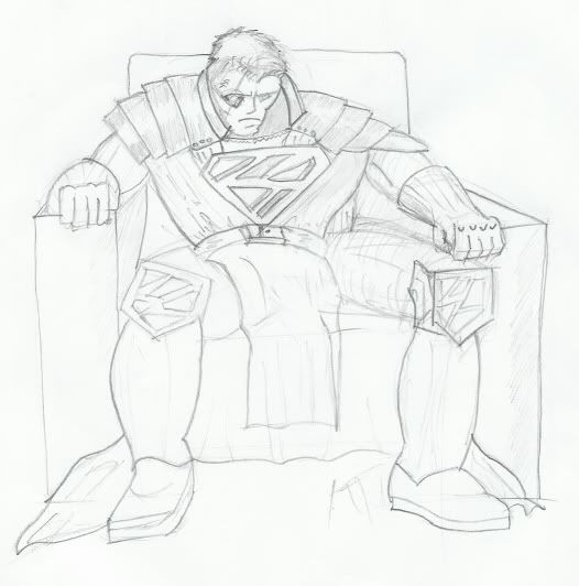
I'm currently putting together a portfolio of my work so that I can apply for a graphics job at a printing company and since I have no formal qualifications I have to prove I can do certain things. One of those things is pencil drawing and then turing that drawing into a vector based image. Since I'm trying to limit the ammount of trek related art I include in this portfolio (lets face it, Trek fans aren't exactly taken seriously by the public at large) I decided to do a generic fantasy character study, which I've roughly based on a Star Wars comicbook cover I vaguely rememebr seeing in WH.Smiths some years ago.
What I'm after from you folks is a critical appraisal, since I'm at that point where I've been looking at it too long and am having trouble judging it objectively.
So here's what I have so far:-
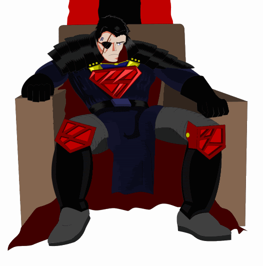
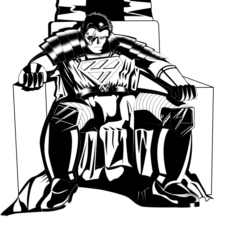
Pencil Sketch Vectorized Image (WIP) As you can see I still have some shading left to do, but you can get a reasonable idea of where I'm going with this.
P.S. I've already shown this to some mates and the Kryptonian connotations have already been pointed out to me, but I swear that was never consciously indended.
posted
The lower legs should be more narrow as they reach the ankles. Your hands really need more work and the foreshortening on the right side is off. Also, you have what appears to indicate the bicep on the arm (right side) facing inward and down but the arm is positioned more to the direct side.
It's got potential but there is still some structural tweaking to be done before coloring and shading.
Overall, I dig it so far: it's got a Batman Animated Series look t the face and color.
-------------------- Justice inclines her scales so that wisdom comes at the price of suffering. -Aeschylus, Agamemnon
Registered: Aug 2002
| IP: Logged
posted
The dark vector overlay covers up some of the anatomic and perspective errors, but not all of them. 1. The whole top half of the body is sort of lop-sided. The head isn't centered within the collar, and the chest is much larger on the right (subject's left). 2. His left leg seems to be broken at the hip and comes out of the waist. 3. His head is a bit misshapen and heavier on its right. If that's an eye patch, I'm not sure how its attached to his head (does it hook into the neck?). 4. The arms of the chair are lop-sided with few right angles. 5. The armor on the shoulders is very unequal between sides. The cloth hanging in front is draped strangely over the figures left leg. 6. The shoes seem to be on the wrong feet.
The vector work is fine (except he seems to have the front cloth tucked under his package), but the figure drawing needs a lot of work.
-------------------- When you're in the Sol system, come visit the Starfleet Museum
Registered: Oct 1999
| IP: Logged
posted
Just a general observation on the kind of portfolio you're putting together. If you're applying for a job at a printing company, I'd definitely have a design-heavy portfolio ready as opposed to an illustration-heavy one.
Nothing wrong with showing all your skillz, but they're going to want to know you can do the things that their clients will need done on a regular basis. Show them you can design a logo, show them you can put together a brochure. And yes, show them you can create spot illustrations. But they will definitely want to see design work.
posted
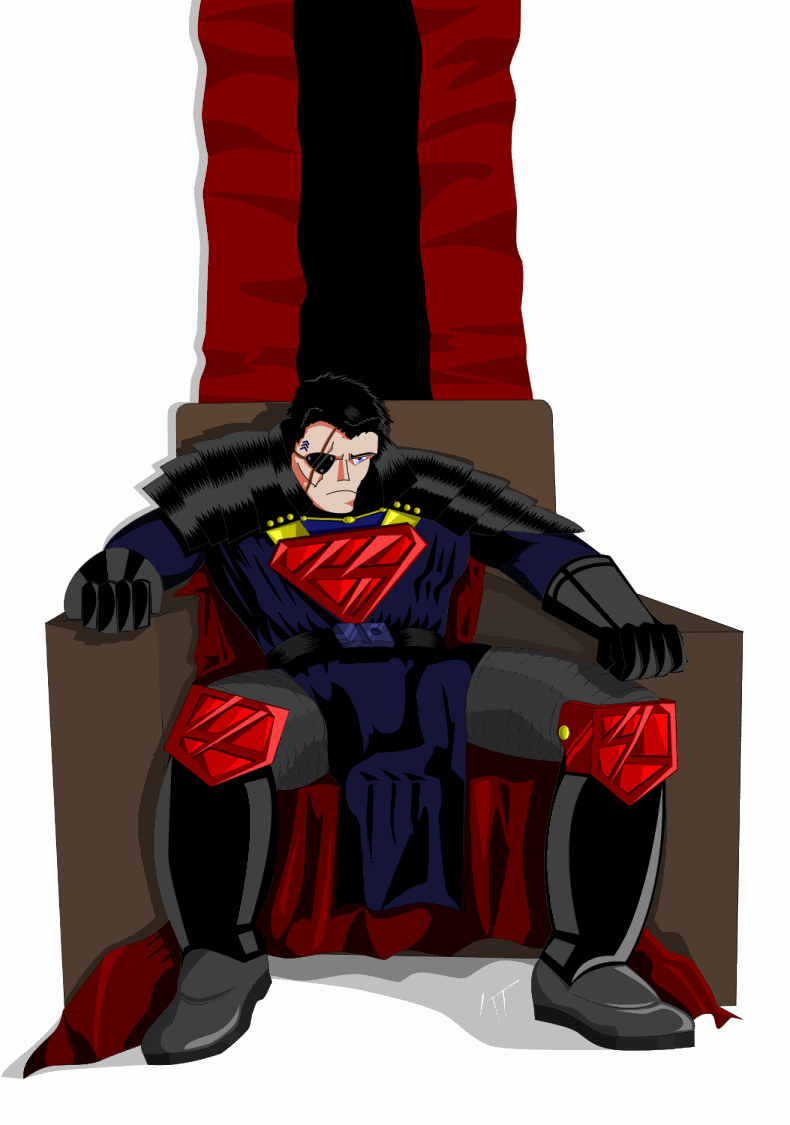
Thanks for all the input folks, you've been allot more useful with this than TrekBBS. I'm on the clock with this one so I'm going to have to wrap it up. Here's what I've managed to come up with.
To address some of the point's rasied: -
quote:The lower legs should be more narrow as they reach the ankles.
Those are big chunky armored boots, so the ankles are meant to look thick compared to the leg.
quote:Your hands really need more work and the foreshortening on the right side is off.
I'm terrible at drawing hands, always have been. However the posture is supposed to be weird, more on that in a moment.
quote:1. The whole top half of the body is sort of lop-sided. The head isn't centered within the collar, and the chest is much larger on the right (subject's left). 2. His left leg seems to be broken at the hip and comes out of the waist. 3. His head is a bit misshapen and heavier on its right. If that's an eye patch, I'm not sure how its attached to his head (does it hook into the neck?). 4. The arms of the chair are lop-sided with few right angles. 5. The armor on the shoulders is very unequal between sides. The cloth hanging in front is draped strangely over the figures left leg. 6. The shoes seem to be on the wrong feet.
Yeah, it is lop-sided and as with the boots that is intended. I choose a weird sort of slumped pose in order to give the piece some character, but the armor makes this difficult to translate. Basically his behind is shifted over to one side of the chair while his upper torso is leaning in the opposite direction, his right elbow is supporting his weight which is why his left is just resting in the edge of the chair's arm. All of this while leaning back and sorta slouching. Combine all of that with the bulky armor, it's a little awkward and in hindsight I was probably being a little too ambitious.
quote:Just a general observation on the kind of portfolio you're putting together. If you're applying for a job at a printing company, I'd definitely have a design-heavy portfolio ready as opposed to an illustration-heavy one.
Nothing wrong with showing all your skillz, but they're going to want to know you can do the things that their clients will need done on a regular basis. Show them you can design a logo, show them you can put together a brochure. And yes, show them you can create spot illustrations. But they will definitely want to see design work.
That's just from my experience.
This is just one out of seven sheets I've included so far, the others include logos, the San Francisco map, the movie poster I did for the TrekBBS art contest, some orthographic drawings of a plane designed by our own Axeman, my Batman & Joker Avatars, a floor plan I did for a security company, a leaflet I did for my mother's business and some other stuff that escapes me at the moment.
quote:Sorry Rev, couldn't help trying out freehand vectoring for myself. Obviously, Spongebob is largely a square , so it was relatively easy.
No worries, I've nicked your ideas often enough. It's a refreasing change from logos and spaceships, isn't it?
posted
Reverend: This site ( http://www.sketchbooksessions.com/shanesboard/ ) is a BBS where a lot of professionals and wannabes post their work. You can find a lot of interesting vector artwork for inspiration. I visit, but am too shy to post any work.
-------------------- When you're in the Sol system, come visit the Starfleet Museum
Registered: Oct 1999
| IP: Logged
quote:Originally posted by Reverend: I suddenly feel quite inferior.
I know what you mean.
If you register, you can see all the posted artwork (some doesn't show up if you don't register). I registered but I don't post. I just like to see other people's work. Lots of different style and approaches on display. Some people do amazing stuff with vectors.
-------------------- When you're in the Sol system, come visit the Starfleet Museum
Registered: Oct 1999
| IP: Logged


![[Wink]](wink.gif)
![[Smile]](smile.gif)


![[Big Grin]](biggrin.gif)


 Printer-friendly view of this topic
