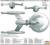
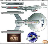
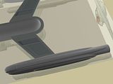
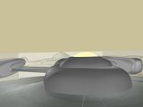
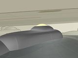
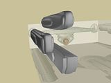
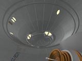
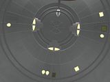
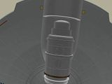
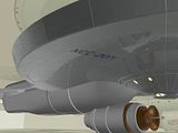
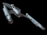
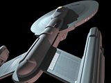
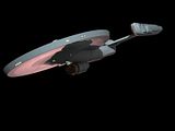
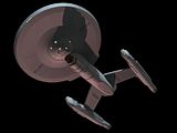
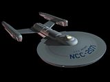
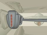
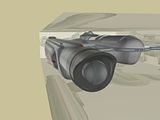
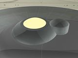
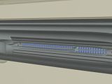
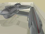
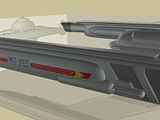
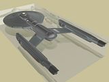
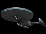
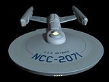
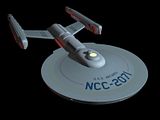
This is topic The Reverend's Antares refinement in forum Designs, Artwork, & Creativity at Flare Sci-Fi Forums.


To visit this topic, use this URL:
https://flare.solareclipse.net/ultimatebb.php/topic/7/1612.html

Posted by Wee Bairns (Member # 1324) on :
 
I can remember a few years back when folks here were designing the Antares from the Concordance, and I loved Reverend's stab at it. Now the ASDB has a bunch of schematics of the final design and the eventual refit you collectively came up with.
Which is all fine and dandy...but there's no profile view of the TOS version!
Does anyone (most likely the Rev) have an image saved of the TOS version's profile??

Pretty please?
 
Posted by Masao (Member # 232) on :
 
It might be available at JOAT.
 
Posted by Reverend (Member # 335) on :
 
Good question. I might have it somewhere...or I might not have gotten around to revising the side view.
I'll let you know when I get home!
 
Posted by Wee Bairns (Member # 1324) on :
 
quote:
Originally posted by Masao:
It might be available at JOAT.

Nope, afraid not. I couldn't even find it in this site's history. [Frown]

I seem to remember it was pretty much a completed view, and the basis for the dorsal and ventral views at the ASDB.
 
Posted by Reverend (Member # 335) on :
 
Ok, it took a bit of digging but I finally fond the original Antares diagrams on an old backup disk dating back to 2003!
Plans- WARNING, Large file!
And an as yet unreleased image of the revised rear view dating back to october '04.
aft view
I've not done ANY trek art in something like 18 months and I'd forgotten half these designs existed.

If there's enough interest I may make time to finish this off.
 
Posted by Wee Bairns (Member # 1324) on :
 
Heh, exactly what I was looking for. Thanks muchly. I love your view of the Concordance design.

And you should definately finish them off if you're unhappy with the progress you've made.
 
Posted by Topher (Member # 71) on :
 
What I want to see is a finished refit version. I don't think I have the WIP files in my ASDB folder anymore.... it was oh so long ago (on another computer, even).
 
Posted by Masao (Member # 232) on :
 
Eighteen months? What have you been WASTING your time with? Eh?
 
Posted by Reverend (Member # 335) on :
 
quote:
Originally posted by Topher:
What I want to see is a finished refit version. I don't think I have the WIP files in my ASDB folder anymore.... it was oh so long ago (on another computer, even).

I'm starting to remember why I stopped doing this stuff. ;-)
I think everything I finished for the refit is up on the ASDB site. I don't think I ever got around to doing a fore or aft view.

quote:
Originally posted by Masao:
Eighteen months? What have you been WASTING your time with? Eh?

Ummmm..this ?
Oh and earning a living.
 
Posted by The Mighty Monkey of Mim (Member # 646) on :
 
Batman > Star Trek? I think not.
 
Posted by Masao (Member # 232) on :
 
Yeah, I think, Rev, that you're wasting your singular talents by being a mere stay-within-the-lines colorer. You're a born trek draftsman and designer!

Also, most of us are working/studying stiffs. No excuse.
 
Posted by Reverend (Member # 335) on :
 
quote:
Originally posted by The Mighty Monkey of Mim:
Batman > Star Trek? I think not.

Hey. Don't dis The Bat. He rocks....he wears tights...and beats up the mentally ill...yeah well he still rocks. Mwahahaha! *drives off in the Revmobile*

quote:
Originally posted by Masao:
Yeah, I think, Rev, that you're wasting your singular talents by being a mere stay-within-the-lines colorer. You're a born trek draftsman and designer!

But I do the lettering too! And I put in funky, scary the glowy eyes and magical effects (outside the lines too! ooooooh!) Plus I get to write all the witty comebacks and pratfalls!

Seriously though, after a while big lumps of metal with blinking lights all start to look the same to me. Plus there didn't seam to be much interest in the more utilitarian designs (like the Brunel, Deneva & the tugs) that I enjoyed doing.
Comic book colouring was a nice change and a new challenge and I've learnt LOADS on that gig. Also it offers a better chance at getting to do computer graphics as a job instead of a hobby.
Having said that I did get contacted by the Star Trek Online people, but that didn't come to anything.

quote:
Also, most of us are working/studying stiffs. No excuse.
Yeah, well I'm lazy too.
 
Posted by Aban Rune (Member # 226) on :
 
drooool... I remember you...

Reverend's Antares Class = Aban's favorite fan design ever
 
Posted by Reverend (Member # 335) on :
 
Technically it's not my design, it's my illustration of someone else's drawing. The only bit I "designed" was the ventral side and the deflector pod.
I've actually seen someone else try it with just an FJ style boom deflector.
 
Posted by Aban Rune (Member # 226) on :
 
Ah, but it's those little details and the excellent rendering that make it drool-worthy. So I nonetheless bow to your brilliance.
 
Posted by Wee Bairns (Member # 1324) on :
 
Agreed. My sentiments exactly.
 
Posted by bX (Member # 419) on :
 
That is a really nice rendering of a classy design. It may be getting old for you, Rev, but it sure isn't for us.
 
Posted by Sarvek (Member # 910) on :
 
I completely agree. You have always done fine work on your ships, shuttles, and logos. It would be great to see more of your work. [Smile]
 
Posted by Bernd (Member # 6) on :
 
And I would love to hire you again for some work that is waiting.
 
Posted by Makotokat (Member # 1041) on :
 
Very nice indeed....
 
Posted by Reverend (Member # 335) on :
 
quote:
Originally posted by Bernd:
And I would love to hire you again for some work that is waiting.

Sure Bernd, if you need anything doing just PM me and I'll give you my new email address. (The old .co.uk one died on me.)


And guys, it's all very flattering but trek art (especially the post TOS stuff) is VERY time consuming and I doubt I'll have time to do any more work on the Antares for months. I've got a comic strip to finish, plus the final 20 page issue and then another project with the same artist that may actually land us some paying work.
 
Posted by Reverend (Member # 335) on :
 
Boo!
Better late than never
 
Posted by Shik (Member # 343) on :
 
Pretty!
 
Posted by Sean (Member # 2010) on :
 
I like it. I don't know why, because it looks kind of odd, but it just flows for some reason.
 
Posted by Fabrux (Member # 71) on :
 
Hot diggity damn! I want to see more views of that nacelle... it looks very transition-y, sexy.
 
Posted by Ritten (Member # 417) on :
 
Nice Rev, very nice, and you didn't lie either, many months.
 
Posted by Reverend (Member # 335) on :
 
quote:
Originally posted by Fabrux:
Hot diggity damn! I want to see more views of that nacelle... it looks very transition-y, sexy.

As you wish.
 
Posted by Fabrux (Member # 71) on :
 
Ooh, me likely me likey. I'm going to have to scale that down and stick it on a ship or two on this page. If y'don't mind, that is. [Smile]
 
Posted by Masao (Member # 232) on :
 
A tiny nit:
The radial panel lines on the top of the saucer look a bit off. The two center-most/top-most sections of the saucer are convex, but the radial lines are all concave at that point. The convexity might also affect the intersection with the spinal/rearward continuation of the bridge.
 
Posted by Reverend (Member # 335) on :
 
Yeah, these are for the most part the same vectors I originally drew all those years ago (at a much lower resolution) so there's a bunch of little details like that that I need to tweak, or redo from scratch.

And Fabrux: go ahead mate. [Wink]
 
Posted by Sean (Member # 2010) on :
 
Fabrux: "U.S.S. Adamant NCC-3029 dreadnought-frigate"
Interesting designation. I thought Dreadnought and frigate were at totally different ends of the spectrum.
 
Posted by Daniel Butler (Member # 1689) on :
 
Purdy. Long and flowing, reminds me of a Battlestar just a *little* bit. (Just a little, I said!)

Why do you suppose it is that Federation ships got flatter and flatter over the years? The Borg build great huge thick thips; everyone else seems to prefer flat things that are very long and very wide, but very thin on the beam. The Constitution class was thick; the Excelsior and Galaxy class were thick but a bit thinner; the newest Akira, Intrepid, Steamrunner (and of course NX) ships are all very flat, showing an obvious design trend towards fewer decks. Any theories?
 
Posted by Sean (Member # 2010) on :
 
More maneurverability, or maybe the advent of more automated tech requires fewer crew, and allows these crew to have more living space, but that still makes it smaller than previous designs. Another answer; The neck is probably a weak point on the ships. If there were a spot on your ship that could be easily hit and would cause your ship to split in two... Wouldn't you want a bit of change in design? Maybe this one was a test ship of sorts.
 
Posted by Daniel Butler (Member # 1689) on :
 
I don't think it'd have anything to do with maneuverability; they're in space, after all. There's no atmosphere to bank in, or anything like that. (Although they bank *anyway.*)

They could maybe move away from the stardrive hull - nacelles - saucer section design... [Wink]
 
Posted by B.J. (Member # 858) on :
 
quote:
Originally posted by Daniel Butler:
The Borg build great huge thick thips

Developing a lisp now, are we? [Big Grin]

The loss of the neck on more recent ships is probably from a subconscious need to streamline things. Of course, the Galaxy class is probably the most streamlined of the lot, yet retains a neck. I would have preferred that the winning Titan design have a neck too, but oh well...
 
Posted by Harry (Member # 265) on :
 
quote:
Originally posted by B.J.:
quote:
Originally posted by Daniel Butler:
The Borg build great huge thick thips

Developing a lisp now, are we? [Big Grin]
I believe he was thinking of Seven of Nine instead of Borg cubes.
 
Posted by Fabrux (Member # 71) on :
 
quote:
Originally posted by Sean:
Fabrux: "U.S.S. Adamant NCC-3029 dreadnought-frigate"
Interesting designation. I thought Dreadnought and frigate were at totally different ends of the spectrum.

The Adamant (like many other ships on that page) was designed back in the days when the first six movies plus TOS were all the Trek fans had to go on. In this time, someone designed a "dreadnought" by adding a third nacelle to the basic Constitution design and a few more weapons and shuttlebays, etc. More info here. Designed by David Schmidt and published in Starfleet Design back in the day.
 
Posted by Sean (Member # 2010) on :
 
Interesting. I'm glad we're over the "the more nacells you have, the faster you go" syndrome.
 
Posted by Fabrux (Member # 71) on :
 
Well hey, it was the working theory at the time. Truth be told, we haven't quite been given a reason for nacelles arranged in anything but pairs, even though there have been canon arrangements of one, two, three and four nacelles.
 
Posted by Sean (Member # 2010) on :
 
Just immaginr a fanboy's wet dream from 25 years ago. A super starship with 7 nacells, and 10 mega phaser cannons, 15 torpedo tubes ( wait, we have that already) and a top speed of warp 12. That sounds a lot like what my dad would have thought.
That's strange. I am a second generation trekkie. Yay me!
 
Posted by Shik (Member # 343) on :
 
Warp 17, actually. Or a little over.
 
Posted by MinutiaeMan (Member # 444) on :
 
Well, part of the idea back then was that the nacelles were supposed to be self-contained units with all the propulsion and power-generation equipment necessary for warp drive. Under that reasoning, it would make sense that a third nacelle would add more speed. But as time went on, the whole logic of engine power transformed, thus making the idea of extra nacelles less logical.
 
Posted by Ritten (Member # 417) on :
 
Spock would be proud.
 
Posted by Makotokat (Member # 1041) on :
 
If I remember, that bulb at the back of the warp engine was supposed to be the antimatter, mixed with the bussard at the fron to generate power (Thus they were called warp power units) So a third nacelle or just one nacelle made sense.
 
Posted by Shik (Member # 343) on :
 
Not so much that as much as it working like a jet engine: the fabric of space being sucked in the front, twisted about in the nacelle, & spit out the back
 
Posted by Reverend (Member # 335) on :
 
...yeah, moving on.

Update

Almost done, just need to finish off the ventral view.
 
Posted by Ritten (Member # 417) on :
 
I really like that Rev, very nice.
 
Posted by Sean (Member # 2010) on :
 
She is a beaut. The type of thing Scotty would have a wet-dream about.
 
Posted by Reverend (Member # 335) on :
 
Not an image I especially wanted floating around in my head.
 
Posted by Aban Rune (Member # 226) on :
 
So... bloody... cool.
 
Posted by Reverend (Member # 335) on :
 
Oi! People from the Midwest USA aren't allowed to say bloody in that context! It sounds weird.

Anyway, a little more word done on the side view...
 -
 
Posted by Masao (Member # 232) on :
 
The panels lines and registry on the top of the saucer don't match on the top and side views. On the side view, the registry sits directly on a line but on the top view it's between lines. Also, on the top view you have 28 radial divisions, but on the side view there are probably only half that number.
 
Posted by Reverend (Member # 335) on :
 
You and I are probably the only two people here who would spot that, you bastard. [Wink] Like I said before some of these vectors are from the original drawing so I'll have to redo most of the grid lines on the fore & side view, probably after I've done the ventral view. As for the name & reg, I'm leaving them alone for now because I haven't decided yet if I should bump it up into the 2100's, now that I don't need to keep an eye towards the "Charlie X" Antares.
 
Posted by Masao (Member # 232) on :
 
You're welcome [Wink]

You spotted the error but didn't do anything about it? Shame! Shame! Your membership in the perfectionist's guild is hereby revoked!
 
Posted by Reverend (Member # 335) on :
 
Bah, the perk in this guild suck anyway, don't even get a membership pin!
 
Posted by Shik (Member # 343) on :
 
quote:
Originally posted by Reverend:
I'm leaving them alone for now because I haven't decided yet if I should bump it up into the 2100's, now that I don't need to keep an eye towards the "Charlie X" Antares.

Well, in my project, I set the Antares pathfinder as NCC-1793, placing it about 2269. That would fit really well with this (maybe because I kinda locked it that way).
 
Posted by Reverend (Member # 335) on :
 
It's a bit sticky because by all accounts the 1700s were commissioned around 2245 and by 2272 the Entente (NCC-2120) is out and about. I tend to think the Excelsior as having a very long development history (being the "Great Experiment" and all) which accounts for it's relatively low reg. So I'm thinking maybe NCC-2071 for the prototype.
 
Posted by Shik (Member # 343) on :
 
There's a Cowboy Bebop reference in there, but damned if I'm gonna look for it.
 
Posted by Reverend (Member # 335) on :
 
So there is, I didn't even realise it. Must have snuck into my subconsciousness as I have just this month watched the series for the first time.
 
Posted by Harry (Member # 265) on :
 
I just love the Phase II docking ports. A nice touch.

As for registries, depending on what kind of system you use, it wouldn't really matter much. In my Big Giant List, there are already 3800s (Ptolemy) and 2700s (Loknar) flying around for decades in 2269. This assumes block assignments based very roughly on ship type and leaving room for growth, leaving lots of gaps.

I would tentatively place this starting at NCC-2050, assuming a late 2260s launch. This is close to the Excelsiors and the Ventures on my list. Alternatively, something around 700-800 would also be a nice zone, near the Oberth, Cahuya and several scout classes. But of course, I have no idea how that fits for other people [Wink]
 
Posted by Aban Rune (Member # 226) on :
 
quote:
Originally posted by Reverend:
Oi! People from the Midwest USA aren't allowed to say bloody in that context! It sounds weird.

I work with lady who moved here from Britain and says things like Blimey all the time. So I'm allowed by association.
 
Posted by B.J. (Member # 858) on :
 
quote:
Originally posted by Reverend:
Oi! People from the Midwest USA aren't allowed to say bloody in that context! It sounds weird.

I say "bloody hell" quite often (out of earshot of the kids), but with a bit of a Southern twang. No idea why, though, since nobody else I know says it.
 
Posted by Reverend (Member # 335) on :
 
Ok, fine, but no American is allowed to say bollocks. That's ours...and the Aussies...and the Kiwis...possibly Canadians...but Yanks are officially banned. I've heard them try it and it just doesn't sound right.
 
Posted by Mars Needs Women (Member # 1505) on :
 
Ah bugger!
 
Posted by Johnny (Member # 878) on :
 
Gordon Bennett...
 
Posted by Ritten (Member # 417) on :
 
Well, bullox to that.
 
Posted by Makotokat (Member # 1041) on :
 
Maybe once they understand "dog's bollocks" they may be allowed (only on sundays during daylight savings time) to use the term bollocks!

I'm of Irish-Scottish-English extraction myself so I can say it whenever I wish.....eh.
 
Posted by bX (Member # 419) on :
 
We're just jealous is all. Americans need better swears.

The ship's looking fantastic, btw, Rev. Still a bit confused about the fore/aft profile and what's extending beyond the deflector. Looking great as usual though.
 
Posted by Reverend (Member # 335) on :
 
quote:
We're just jealous is all. Americans need better swears.
Yeah, well get your own dialect!
quote:
The ship's looking fantastic, btw, Rev. Still a bit confused about the fore/aft profile and what's extending beyond the deflector. Looking great as usual though.
Not sure what you mean. Are you referring to the spike or the radial bands?
 
Posted by Makotokat (Member # 1041) on :
 
It is a lovely piece of work Reverend!
 
Posted by Aban Rune (Member # 226) on :
 
There was noone else at the office today so I printed it out nice and big on our wide-format. This way I can study it and conjecture over the functions of various greebles, how many Galileo-type shuttle craft could fit in the shuttlebay, and various other subjects.
 
Posted by Reverend (Member # 335) on :
 
Sure, rub it in for the unemployed guy. [Wink]
I'd be surprised if it holds to that kind of scrutiny mind; I only have a vague notion as to the internal layout and the views as you see them are not final. For instance I'm working on the ventral view right now and I'm having to revise the other views along with it as I go. The shuttlebay is particularly tricky.
 
Posted by Reverend (Member # 335) on :
 
Ok, I think this about does it. That is unless Masao can find the three pixels I intentionally left out of place just to bug him...yeah, anyway, I spread it across two sheets for obvious reasons and filled in the gaps with mindless jibbering.
 -
 -
Bernd if you're still awake, we finally have an update for the ASDB site!
 
Posted by Shik (Member # 343) on :
 
quote:
Originally posted by Reverend:
That is unless Masao can find the three pixels I intentionally left out of place just to bug him...

The Persian rug mentality. I approve.

You didn't change the hull number on the project logo. Intentional or oversight?

Also, "Leonov" & "compression".
 
Posted by Reverend (Member # 335) on :
 
I attribute the bad spelling to being up too late and writing all that crap off the top of my head (and it's not like I expected anyone to actually READ it or anything) as for the patch, it never even occurred to me to change the reg, too busy trying to get the grid lines to line up properly I guess (read; it's Masao's fault.)
Anyway, all of those errors have been corrected, feel free to clear your cache & refresh.
 
Posted by Masao (Member # 232) on :
 
Pixel 1: The location of the registry doesn't match on the front and side views. It's noticably lower on the side view. According to the top view, the read arrow line should be just below the phaser turrets, but on the side view its on the next section further out or down. The arrow should be at the center of the letters, but seems to be near the top.

Pixel 2: Why do the registry letters taper on the top view?

Pixel 3: The sides of rectangles on the front of the bridge are too straight on the front and side views.

Disclaimer: I'm an editor, whose job is to go over manuscripts letter by letter and look for errors. I love my work.
 
Posted by Reverend (Member # 335) on :
 
Bah! Close enough I say!
A good artist knows when to declare victory and move on. [Wink]
 
Posted by Aban Rune (Member # 226) on :
 
Someone please do some 3-d renders of this bad boy so I've got some photo reference to work with.

Ever since I first saw this ship, I've thought it could be the star of a post-TOS series.
 
Posted by Shik (Member # 343) on :
 
quote:
Originally posted by Reverend:
I attribute the bad spelling to being up too late and writing all that crap off the top of my head (and it's not like I expected anyone to actually READ it or anything) as for the patch, it never even occurred to me to change the reg, too busy trying to get the grid lines to line up properly I guess (read; it's Masao's fault.)
Anyway, all of those errors have been corrected, feel free to clear your cache & refresh.

It's OK..I was so tired I failed to notice "terretory" & "availible" as well.
 
Posted by Reverend (Member # 335) on :
 
Aban, I think someone already took a stab at this in 3D a couple years back, not sure what became of it though.

Shik. I hate you.
 
Posted by Shik (Member # 343) on :
 
Haha...sorry, duder. Mom used to have me proof her research papers & book manuscript as well.
 
Posted by Aban Rune (Member # 226) on :
 
I think you may be right. In fact, I'm pretty sure I've got a few of those images. I may just have to take a stab at this ala my Aegian drawing from back in the day.
 
Posted by Reverend (Member # 335) on :
 
quote:
Originally posted by Aban Rune:
I think you may be right. In fact, I'm pretty sure I've got a few of those images. I may just have to take a stab at this ala my Aegian drawing from back in the day.

Found it. Looks like he never finished it though. Regardless, it's changed quite a bit since then anyway.
If you want to try and persuade a 3D artist to have a go, your best bet would be to try and scare up someone on either TrekBBS or scifi-meshes.
I'd trust our own Axeman with the job, but I gather he doesn't have much time for it these days. You could try PM'ing him, you never know. Of course Vektor ant TrekBBS is one of the best around for TOS rendering, but I doubt he'd be interested...although he did have a bash at my old SD1 design way back when...Best of luck!
 
Posted by Makotokat (Member # 1041) on :
 
Such a classy ship.....I'd have a go if I wasn't so busy. I am downloading in your pics however.
 
Posted by Aban Rune (Member # 226) on :
 
Hmmm... yah, I've got something else printed out at home I think... I'm not going to bother anyone else, but I will see what I can do with what I've got.
 
Posted by Reverend (Member # 335) on :
 
Just be sure to use the images that are there as of now. I've been secretly mucking about with a detail of two all day. Might need to clear down your cache & refresh. [Wink]

If you have any questions or want any high res close-ups; send me a PM and I can give you my proper email.
 
Posted by Sean (Member # 2010) on :
 
Very nice "Clergyman" [Big Grin]
Seriously, this thing has some flare to it ( no pun intended)
 
Posted by Reverend (Member # 335) on :
 
...No.
 
Posted by Ritten (Member # 417) on :
 
Typing Clergyman was quicker than Reverend?
 
Posted by Sean (Member # 2010) on :
 
Uhhhhh...
*Runs away before being tarred and feathered*
 
Posted by Reverend (Member # 335) on :
 
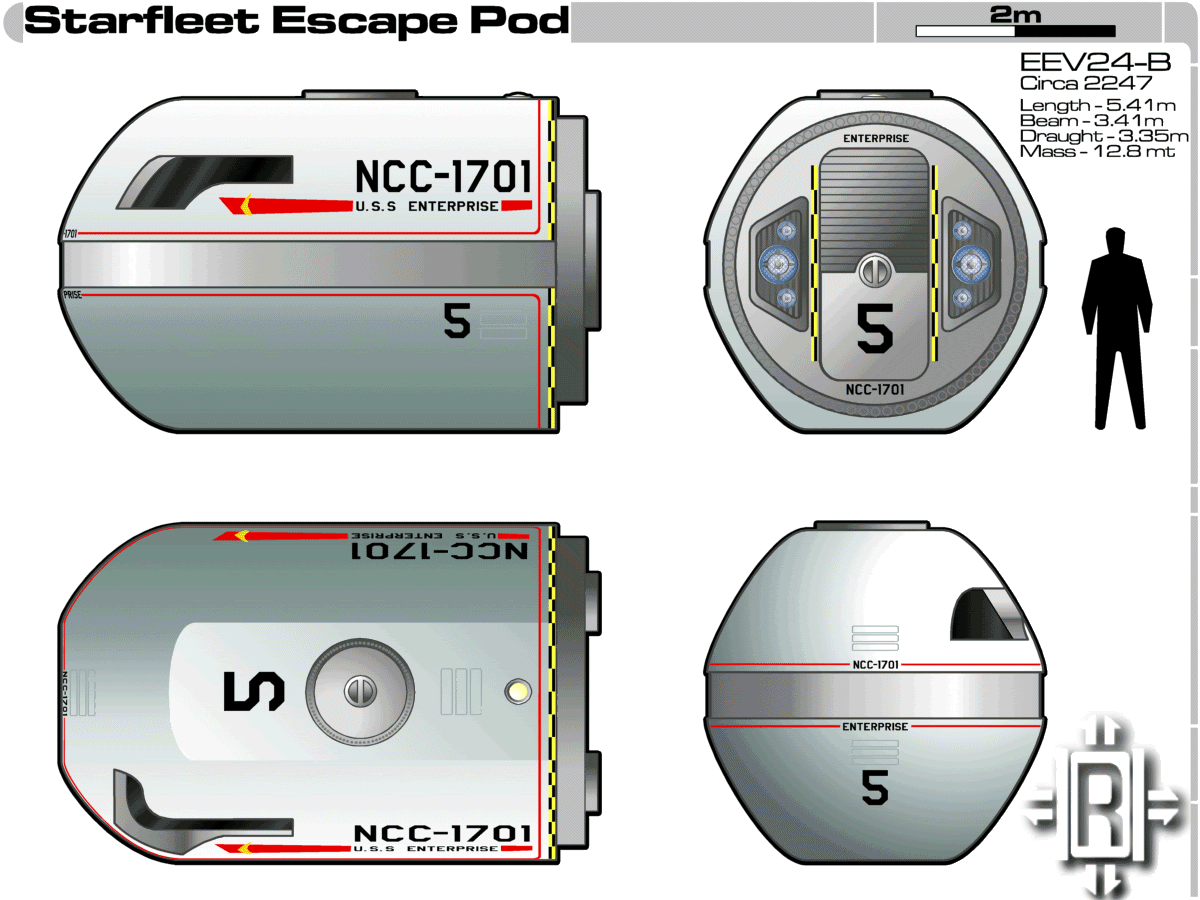
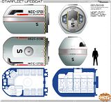
Ok, although Aban asked me the question in a, I think I might as well post this here too. This is the location of the escape pods.
 -
...and this is what they look like.
 -
 
Posted by OverRon (Member # 2036) on :
 
Those things hold what? 10 people at a squeeze, so crew compliment is 100? With a bit of a leeway for visitors to the ship?
 
Posted by Reverend (Member # 335) on :
 
Exactly ten people yes, so they have a potential evacuation capability of 110. Crew compliment can be anything from 20 to 100, though I imagine the 50 - 80 bracket to be the more common.

The reason why there's more than they really need has to do with not knowing how the crew might be distributed through the ship at any given time.
For instance if all the pods are in the saucer then it leaves the folks in the engineering section stranded or with a very long way to run (assuming the turbos are down and there's no direct route straight through the centerline) or leave them dependent on getting out via the shuttle bay, which may not be safe.
 
Posted by bX (Member # 419) on :
 
Oooh, it's smaller than I thought. That's good though.

If memory serves, you're an Illustrator guy, right? I'd love to take a crack at a 3D. If you can get me some .ai files, I can see what I can come up with. If you're worried about replication, etc, I really just need the curves for maximum fidelity lathing, etc. (Yes, Strata, still haven't learned that cursed Lightwave). PM?
 
Posted by Reverend (Member # 335) on :
 
Actually I'm a Paint Shop Pro guy, so it's all in .pspimage files.
 
Posted by Sean (Member # 2010) on :
 
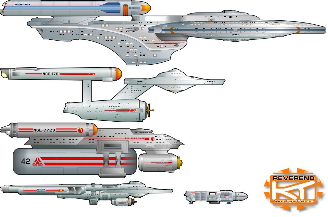
SO this ship would be along the size of an NX class? Maybe a little bigger?
 
Posted by Ritten (Member # 417) on :
 
I haven't used PSP since my friend gave me a copy of Hotdog Pro, which it was bundled with.

Back then I thought JPGs were cool too.

Live and learn.

Aban's the illustrator guy, Rev is the paperweight.
 
Posted by Aban Rune (Member # 226) on :
 
And Photoshop!
 
Posted by Fabrux (Member # 71) on :
 
PSP will save as *.ai files, though. Used to be able to do *.psd as well but I don't see that in there anymore...
 
Posted by Sean (Member # 2010) on :
 
I use a no. 2 graphite pencil and stationary.
 
Posted by Masao (Member # 232) on :
 
[QUOTE]Originally posted by Fabrux:
[QB] PSP will save as *.ai files...QUOTE]

Can it import ai files?
 
Posted by Reverend (Member # 335) on :
 
I'm not seeing it in the "Save As" tab, so probably not. It can save as PSD all right, but if memory serves it doesn't keep the vector data and just converts it all to rasta.
To be honest though, if you're doing a 3D model it's usually better to just trace it.
While it's easy to get straight lines to align, compound curves are a nightmare and to be honest, mostly guesswork...the Korolev Yacht being a weird exception; according to Kenny I somehow managed to get it about 95% correct when he did the mesh. So it's better not to trust the 2D 100%.
 
Posted by Fabrux (Member # 71) on :
 
Rev, what version of PSP are you running? I'm using 9.00 (I hate 10 with a passion). I found *.psd in the save as menu. *.ai is there, too. Its Encapsulated Post Script (*.eps, *.ai, *.ps).
 
Posted by Reverend (Member # 335) on :
 
I'm running 10. Didn't like it at first but I got used to it. 11 was crap, so I won't be upgrading any further for a while. Like I said, I can see *.psd but no...oh wait, you're right, Encapsulated Post Script, didn't see that.

Oh and Sean, yes it's roughly the same size as the NX. Here's a rough scale chart I keep.
 -

[ March 02, 2008, 10:15 PM: Message edited by: Reverend ]
 
Posted by Mikey T (Member # 144) on :
 
Woah, what's that ship on top?
 
Posted by Reverend (Member # 335) on :
 
quote:
Originally posted by Mikey T:
Woah, what's that ship on top?
The Korolev.
 
Posted by Ritten (Member # 417) on :
 
quote:
Originally posted by Aban Rune:
And Photoshop!

And that too.


Nice stuff Rev.


How do you two rate GIMP? I find it a decent middle ground, compared to the older versions of both PSP and PS I have had. I think 6 is he highest I went on either, so my data is, mm, dated.
 
Posted by Reverend (Member # 335) on :
 
Never heard of gimp I'm afraid.
 
Posted by Aban Rune (Member # 226) on :
 
Me either. Not outside of Pulp Fiction anyway.

I'm on PS CS2 at work and CS1 at home. Same for Illustrator and InDesign. Never tried CS3, but I've heard it's somewhat convoluted.
 
Posted by B.J. (Member # 858) on :
 
I use GIMP for a lot of stuff. The newer MkII Viper pics (the ones after the MkII toon), the Boeing Bird of Prey, and the toons on my web page were all done with GIMP. It's functionality is comparable to Photoshop (which I've never used personally), but without having to throw down a huge chunk of change. That means it's free and open source. Good thing for a hobbyist with kids such as myself.
 
Posted by Shik (Member # 343) on :
 
I managed to get myself a cracked copy of CS3 Design Suite Premium. I bought a book to learn it all, but so far I haven't bothered much. I should get back on that & stop using Photoshop just for making macros.
 
Posted by OverRon (Member # 2036) on :
 
quote:
Originally posted by Reverend:
quote:
Originally posted by Mikey T:
Woah, what's that ship on top?
The Korolev.
Can't say I've seen a Korolev before, is that an official design that hasn't been used on-screen (or used like other ship models in background footage like the Wolf 359 wreckage)? Or a fan-made one? Looks like it's got a USS Pasteur (Olympic class?) Secondary hull and a New Orleans saucer. Still, I like it.
 
Posted by Fabrux (Member # 71) on :
 
Its an ASDB design. See here.
 
Posted by Daniel Butler (Member # 1689) on :
 
I find Photoshop to be superior to GIMP, but that may be because what formal education I've had in graphic design and photomanipulation was done in PS, and GIMP is organized differently. I also hate how GIMP can't just show one window.
 
Posted by B.J. (Member # 858) on :
 
^ That's pretty much the biggest complaint of most people (re: multiple windows). It takes some getting used to, but it's not going to prevent you from doing anything. I'd prefer a single window as well. It may happen someday, but I think it will take at least another year before that happens.
 
Posted by Ritten (Member # 417) on :
 
Most likely. I like GIMP a lot, and I have seen some incredible work done with it, on par with Aban's stuff, so it can work. I lack the ability to do stuff like that myself, but if everyone could do it guys like Aban would have to find a new line of work.

It takes some getting used to Dan, but once you get good with it you can do all sorts of stuff with it.

PSP I just did not like, but, that was a long while ago by software standards, so it has improved enough to be version 10 now. I think what bothered me most was I missed the layering PS gave me, which is what attracted me to GIMP.

I miss my access to 3DSM more than other programs, and I have not found an open source 3D program that I have liked, even a little, after being tainted by it.
 
Posted by Captain Serek (Member # 1038) on :
 
I have always liked the Reverend's take on the Antares class, both the original and refit. Keep up the good work, sir.
 
Posted by Fabrux (Member # 71) on :
 
PSP has had layers at least since version 5, which is where I started.
 
Posted by Reverend (Member # 335) on :
 
Version 4 had them too, I'm sure of it and that must have been 9 or 10 years ago.
 
Posted by Ritten (Member # 417) on :
 
Wow, then I had Ver 3 then, so it has been longer than I thought. I think that it was the first version with hot wax coating, although, I could be mistaken on that too.

Another option for me is I was not bright enough to figure out how to use PSP, which I really do not like the thought of, but, it is a seemingly plausible possibility.

And I on that note, as I do need to change the subject now, show me more ships.
 
Posted by Reverend (Member # 335) on :
 
Nothing left to do. It's done! Just need to wait for Bernd to update the ASDB site so the rest of the internet can nitpick it.
 
Posted by Fabrux (Member # 71) on :
 
Bernd's a bit behind on the ASDB, no? The updated Korolev drawings aren't on there either...
 
Posted by Reverend (Member # 335) on :
 
Well he's a busy man and to be fair, the Korolev isn't exactly finished yet.
 
Posted by OverRon (Member # 2036) on :
 
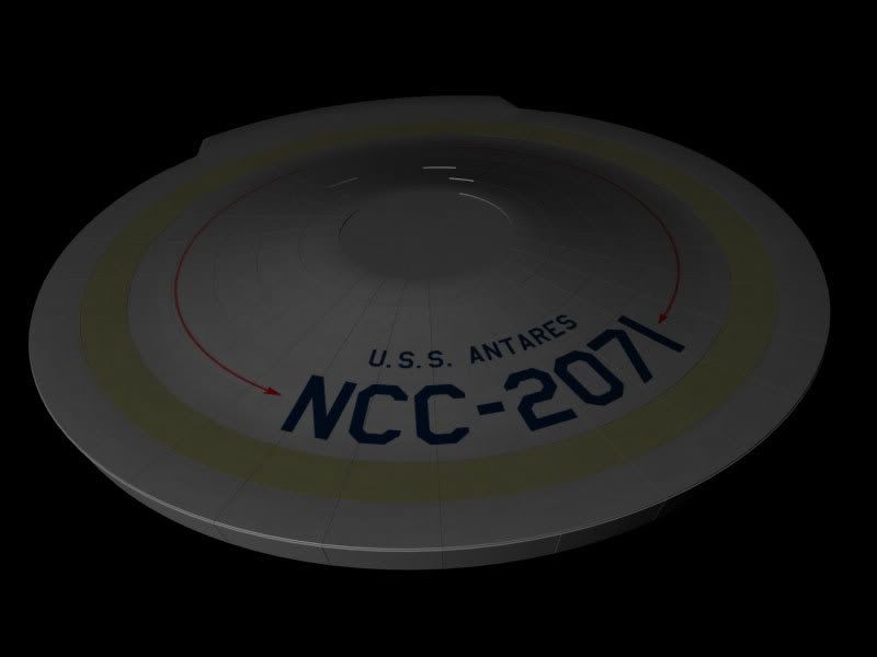
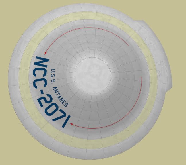
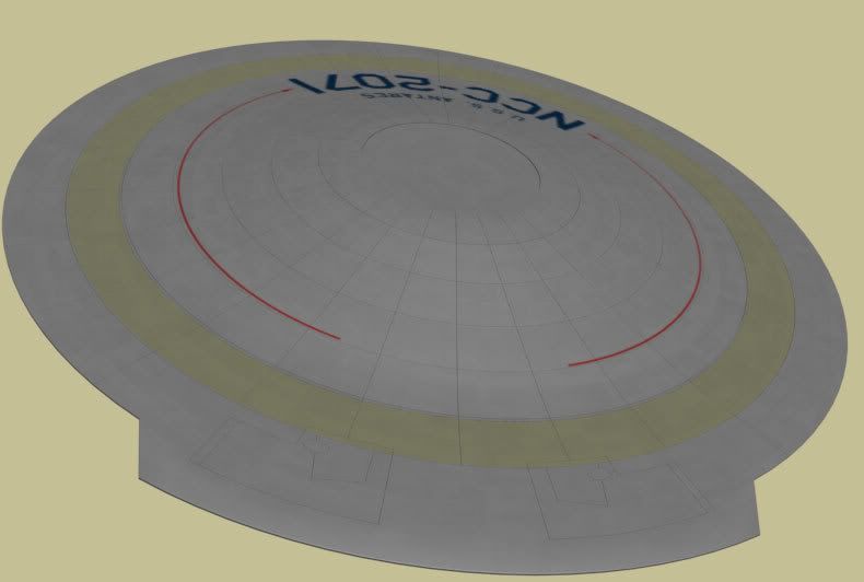
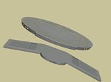
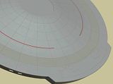
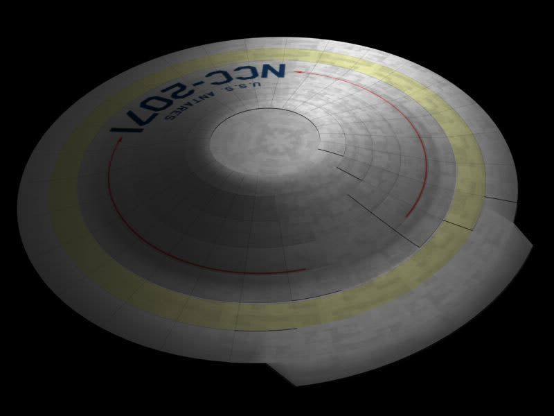
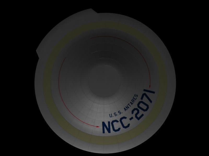
Well I was a little bored doing my Runabout so thought I'd try and see what I can come up with by doing this design. Just an initial test render, of the saucer, and a long way from complete. Also testing out a texture as well. The grid lines are actually modelled into the saucer, so it's gonna be a hefty mesh when it's done.

 -
 -
 -
 
Posted by shikaru808 (Member # 2080) on :
 
Round-y. I like it. Do you intend to leave the arrows as they are or make them more Starfleet? Or is this a FJ ship?
 
Posted by Reverend (Member # 335) on :
 
I think you'll find the Excelsior had arrows too.
 
Posted by Shik (Member # 343) on :
 
On the nacelles, yes. No arrowheads on the saucer. But then, this isn't an Excelsior.
 
Posted by Ritten (Member # 417) on :
 
OverRon, how about giving it starbase lighting, the single light is good for realism, but we want you to show off your work.
 
Posted by OverRon (Member # 2036) on :
 
I haven't even thought about doing a proper light set up for it yet. The lighting in this is just to test out the textures and to see if the specularity was ok. Also I'm debating whether or not to use the "Aztec" specular level pattern and use it to bump the saucer a bit.

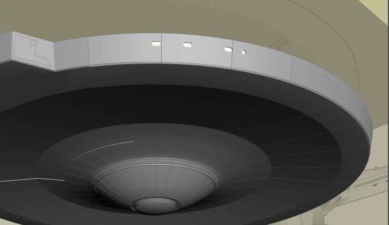
Anyways a very small update, just been adding some details to the rim of saucer, fairly small minor details like adding some of the irregular hull plating, and the windows and recesses. So the rim of the saucer is done apart from a texture.

 -

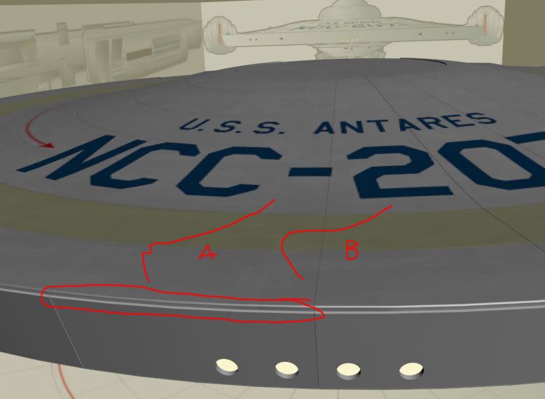
Speaking of which, at the moment I've got the rim hull plating extruded separately from the top/bottom of the saucer, like the cross-section diagram I drew as A, should it be more like B? So that hull plating of the top and bottom is smooth around the "corners" of the rim?

 -

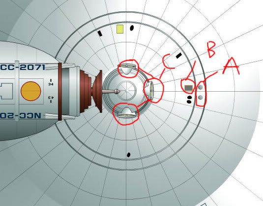
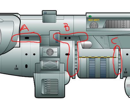
Also, the parts I've circled here: A, B, and C. They're all recessed into the hull right? As I'm trying to get a sense of how the secondary hull is. How far are they recessed? 3m?
 -
 
Posted by Aban Rune (Member # 226) on :
 
if you can bust out a rough model of this, you will be my hero.

Second of course only to Rev.
 
Posted by OverRon (Member # 2036) on :
 
Just finished off all the modelling of the hull panels (including the weirdly shaped bits on the impulse engine extrusion).

 -

Edit: Closer shot of the detail on the impulse extrusion.

 -

Just a few quick questions on the textures. They looking ok? Right shade of grey? Too metalic? The yellow too yellow? Aztecs too prominent/not prominent enough?

As I want to get fixed with one style of texture, then I'll make some higher res textures.
 
Posted by OverRon (Member # 2036) on :
 
Just wanted to ask a few questions about the features on here:

 -

A - I'm guessing phaser cannon emplacements? So that would be two on the underside of the saucer, forward facing, and four on the top of the saucer, sideways facing.

B - Not quite sure what this is.

C - Light's I'm guessing, but it leaves me wondering where the torpedo launchers are. Any in the saucer itself?
 
Posted by Ritten (Member # 417) on :
 
You have made me want to buy a good 3D program. I miss my 3DSM.
 
Posted by Fabrux (Member # 71) on :
 
C - sensor dome emplacements similar to the 1701-refit, I should think.
 
Posted by Sean (Member # 2010) on :
 
Very nice.
 
Posted by Reverend (Member # 335) on :
 
quote:
Originally posted by OverRon:
I haven't even thought about doing a proper light set up for it yet. The lighting in this is just to test out the textures and to see if the specularity was ok. Also I'm debating whether or not to use the "Aztec" specular level pattern and use it to bump the saucer a bit.

Anyways a very small update, just been adding some details to the rim of saucer, fairly small minor details like adding some of the irregular hull plating, and the windows and recesses. So the rim of the saucer is done apart from a texture.

 -

Speaking of which, at the moment I've got the rim hull plating extruded separately from the top/bottom of the saucer, like the cross-section diagram I drew as A, should it be more like B? So that hull plating of the top and bottom is smooth around the "corners" of the rim?

 -

B for preference, but A is fine if it makes thing easier.

quote:
Originally posted by OverRon:
Also, the parts I've circled here: A, B, and C. They're all recessed into the hull right? As I'm trying to get a sense of how the secondary hull is. How far are they recessed? 3m?

 -

I'm PM'ing you something that I sent Aban, it should clear things up. with the hull recess. If not, I'll do you a cross-section.
 
Posted by Reverend (Member # 335) on :
 
quote:
Originally posted by OverRon:
Just wanted to ask a few questions about the features on here:

 -

A - I'm guessing phaser cannon emplacements? So that would be two on the underside of the saucer, forward facing, and four on the top of the saucer, sideways facing.

B - Not quite sure what this is.

C - Light's I'm guessing, but it leaves me wondering where the torpedo launchers are. Any in the saucer itself?

A - Phasers
B - Some kind of access hatch like the ones you get on the E. There's a similar yellow one on the starboard side.
C - Fabrus is right, Those are the sensor dome emplacements, like on the E-refit.

I didn't really give it any torpedo launchers, given that it's just a Surveyor.
 
Posted by Reverend (Member # 335) on :
 
quote:
Originally posted by OverRon:
Just finished off all the modelling of the hull panels (including the weirdly shaped bits on the impulse engine extrusion).

 -

Edit: Closer shot of the detail on the impulse extrusion.

 -

Just a few quick questions on the textures. They looking ok? Right shade of grey? Too metalic? The yellow too yellow? Aztecs too prominent/not prominent enough?

As I want to get fixed with one style of texture, then I'll make some higher res textures.

The Aztec looks about right. Remember it's Phase II'ish, so looking a little more TMP is ok.
Having said that the ring could be a little more subtle. Think of it as more of a discolouration than something that's painted on.
As for the overall colour, I use a colour Masao gave me. It's a sort of greenish grey that's meant to be the same colour as the original Enterprise minature. [R176 G191 B189]
 
Posted by Harry (Member # 265) on :
 
quote:
I didn't really give it any torpedo launchers, given that it's just a Surveyor.
Hmm.. I can still launch probes, right? Right?
 
Posted by Reverend (Member # 335) on :
 
There's a specialised probe rack on the mid-hull module.
 
Posted by Makotokat (Member # 1041) on :
 
Lookinmg quite good!
 
Posted by OverRon (Member # 2036) on :
 
I'm little bit pissed off at the moment, as my PC BSOD'ed when I was adding details to the bottom of the saucer, which corrupted that file and somehow corrupted the 5(!!!) previous versions except for my first version.

To add salt to the wound my router decided to blow up too. It's not been my week *sighs*

Anyways I've mostly rebuilt the saucer, this time I've pruned a lot of the faces out, only 15,000 now . As it was a little on the ridiculous side before at 100,000+ faces. Once I've got the saucer past the point I've already done I'll post some more pics.
 
Posted by Makotokat (Member # 1041) on :
 
Keep at it, I know your pain. It's looking good!
 
Posted by Reverend (Member # 335) on :
 
quote:
Originally posted by OverRon:
I'm little bit pissed off at the moment, as my PC BSOD'ed when I was adding details to the bottom of the saucer, which corrupted that file and somehow corrupted the 5(!!!) previous versions except for my first version.

To add salt to the wound my router decided to blow up too. It's not been my week *sighs*

Anyways I've mostly rebuilt the saucer, this time I've pruned a lot of the faces out, only 15,000 now . As it was a little on the ridiculous side before at 100,000+ faces. Once I've got the saucer past the point I've already done I'll post some more pics.

I've been there. Lost whole pages of colouring & lettering before now and even when I was doing this a random BSOD forced me to draw the nacelles again from scratch.
Of course there's always the anthill effect to consider. That is the second time round you know what you're doing to you can make it better.
 
Posted by Aban Rune (Member # 226) on :
 
I'm doing a bridge design. I started by tracing off the the outer hull detail of the bridge bulge. Here's what I've got so far:

 -

I've got the perimeter stations sketched out, but don't have the vectors drawn in yet. Thoughts?
 
Posted by Sean (Member # 2010) on :
 
Very nice.
It would be interesting if this ship had a slightly different bridge design from Connies or other contemporaries. I might be mistaken, but I read that this is a support craft, and not a front line vessel right? If so, it would be interesting to see a more modernized version of a J-class freighter bridge. I think you're going that direction. ( that emplacement behind where the captain's chair would be is some sort of console right?-not a hand rail?)
 
Posted by Shik (Member # 343) on :
 
Not as many stations as a ship-of-the-line. Maybe some dual-duty ones, where chairs that slide between the stations easily.

Also, a hot tub. Maybe in place of the captain's chair.
 
Posted by Reverend (Member # 335) on :
 
quote:
Originally posted by Aban Rune:
I'm doing a bridge design. I started by tracing off the the outer hull detail of the bridge bulge. Here's what I've got so far:

 -

I've got the perimeter stations sketched out, but don't have the vectors drawn in yet. Thoughts?

Looks fine so far. The only things you need to keep in mind is that it's primarily a Surveyor, so more emphasis on science stations and no dedicated tactical station. Naturally the aesthetics are going to be more or less the same as the TMP bridge.
 
Posted by Aban Rune (Member # 226) on :
 
Added a few things. Don' thave the actual consoles done yet. Any thoughts on station layout?

 -
 
Posted by Shik (Member # 343) on :
 
Not seeing a hot tub there, mister...!
 
Posted by Aban Rune (Member # 226) on :
 
That's what the emergency hatch is for. The egress markings are just there for the brass. If you pull it open, there's really a jacuzzi down there.
 
Posted by Sean (Member # 2010) on :
 
Where will Tactical be accessed from when needed? Perhaps #3, or maybe #14? #3 makes sense. as there will already be someone manning the station, or at least someone qualified to on the bridge, instead of having to find someone to sit and do nothing at station 14 until a defensive situation arises.
 
Posted by Aban Rune (Member # 226) on :
 
#3 makes sense to me. If phaser use is a function of a mission task, then it would need to be coordinated with other mission tasks. If the ship is at hightened alert, then the mission priority is defense, so again, it makes sense to have phaser control there. What do you think Rev?
 
Posted by Shik (Member # 343) on :
 
I think you should keep it on the helm board.

Or put it next to the hot tub.
 
Posted by Reverend (Member # 335) on :
 
Well in TOS tactical was always split between coms (alert status) and helm (weapons) and I think either science or engineering had shield control. So I'd say basic tactical systems should be accessible from Helm, Comms and Mission Ops. Multiple redundancy and all that.

For #14 I'd say Planetary Science should do the job and instead of Mission Ops 2, I think an Astrometrics/Stellar Cartography station would be more appropriate. Oh and I'd swap #9 & #12 around. Having Uhura on the Captains right is just weird. [Wink]
 
Posted by Sean (Member # 2010) on :
 
If it were a smaller ship, possibly a civilian ship, I would recommend giving the captain his own console. Infact, I would recommend that now. Nothing big, just a small little readout like Riker's and Troi's on the E-D.
 
Posted by Aban Rune (Member # 226) on :
 
OK... I got Rev's changes made. I'll do the consoles tomorrow.
 
Posted by The Ginger Beacon (Member # 1585) on :
 
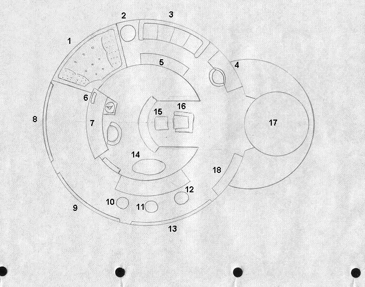
So if Shik designed the ship, her bridge would look a bit like this?


 -

1: Hot tub, 2: Phaser control, 3: Science sofa, 4: Communications, 5: Science station (pops out), 6: Red alert lava lamp, 7: Helm / Navigation, 8: Main viewer, 9: Stellar cartography viewer, 10: Stellar cartography, 11: Multi-role, 12: Enginering, 13: Enginering display, 14: Coffee table / captains console, 15: Captains footrest, 16: Captains recliner, 17: Turbolift, 18: Enviro controls (doubles as a fire when inactive).


Despite my liking of the captains coffee table, I might have to go with Abans take on things.
 
Posted by Ritten (Member # 417) on :
 
I do hope that the hot tub doubles as the escape pod, otherwise it would just be a waste.

Isn't the coffee table a bit far from the recliner?

I like the concept though.

Who would be the First Office? J'Cuzzi? T'Spa?
 
Posted by Sean (Member # 2010) on :
 
I'd love to see Tpol in T'Spa....
 
Posted by Shik (Member # 343) on :
 
quote:
Originally posted by The Ginger Beacon:
So if Shik designed the ship, her bridge would look a bit like this?

 -

1: Hot tub, 2: Phaser control, 3: Science sofa, 4: Communications, 5: Science station (pops out), 6: Red alert lava lamp, 7: Helm / Navigation, 8: Main viewer, 9: Stellar cartography viewer, 10: Stellar cartography, 11: Multi-role, 12: Enginering, 13: Enginering display, 14: Coffee table / captains console, 15: Captains footrest, 16: Captains recliner, 17: Turbolift, 18: Enviro controls (doubles as a fire when inactive).


Despite my liking of the captains coffee table, I might have to go with Abans take on things.

No, this is brilliant!

You think I'm joking about the hot tub, but see, here's the thing. Non-combat ship. relaxed environment. You gotta figure on transports, freighters, & the like things would slip some. The captain shows up for duty in bathrobe & bunny slippers. The doctor makes moonshine. Little mods. And maybe the captain wants a hot tub.
 
Posted by Fabrux (Member # 71) on :
 
This is the kinda of bridge Malcolm Reynolds would have. If he had a ship as big as an Antares, that is.
 
Posted by Reverend (Member # 335) on :
 
quote:
Originally posted by Aban Rune:
Added a few things. Don' thave the actual consoles done yet. Any thoughts on station layout?

 -

Just an idea, but after looking at the bridge plans on Ex Astris and star trek schematics and I wonder if it would be an idea to use those roll-out consoles flanking Spock's science station on one or more of these stations to add more adaptable functionality. One or two standing stations and/or a console mounted on the inner rail could help to break thing up a little too.
It also occurs to be that the person manning the aft station would be basically staring at the back of the captains head, so it may be an idea to sink the helm, nav & command stations a step or so deeper.
 
Posted by Sean (Member # 2010) on :
 
Still think the captain should get his own little computer console. WIll this be a ship commanded by a full bird captain, or a lower ranking officer?
 
Posted by B.J. (Member # 858) on :
 
quote:
Originally posted by Sean:
full bird captain

..... I think you just hurt my brain.

Is there some other level of Captain we're unaware of? Perhaps Hawkeye's "Corporal-Captain" initiative?
 
Posted by Sean (Member # 2010) on :
 
Buffalo Chips! I was actually quoting Potter.
ALthough I see no reason why orders from G2 and G3 making a G5 combined field officer op-tech glitch couldn't make a corporal-captain. [Big Grin]

I used that term because it is standard practice to call the commander of a ship "The Captain" regardless of rank.
 
Posted by The Ginger Beacon (Member # 1585) on :
 
What about instead of a captains console, something halfway between that and those gooseneck thingies from The Cage? The TMP slide out consoles are a great idea as well, as they allow more multi-role ability from each station.
 
Posted by The Ginger Beacon (Member # 1585) on :
 
(And also, Shik, the bit where the engineer etc sit on the Jacuzibridge would double as a bar, for the doctor to make his martinis.)
 
Posted by Sean (Member # 2010) on :
 
Something like a TOSed FIrst officer's console with a Cage headlamp thingy.
 
Posted by Reverend (Member # 335) on :
 
Well this is late 2260's early 70s design, so no. The command chair is fine as it is.
 
Posted by Aban Rune (Member # 226) on :
 
OK... how does this look? I'm not happy with the station assignments, but I think the layout looks pretty cool.

 -
 
Posted by Reverend (Member # 335) on :
 
Looking good, though I'd remove the roll-outs from the Comms station for a bit of asymmetry, perhaps make #14 a standing only station too.
If you want a more logical layout try:-

09 - Probe Control
10 - Astrometrics
11 - Engineering
12 - Comms
13 - Planetary Science
14 - Aux Systems

That way all Ships Operations stations are to the Captain's left and all Mission Operations are to the Captain's right.
 
Posted by Aban Rune (Member # 226) on :
 
Cool. I'm taking a week off, so I won't be able to work on this for a little bit. But by the time the 3-d model is ready, I'll definitely have this done.

So who wants to do internal blueprints? [Smile]
 
Posted by Reverend (Member # 335) on :
 
well if anyone wants to, here's a rough cross-section.
 -
 
Posted by Malnurtured Snay (Member # 411) on :
 
Just a suggestion, but maybe the emergency crawlway should be bigger so that people can get past a turbolift stranded in the shaft?
 
Posted by Harry (Member # 265) on :
 
Oh look, it's the data file of USS Antares [Wink] The crew count is completely random, I must admit.

 -
 
Posted by Aban Rune (Member # 226) on :
 
Yah, the shaft crawlway could probably stand to be a little bigger. It was fine until I enlarged the turbolift a little.

So what have we got here... looks like 9 decks. How would that deck in the narrow part of the saucer be classified? I would tend to call it part of the deck below it, since there will probably be places where stairs woould take you up half a level. That seems more likely than steps leading down from the deck above.
 
Posted by Reverend (Member # 335) on :
 
quote:
Originally posted by Malnurtured Snay:
Just a suggestion, but maybe the emergency crawlway should be bigger so that people can get past a turbolift stranded in the shaft?

That wouldn't be consistent with what we've seen of turbo shafts to date. Besides, speaking as someone who used to build lifts, that would be a particularly dangerous thing to do.
 
Posted by OverRon (Member # 2036) on :
 
quote:
Originally posted by Aban Rune:
Cool. I'm taking a week off, so I won't be able to work on this for a little bit. But by the time the 3-d model is ready, I'll definitely have this done.

So who wants to do internal blueprints? [Smile]

Well it might be a little while for me to finish off a 3D model, as I'm having troubles with my PC. Ive reinstalled windows and all my apps, but I still have some stability issues, and running memtest seems to point to the fact that my memory might be on the way out.

Just looking at that cross section. That's an escaped pod located behind the bridge turbo lift shaft, right? Does the escape pod have grav plating? As if the escape pod is oriented that way, I can see it being a struggle for the crew to get into. With the pods grav plating on, and having to go from one grav field to another to get in. Or having the grav plates off and relying on the ships grav plating and have to "climb" into the front of the pod. Or with the pod having no grav plating in that area, and once the pod is full and everyone seated, activating the grav plating. Any which way it would add another time factor into getting into the pod quickly.
 
Posted by Sean (Member # 2010) on :
 
That area could be a "Sweet Spot" like on NX-01. The area would only have to be a few metre's wide. Or, you can consider how they got into the Phoenix in First Contact. Actually, I believe that modern day space shuttles have seats that swing so that they can be sat in when the ship is verticle,( please, someone who is familiar w/ the space program correct me if I am wrong) so, for a dedicated bridge escapr pod, I see no reason why that technology could apply.
 
Posted by Ritten (Member # 417) on :
 
A near zero G spot? A few meters wide is way, way, way too big.
 
Posted by Shik (Member # 343) on :
 
Rev has hull number dyslexia.
 
Posted by Sean (Member # 2010) on :
 
WHy, Ent's was comparitively large? This one would need to be much smaller. If not meters, then a little bigger than the hatch. Also, you could just reposition the pod so that it is at like a 70 deg. angle or lower, then have a step ladder to get into the pod.

Also, on a Shik-like state of mind, a meter sized G-spot would be scary. [Big Grin] [Big Grin]
 
Posted by Reverend (Member # 335) on :
 
It's quite simple. The grav plating is on and the crew enter through the "top hatch" (which from the outside is a wall hatch) and once they swing their legs in there's an internal ladder for them to climb down (horizontally) to the deck floor. It's a bit queasy but that's not a big deal during an emergency and it's simple enough to visualise if you've seen Kubrick's 2001.
 
Posted by Reverend (Member # 335) on :
 
And here's a crossection.
 -
 
Posted by OverRon (Member # 2036) on :
 
Ahhh I'd forgotten about the top hatch. I'd imagined that they'd have to climb in from the bottom, from the deck below.

Anyways thoroughly checked my RAM through memtest and one stick of it is definitely up shit creek. So I've gotta to send it back to Corsair and get a replacement, God knows how long that'll take. At least it has lifetime warranty though.
 
Posted by Sean (Member # 2010) on :
 
I thought the same as OverRon.
 
Posted by Reverend (Member # 335) on :
 
Ok, I know I said I was done, but there were a few details that were bugging me (like the saucer rim nor having floor space to accommodate the escape pods AND a corridor) so here we go again...
 -
 -
 
Posted by MinutiaeMan (Member # 444) on :
 
So the USS Serenity is undergoing a compression coil refit, huh? Nice.
 
Posted by Reverend (Member # 335) on :
 
Well you can't let a compression coil get busted now, can you?
 
Posted by OverRon (Member # 2036) on :
 
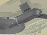
Well I managed to steal 1 gig of decent RAM out of my brothers PC so been working on this a little more. Felt a little burned out with doing the saucer so I did another part, the nacelle pylon thingie.

Anyways it's fully modelled, I hope, and trying out new larger textures (although can't really see them too well unless the light is just right). Not sure of the material properties as it's looking a little too metallic, so I may tinker with them to get them looking a little more like plastic.

And I just noticed Rev has gone and changed the pylons in those last two images, sods law eh? [Razz]

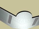
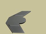
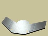
 -  -  -
 -  -  -

And here's a test render vid showing the material. Too metallic?

 -

Edit: Making them clickable thumbnails now
 
Posted by Sean (Member # 2010) on :
 
If you want it to fit in with a mid-late 23rd century starship paint job, then you might want to tone the mettalic-ness.
 
Posted by OverRon (Member # 2036) on :
 
Okay, finally re-built the top of the saucer section, and have done a final texture image for it.

How are materials looking now? As I've plasti-fied them a lot.
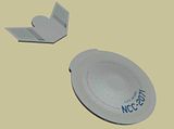
 -  -
 -  -
 
Posted by Aban Rune (Member # 226) on :
 
It shall be glorious.
 
Posted by Sean (Member # 2010) on :
 
Beautiful.
 
Posted by Bernd (Member # 6) on :
 
I have included the latest version of the Antares, and revised the text to comment on the recent revision.

http://www.trekships.org/antares.htm

What's the status of the Korolev, BTW?
 
Posted by Reverend (Member # 335) on :
 
quote:
Originally posted by OverRon:
Well I managed to steal 1 gig of decent RAM out of my brothers PC so been working on this a little more. Felt a little burned out with doing the saucer so I did another part, the nacelle pylon thingie.

Anyways it's fully modelled, I hope, and trying out new larger textures (although can't really see them too well unless the light is just right). Not sure of the material properties as it's looking a little too metallic, so I may tinker with them to get them looking a little more like plastic.

And I just noticed Rev has gone and changed the pylons in those last two images, sods law eh? [Razz]

 -  -  -
 -  -  -

And here's a test render vid showing the material. Too metallic?

 -

Edit: Making them clickable thumbnails now

In my defence all I did to those Pylons was to make the cross-section a little more rounded and less square. Looking good though.
 
Posted by Reverend (Member # 335) on :
 
quote:
Originally posted by OverRon:
Okay, finally re-built the top of the saucer section, and have done a final texture image for it.

How are materials looking now? As I've plasti-fied them a lot.
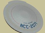
 -  -
 -  -

As a general guide, it'd probably be best to try and emulate the TMP Enterprise in terms of ther materials' texture & reflectivity rather than the pristine look of the old TOS ships.
 
Posted by Reverend (Member # 335) on :
 
quote:
Originally posted by Bernd:
I have included the latest version of the Antares, and revised the text to comment on the recent revision.

http://www.trekships.org/antares.htm

What's the status of the Korolev, BTW?

Nice one, though you've got the sheets labelled the wrong way round. [Wink]

As for the Korolev, funny you should mention that...
 
Posted by Bernd (Member # 6) on :
 
Oops. I have switched the labels.
 
Posted by OverRon (Member # 2036) on :
 
quote:
Originally posted by Reverend:
In my defence all I did to those Pylons was to make the cross-section a little more rounded and less square. Looking good though.

Well I should be able to round them out ok. Is it round all the way round? Or just a chamfer like this?
code:
_______
\
\
|
|
/
_______/

Also, those marking on the back of the pylons, are they indented? Or bulging out? Are they on the front of the pylons as well? They remind me kinda of phaser strips, but they weren't on ships this early.

At the moment I'm trying to struggle with the shape of the main secondary hull. My attempts so far have been off the mark. Do you have any views of the secondary hull with all the other stuff out of the way?
 
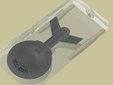
Posted by OverRon (Member # 2036) on :
 
quote:
Originally posted by OverRon:
At the moment I'm trying to struggle with the shape of the main secondary hull. My attempts so far have been off the mark. Do you have any views of the secondary hull with all the other stuff out of the way?

Err nevermind about that, I remember you sent me some reference images of that area.
 
Posted by Reverend (Member # 335) on :
 
quote:
Originally posted by OverRon:
quote:
Originally posted by Reverend:
In my defence all I did to those Pylons was to make the cross-section a little more rounded and less square. Looking good though.

Well I should be able to round them out ok. Is it round all the way round? Or just a chamfer like this?
code:
_______
\
\
|
|
/
_______/

Also, those marking on the back of the pylons, are they indented? Or bulging out? Are they on the front of the pylons as well? They remind me kinda of phaser strips, but they weren't on ships this early.

At the moment I'm trying to struggle with the shape of the main secondary hull. My attempts so far have been off the mark. Do you have any views of the secondary hull with all the other stuff out of the way?
That cross-section is about right, but you're the 3D artist so do whatever works best for you. As for the details on the aft face of the pylons, they're plasma flush vents, so they're indented.
 
Posted by OverRon (Member # 2036) on :
 
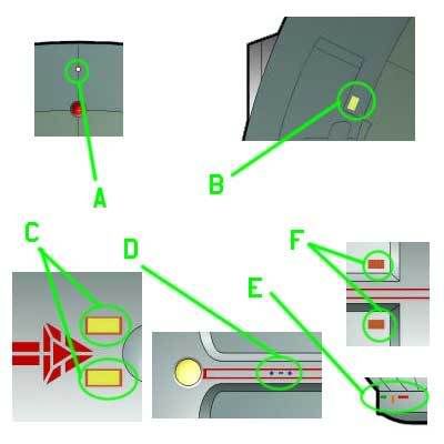
Just a quick question about some of the markings on the hull. Are some of these lights or hull markings?

 -
 
Posted by Reverend (Member # 335) on :
 
A - Flashy strobe
B - Hull marking (for the impulse reactor access port)
C - Hull marking (transporter emitters)
D - *squints* hull marking
E - The same funky disco tale lights that the Enterprise has under the hanger bay
F - Hull marking (for the deuterium refuelling ports)
 
Posted by OverRon (Member # 2036) on :
 
A little update. I was having trouble trying to get the shape right on the rear bottom of the secondary hull, modelled several different objects but none turned out that good. Anyways my best attempt at it so far, although I may try and do something else with it later on.

 -  -
 -  -
 
Posted by OverRon (Member # 2036) on :
 
Another update. Finished off most of the engineering hull now. Even had time to put the deflector on too. This mesh is starting to shape up a bit now, but still got a ways to go. Going to try and finish off the main basic elements first, like the bridge, bridge module, impulse and warp nacelles, then I'll start filling in the details of some of the things I've just skipped over for now.

 -  -  -
 -  -  -
 
Posted by OverRon (Member # 2036) on :
 
And although this is no way even near to complete, I just had to see what it would look like in a better scene, with some basic fake radiosity and shadow casting lights.

 -  -  -
 -  -  -
 
Posted by Reverend (Member # 335) on :
 
Looks ok to me, though don't feel too beholden to the exact lines of the plans. 2D drawing has a slight element of guesswork when dealing with unusually curved objects so feel free to go with what looks best rather than necessarily what's the most faithful.
 
Posted by OverRon (Member # 2036) on :
 
Been taking a little break from doing this, but got back into modelling mode today, so a few updates. I'm not sure about the nacelles, it was hard trying to envisage how all the shapes of the nacelle fitted together, but I think I've got a look that works. I've done a lot of guesswork with them, so not too sure how they fit in with the way you imagined them.

I've also done a small amount on the bridge module. You wouldn't believe it for such a simple shape, but it just wasn't behaving itself when modelling. I finally got it done though.

I'm just going to fill in the main basic shapes of the ship, before I get in and do the heavy detailing like I've done with the saucer and pylon.
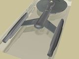
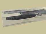
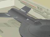
 -  -  -
 -  -  -
 
Posted by OverRon (Member # 2036) on :
 
 -  -
 -  -
 
Posted by Reverend (Member # 335) on :
 
quote:
Originally posted by OverRon:
Been taking a little break from doing this, but got back into modelling mode today, so a few updates. I'm not sure about the nacelles, it was hard trying to envisage how all the shapes of the nacelle fitted together, but I think I've got a look that works. I've done a lot of guesswork with them, so not too sure how they fit in with the way you imagined them.

I've also done a small amount on the bridge module. You wouldn't believe it for such a simple shape, but it just wasn't behaving itself when modelling. I finally got it done though.

I'm just going to fill in the main basic shapes of the ship, before I get in and do the heavy detailing like I've done with the saucer and pylon.
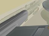
 -  -  -
 -  -  -

It may help if you have a look here.
If you look at the fore view you can see the basic shape of a refit nacelle is a rounded trapezoid shape intersecting with a cylinder with an arc scooped out. Though on the Antares the scoop is only on the inner face, with the outer face being slightly flattened. As you've done it the joints between the main section are too soft and sculpted and the central block should taper more towards the bottom. Other than that it's looking good.
 
Posted by OverRon (Member # 2036) on :
 
Yeah, I was trying to do most of the nacelle as a single low poly object, and then tinker with that to get the general shape, and mesh smooth the whole thing to take the hard edges off. You can see though, it makes it a little too soft and rounded. I've been chamfering various edges on it before mesh smoothing it to get the desired shape, but the result so far has been quite what I had in mind exactly. Plus I've just realise I've done the bottom of the nacelle wrong, so gonna have to redo that whole thing from scratch.

As for the scooped out bit, I was just gonna get the general shape of it finished before I started doing that detail work.
 
Posted by OverRon (Member # 2036) on :
 
Okay, version 2 nacelles. I think I got them about right:

Middle left is new nacelle

 -

Bottom right is new nacelle

 -

Bottom is new nacelle

 -

And a few perspective shots

 -  -  -
 
Posted by Reverend (Member # 335) on :
 
HUGE improvement.
The thing you need to remember and it's a trap allot of 3D artists fall into, is that these things are meant to be machines, not sculptures. So it's always best if you approach it with that in mind by making it more an assembly of shaped sections rather than a single sculpted block.

Oh and before you start doing the forward cut-ins, this rough diagram should give you a slightly better idea as to how the different components relate to each other.
 -

[ April 03, 2008, 07:59 AM: Message edited by: Reverend ]
 
Posted by Sean (Member # 2010) on :
 
Very nice. If only I were that talented...
 
Posted by Reverend (Member # 335) on :
 
Talent just means you've been at it longer than most. It's only a matter of practice.
 
Posted by Sean (Member # 2010) on :
 
You also need the money to get the software, a computer that isn't retarded, and the knowhow to actually work the program. I am totally clueless when it comes to the technical terms used in these types of threads. That is why I cant usually say much more than " Ooo pretty", or give an asthetic suggestion.
 
Posted by Reverend (Member # 335) on :
 
There are plenty of free programs out there that can probably run on a P100 and still produce something of reasonable quality. As for know-how, I'm self taught, you pick it up as you go. Failing that, there's no shortage of tutorials if you're willing to put the effort in.
 
Posted by Sean (Member # 2010) on :
 
Having that encouragement, I might just learn. I've got summer comming up, so there'll be no shortage of time.
 
Posted by Aban Rune (Member # 226) on :
 
I'm starting to have really inappropriate thoughts about this ship... It's looking great.
 
Posted by Shik (Member # 343) on :
 
Sean, what's the specs on your computer? Processor speed, OS, RAM, all that. I might just be able to help you out a bit.
 
Posted by Sean (Member # 2010) on :
 
God, i dont know. I 'll have to ask my father. THough when we originally got it, it ran windows 95. It was rebuilt once too. It has less than 1GB of memory as standard. It pretty much sucks ass.
 
Posted by B.J. (Member # 858) on :
 
[Eek!]
I don't know whether I'm more shocked at the age of the computer, or the fact that you know nothing about it!
 
Posted by Shik (Member # 343) on :
 
As long as it's not a 486 or powered by handcranks, hamsters, or waterwheels, I still might be able to help.

(Doesn't Windows have a system information thinger like Macs, except, y'know...not as easily found? I'd look it up on this shitbox, but I doubt it would help.)
 
Posted by Aban Rune (Member # 226) on :
 
Start Menu > My Computer > View System Information
 
Posted by Sean (Member # 2010) on :
 
System-Windows XP home edition
Version 2002

Computer
AMD Duron processor
746MHz,512MB of RAM
 
Posted by Reverend (Member # 335) on :
 
You're kidding right? That's not a bad machine to be doing 2D graphics on, hell the original Antares schematics were probably done on my old 433 and I think that only had 128mb RAM!
 
Posted by Shik (Member # 343) on :
 
No joke. I did the graphics for my old website on a P133 with like 256 MB RAM.
 
Posted by Reverend (Member # 335) on :
 
Kids today! Wouldn't know a slow computer if it landed on their heads! Sean, try using a tape loading Sinclair ZX-81 or the Atari ST, THOSE are slow by today's standards, while a 746 is just a few years behind the times.
 
Posted by Shik (Member # 343) on :
 
My first computer was a Radio Shack TRS-80 color Computer with Extended 32K Basic memory. We had a cassette tape player hooked up to it to play games & programs , & an old "dial the number, listen for tone, & then slam it into the cups" type modem that ran at the then amazing speed of 300 baud.

Which makes me want to share something I wrote on my LJ 2 weeks ago:

In 1985, two horny teenagers made a woman using a Memotech MTX512 computer with attached FDX system, utilizing a massive 64 KB of memory & a crappy little Z80A microprocessor. Now, granted they had to tap into a military installation to get the extra processing power they needed to fuel their hoochie-birthing dreams, but military tech wasn't that far in advance of civilian tech at the time.

Right now, I'm writing this on a computer that in modern terms is positively ancient. It's 6 years old. It's got the maximum memory of 1.5 GB. Its processor speed is only 800MHz, although there are upgrades available to bring it to a top of 1.5 GHz. It's got a modern OS & a user interface leaps & bounds over that of the Memotech used so long ago.

And yet.

And yet.

I guess what I'm trying to say here is that despite all this technological advancement, I am still unable to build & infuse life into a woman. If any OS could do it, you KNOW it would be OS X. (Maybe Linux, too, but I'm not versed so well in that one.) What I'm trying to say here is that there's a market out there, ripe for the plucking. Now, I'm not doubting Steve Jobs' visionary talents, but sometimes I think he needs a little nudge at times.

iSlut.

'S all I'm sayin', yo.

 
Posted by OverRon (Member # 2036) on :
 
quote:
Originally posted by Shik:
...cassette tape player...

I remember having one of them on my old Amstrad, it squeaked and squealed for 10 minutes and then you got to play Dizzy, James pond, or How to be a complete bastard.

As for your PC specs, I started doing 2D and 3D stuff on an old 133 MHz pentium, with a whopping 144MB of RAM. Using Paint Shop Pro and some free 3D app I got off of a Computer Arts magazine.
 
Posted by Reverend (Member # 335) on :
 
Ok, now this is starting to turn into a Four Yorkshiremen sketch for the pacman generation! And since Sean is just a wee babby, probably doesn't even know who the four Yorkshiremen are. [Wink]
If such is the case, watch this, or if you prefer, this.

Anyway, how's that mesh coming?

Oh and Dizzy rocked, though I never could finish Spellbound Dizzy.
 
Posted by Shik (Member # 343) on :
 
Ha...Yorkshiremen.

In any event, I made the laddie an offer for a free copy of PSP 5.01 to get him started if he wishes. We'll see what happens when he returns.
 
Posted by B.J. (Member # 858) on :
 
Well, he doesn't even need commercial software to get started. For 2D raster, there's GIMP (which I use), or Inkscape for 2D vector stuff. On the 3D side, there's Blender or Sketchup.
 
Posted by Shik (Member # 343) on :
 
True.
 
Posted by The Ginger Beacon (Member # 1585) on :
 
How good is GIMP on PC's? I was considereing it for a while, but never got round to downloading it.
 
Posted by B.J. (Member # 858) on :
 
I've got no problems with it. And it's a lot easier to install now that they got rid of the separate GTK install requirement (just the one install file now).
 
Posted by The Ginger Beacon (Member # 1585) on :
 
Cool. One shall investigate.
 
Posted by Sean (Member # 2010) on :
 
I didn't know my computer was that good. I thought that software like that would'nt work because Of the lack of space on the hard drive. Well, I know very little about computers, so I'll go with you guy's on this.
 
Posted by Daniel Butler (Member # 1689) on :
 
Hard drive space doesn't stop something from working unless you actually have so little that you can't install it. It's RAM that is the computers 'working' memory. (Well except for the page file/swap volume, but...)

I never had a cassette drive but I always wanted one for some reason. It's funny, my first computer had only 8 mb of RAM, and modern RAM average amounts outstripped the HDD capacity of that thing so long ago it's not even amusing to mention it anymore. It'd be like saying "lol vacuum tubes." And yet I remember the internet and color graphics and all, and it doesn't seem THAT shitty compared to modern stuff...Hmm...memory must be very fuzzy...
 
Posted by Sean (Member # 2010) on :
 
Thank you Shik. I just downloaded it and opened it up. It may take a while to figure out, but it looks easy enough.
 
Posted by Aban Rune (Member # 226) on :
 
OK... finally got a chance to finish this bridge design. Rev... hit me with a station list. I don't have them numbered, but I need something for those freestanding consoles along the inner rail to do also.

 -
 
Posted by Reverend (Member # 335) on :
 
Ok, let's see...
01 - Uppy downy, sidey side thing.
02 - Ladder
03 - Mission Ops
04 - Captain's log rest
05 - Helm
06 - Nav
07 - Burk! Feed me.
08 - Sony Vaio
09 - Probe Control
10 - Astrometrics
11 - Engineering
12 - Comms
13 - Planetary Science
14 - Aux Systems

Remember that this way all Ships Operations stations are to the Captain's left and all Mission Operations are to the Captain's right.
As for the rail consoles, I'd call them general purpose computer terminals. The type that can be configured for just about anything, depending on the need. For instance during a resupply one can be configured to monitor the cargo/docking operations an coordinate with docking control without tying up the comms station OR the can be set to read telemetry during a full planetary survey OR act as damage control stations during an emergency...and so on and so forth.
 
Posted by Bernd (Member # 6) on :
 
I like the bridge! Quite fitting for its era.
 
Posted by OverRon (Member # 2036) on :
 
It's been a while since I last did any work on the Antares, but managed to have a crack at it today for a few hours.

Not much improvement yet, just been fleshing out some of the Hull panelling and other details. Finished off the bottom of the saucer and the rim, now fully modelled and with the main textures added (Still have to do textures for the smaller objects like the sensors). Added a turbolift shaft behind the bridge, and did a little work on some of the top secondary hull panelling and detailing before I start texturing. Anyways here's a bunch of pics:

 -  -  -  -
 -  -  -  -
 
Posted by Aban Rune (Member # 226) on :
 
Ooooh... I can't wait to see this girl all decked out.
 
Posted by Aban Rune (Member # 226) on :
 
OK... how's this?

 -
 
Posted by Reverend (Member # 335) on :
 
quote:
Originally posted by OverRon:
It's been a while since I last did any work on the Antares, but managed to have a crack at it today for a few hours.

Not much improvement yet, just been fleshing out some of the Hull panelling and other details. Finished off the bottom of the saucer and the rim, now fully modelled and with the main textures added (Still have to do textures for the smaller objects like the sensors). Added a turbolift shaft behind the bridge, and did a little work on some of the top secondary hull panelling and detailing before I start texturing. Anyways here's a bunch of pics:

Coming along fine, the only not I have for now is that the smallest circle at the centre of the ventral sensor dome should actually be a little bump/dome in and of itself, rather than an outline. If you remember the ion-pod/nipple thing on the e-nil, you'll get the idea.

Can't wait to see the finished product. For some reason I have an image of this thing being launched from dry dock, just as the Enterprise is coming in for it's overhaul.
quote:
Originally posted by Aban Rune:
OK... how's this?

 -

Spiffy.

I'm wondering, should I do a refit version of this design and if so in which era should it take place? I'm thinking since the Hermes was in the 10xxx range it should be a post Excelsior, pre-Ambassador type look. Perhaps taking a few ques from Probert's original Ambassador concept.
 
Posted by OverRon (Member # 2036) on :
 
Well I've been working on the engines today. I think I've finished off all of the modelling for them, except for the running lights on the tops. Done a little bit of texturing on the nacelles as well. This took me a lot longer than I expected, trying to include all the little details from Rev's schematics. All that's left to do with the nacelles are the main textures, but most minor textures are done there now.

Some close-ups of the nacelles. These parts differ the most from the original plans, but if you notice any glaring discrepancies let me know. Finally amended the pylon strut thingies and added the chamfer on the sides that are on the new plans. Also how far in does the cylinder and hemisphere go into the back end of the nacelle? As what I've done just doesn't look right.

 -  -  -  -
 -  -  -  -
 
Posted by OverRon (Member # 2036) on :
 
Just cloned the nacelle over to give a better overview of the ship, and using an improved lighting set up (but not best I can do).

 -  -  -  -
 -  -  -  -
 
Posted by OverRon (Member # 2036) on :
 
Okay then, I'll nipple-ise that part then> [Razz]
 
Posted by OverRon (Member # 2036) on :
 
That good for ya? [Wink]

 -
 
Posted by Reverend (Member # 335) on :
 
Small point, but the nacelle end caps aren't nearly as deep at that. Not that you can tell from the plans as it's one of those details that don't show up on a cross-section, like so.
 -
I would also add some topography to the nacelle pylons so everything isn't so perfectly flush. Giving the plasma vents some dimension would be a good start.
Also, though I realise it's early days, but I'd tone down colour on the ramscoop and the warp grill a bit. Have a look at the glow the Enterprise had in TMP to get an idea of the temperature of the colours. Not burning white hot as much as a simmer.
 
Posted by Reverend (Member # 335) on :
 
quote:
Originally posted by OverRon:
That good for ya? [Wink]

 -

Looks fine!
 
Posted by Shik (Member # 343) on :
 
Nice & pink....the way it should be for a Caucasian.
 
Posted by Aban Rune (Member # 226) on :
 
Her little waist chain/probe launcher ring is missing. But I assume that's coming up on the list. This is looking awesome.
 
Posted by OverRon (Member # 2036) on :
 
Yeah, on my "still to do" list:

- Finish off all the top and bottom secondary hull sections.
- Probe Launcher ring.
- Running lights.
- Port/Starboard lights.
- Blinking running lights (if there are any).
- Impulse Engines.
- Shuttlebay.
- Phaser cannon ports.
- Finish off Deflector Secondary hull.
- Various docking hatches.
- Create better textures for the windows.
- Texture all unfinished parts.
- Tweak the texture properties to get the right "look."
- Create a set of hull lights for engine glows.
- Create a light-box to fit the mesh in.
- Render lots of nice looking pics. [Razz]

And once I've done that, and if I can be bothered, I'll add very low poly rooms and lights behind each of the windows to give the sense that you can actually "see" inside the ship.

Anyways been tweaking the mesh some today. Added the textures for the main part of the nacelles now. Fixed the end caps. Raised/lowered parts of the pylon struts to try and break up the flatness of it (although I'm not too sure of the result of that). Texture various parts of the sensor arrays and other dorsal saucer features. Added the "nipple" to the bottom of the sensor dome. Is that bump the right size? Toned down the bussard and warp grille glows a little. And a few other little things which I can't remember now.

Some pics showing some of the changes:

 -  -  -  -
 
Posted by OverRon (Member # 2036) on :
 
Some more pics showing the changes:

 -  -  -
 -  -  -
 
Posted by OverRon (Member # 2036) on :
 
Just testing a light box setup here, the main scene light is a little too strong. Ignore the weird blue glows on the inner engines and pylon, as I was just testing out some glow lights there, but I'll need to tweak them a lot:

 -  -  -
 -  -  -
 
Posted by Aban Rune (Member # 226) on :
 
Groove-i-nation.
 
Posted by OverRon (Member # 2036) on :
 
I've been working on the secondary hull's "belt," the parts that I assume are sensor pods, cargo bay, and one of the airlocks. Mostly un-textured at the moment, but I'm probably gonna rework all the textures, as they still look too bland.

 -  -  -
 -  -  -
 
Posted by OverRon (Member # 2036) on :
 
And testing a texture with a more prominent aztec pattern and a better light rig.

 -  -  -
 -  -  -
 
Posted by Jason Abbadon (Member # 882) on :
 
Super cool...I drool in your honor, sir!
 
Posted by Reverend (Member # 335) on :
 
Looking good, though I don't think you need to apply an aztec pattern to the forward sensor domes. Also, you might want to try applying a different texture to the raised sections of the nacelle pylons, or no texture at all. As it stands it looks far to continuous.
 
Posted by Captain Serek (Member # 1038) on :
 
I like your progress so far. I look forward to it's completion.


© 1999-2024 Charles Capps

Powered by UBB.classic™ 6.7.3