Does this mean I have to redesign the logo?
Posted by MinutiaeMan (Member # 444) on :
Hell no! Yours is much more interesting and imaginative. Frankly, I'm a little disappointed they didn't try to contact us about using it. They used Masao's station design, after all Posted by Mars Needs Women (Member # 1505) on :
Incidentally Reverend, I forgot you were the one who made logos, not Fabrux. You can rejoice as well. Posted by Jason Abbadon (Member # 882) on :
Memory Alpha's a giant target for starships.
Posted by Reverend (Member # 335) on :
quote:Originally posted by MinutiaeMan: Hell no! Yours is much more interesting and imaginative. Frankly, I'm a little disappointed they didn't try to contact us about using it. They used Masao's station design, after all
Really? I was never very happy with it. But that's often the case when something is done by committee for people who don't really know what they want in the first place. I shouldn't complain too much, it only took 10 mins. Posted by MinutiaeMan (Member # 444) on :
Oh, well never mind then.
Seriously, just because it's simple doesn't mean it's boring or no good. I like the logo you did because it's memorable and relatively simple, but not a clichéd triangle like most Starfleet logos tend to be. It's different.
Posted by Reverend (Member # 335) on :
It's the Federation seal inside a hexagon!
Not sure I like my new idea anyway... What do you think? Too busy? Too much like an inverted sheriff's badge? Hmm...
While I'm on the subject is there any way to retrieve my old login password? I forgot it and I'm pretty sure the e-mail it's attached to is the one that fell into a black hole and slipped into an alternate universe or something, so the usual way won't work.
Posted by Shik (Member # 343) on :
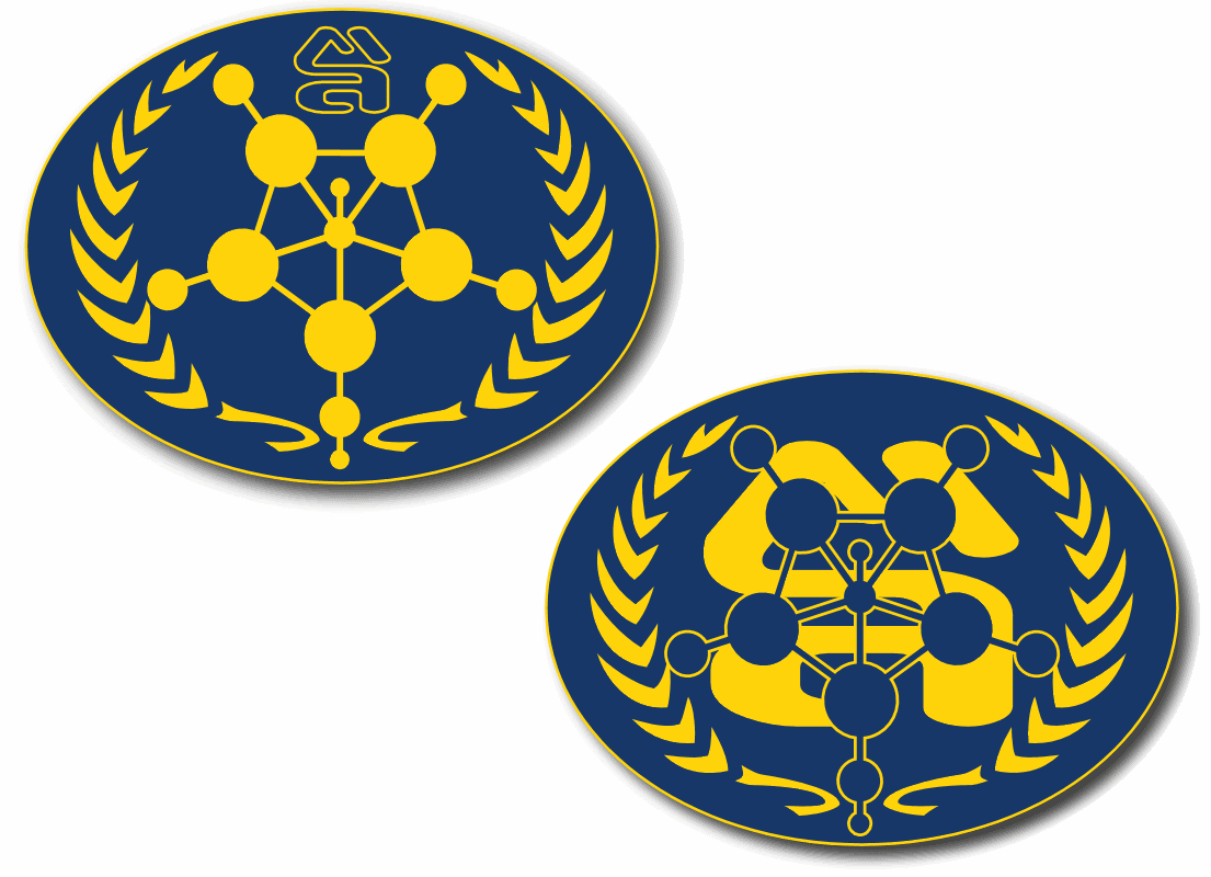
Take away the outer pentagon. Let the innards stand alone.
Posted by Masao (Member # 232) on :
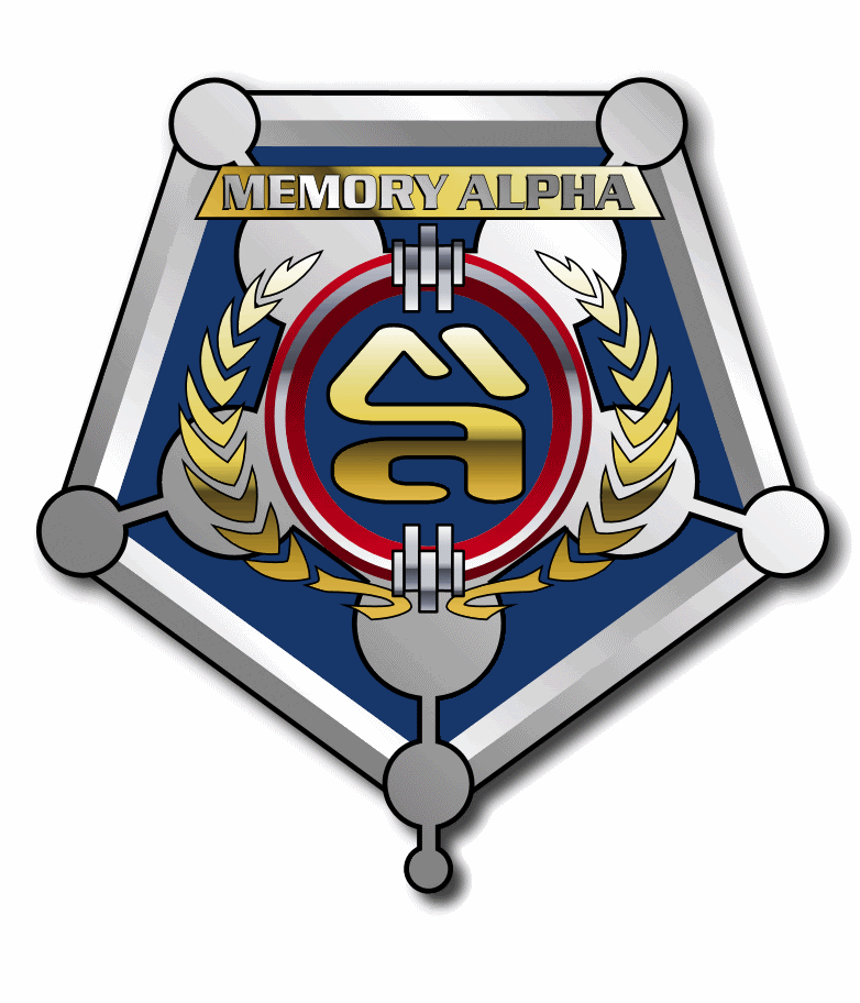
That's way too busy. You have at least 5 elements, all of which are themselves complex. You have a metallic wreath, a schematic of the library, a beveled pentagonal border, a typographic logo on a 3-stripe-bordered shield with some little greebly doohickies, and the name on a metallic plate.
Posted by Reverend (Member # 335) on :
Yeah, that's pretty much what I thought too. Let's try... this.
Posted by Shik (Member # 343) on :
Kill the smaller circles.
Posted by Masao (Member # 232) on :
You're down to four elements, which is better.
That metallic treatment makes the letters hard to read. The metal on metal doesn't help. If you look at the logo at the size of the thumbnail, the letters are pretty unreadable. I suggest trying without a pentagonal shield in the center. Instead put the letters on the blue background. I'm also getting kind of a Mickey Mouse vibe from the shield and the top large ears.
I'm thinking that the smaller satellite domes were latter additions, so the original plan, and the logo, should have only the larger domes.
Posted by Harry (Member # 265) on :
I'm kinda glad there are now two different logos. I he had used our logo, while undoubtedly cool, it would've sort of been a free-for-all for everyone else to use that logo too. It's now clear that MA the website is a different thing than MA the TOS library.
That said, we have thought about updating the logo to contain some newly canon elements...
IMO, the two most recognizable elements are the polygonal shape and the "MA" letter forms.
Ill make up some concepts as well Posted by Reverend (Member # 335) on :
quote:Kill the smaller circles.
That'd negate the whole point of using the building!
quote:Originally posted by Masao: You're down to four elements, which is better.
That metallic treatment makes the letters hard to read. The metal on metal doesn't help. If you look at the logo at the size of the thumbnail, the letters are pretty unreadable. I suggest trying without a pentagonal shield in the center. Instead put the letters on the blue background. I'm also getting kind of a Mickey Mouse vibe from the shield and the top large ears.
I'm thinking that the smaller satellite domes were latter additions, so the original plan, and the logo, should have only the larger domes.
Just a thought, but I wondered how these arrangements might look... Or failing that there's the LCARS Vista edition. I think I'm zeroing in on it now.
Posted by TSN (Member # 31) on :
"Based on the size and spacing of the windows, I’d estimate that each of the domes must be similar to the Superdome[.]"
Even if he means the smaller domes, that planetoid must be made out of something improbably dense, in order for it to be round at such a miniscule size.
Posted by Shik (Member # 343) on :
Too hard to read. And I'd said kill the smaller circles because it then did indeed look like a marshal's star.
Posted by Mars Needs Women (Member # 1505) on :
I think the problem is that you are trying to have the letters MA combined with the structure, and it makes it too difficult to read. I prefer the 3rd design which has the initials above the structure.
Posted by Masao (Member # 232) on :
You might try going more schematic with the domes, rather than having an exact representation. Here's an example. The central typographical logo is just a placeholder, of course. You could also put a wreath around the "MA," I think that might be an overused device.
Posted by Reverend (Member # 335) on :
Doesn't matter any more. Scroll down. Good thing too, my version was starting to piss me off. Hurray for Okuda!
Not that it matters now, but that Federation wreath was one of those committee mandated things. I didn't like it either.
Posted by Mars Needs Women (Member # 1505) on :
What are you talking about? The patch? I pointed it out in my first post.
Posted by Reverend (Member # 335) on :
I didn't follow the link in the first post as I had already read the article before they updated it. I only just now noticed it had been updated. Shows what happens when you skim posts and make assumptions.
Posted by Bernd (Member # 6) on :
I liked your latest version of the logo, Reverend. Maybe you could have made the letters more prominent (in front of the structure).
BTW, this is how Mike Okuda explains his version to Jörg:
quote: Yes, the arrangement of stars is intended to resemble Orion, which is the name of NASA's new spacecraft. The overall form of the emblem is based on the project logos for NASA's Project Constellation, of which Orion is a part.
Posted by Pensive's Wetness (Member # 1203) on :
Jesus, i thought this was a BSG thread.... asshats... :/
Posted by Masao (Member # 232) on :
Rev: You're quitting now? Most of us assumed you knew Okuda had posted his own emblem. We thought you were simply designing your own "answer." I think your latest attempt was getting better.
Posted by Reverend (Member # 335) on :
No I just needed to have a bit of a rethink and come back with stunning new awesome concept...but I threw that out and nicked your idea instead. Posted by Reverend (Member # 335) on :
...or perhaps one of these two. Though I'm really starting to feel there's too much yellow here...
Posted by Masao (Member # 232) on :
The left one is better.
I don't think there's too much yellow. Instead, I think you're overusing the yellow-white gradient fills. The fills are interfering with the recognition of the shapes, which are more important than their color. Make the wreath one color (white or yellow, not both), make the five circles another color (white or yellow, to contrast with the wreath), then make the "MA" another (again, to contrast). Neither the wreath nor the circles need gradient-fill outlines. Also, remove the line around the shield. To allow the circles and the wreath to be separated visually, make sure that the space between the circles and the wreath is wider than the spaces between the leaves of the wreath.
Regarding the "MA," I think the "A" is overpowering the "M." Or maybe it's just because the fill makes the white "A" more noticeable. The "M" is hard to distinguish from the top two circles. Also, you might try making the letters smaller to leave more of the shield uncovered so that its shape is easier to recognize.
You should try to design a logo so that it could have a monochrome (black and white) version.
Posted by Masao (Member # 232) on :
![[Wink]](wink.gif)
![[Razz]](tongue.gif)