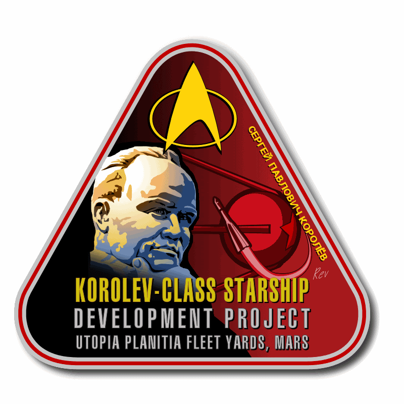
My original is twice that res, and it's a multilayer PSD so if you want special backs or just the image with transparency instead of backgrounds, lemme know all. Sorry to beat you to it Rev.
As Masao pointed out, the font (or at least the spacing) is wrong on the lettering but otherwise it looks quite nice. I think the nacelle bussards might benefit from a slightly darker or more "rich" red color. Same for the water on the Earth. (Now that I look closer I see you didn't really duplicate the cloud pattern either.)
-MMoM Posted by jesus X (Member # 1201) on :
No, the coud pattern I didn't bother to replicate exactly. The resolution was so low (compared to the size I was working in) that it was near impossible to actually duplicate it, so I took a satellite photo of clouds over ocean, and adjusted the perspective. I do see now the coloration of the water is too light. Looks like the entire portion is too light, actually, separate from the ship itself. I'll have to adjust it.
I'll tweak the Bussard collectors, and see what adjustments I can do the the text. I've got Photoshop 8 now (yay client project expenses!) which has a better text engine... Posted by Masao (Member # 232) on :
Two nits: 1. The cloud cover doesn't fit with the vector art of the rest of the patch. I think you should posterize the heck out of it and beat everything into either blue or white. 2. The ribbing and the shape of the ring just back of the nose looks a bit off. The shape doesn't seem to a proper section of a cone while the ribs don't seem to extend correctly from the tip of the nose. These kinds of things are very hard to draw, which is why I didn't do this patch!
Posted by jesus X (Member # 1201) on :
I've darkened the water and Bussard domes, and made the clouds more vectorish, although frankly, I liked it the other way.
PS: About the nosecone, I kow it doesn't look quite conical. I tried to keep to the feeling of a patch/logo than a realistic rendering, more stylized.
Posted by Sarvek (Member # 910) on :
Awesome work on the Phoenix Patch Jesus X. You did a great job. Keep up the great work. I am truly impressed. Posted by jesus X (Member # 1201) on :
Ok, I made an index.html for that directory so I don't have to paste individual URLs anymore in IRC. Stuff that I do that's posted here will be there too.
And soon, there'll be second URL, as soon as the DNS changes propagate...
Posted by Masao (Member # 232) on :
Jesus, I would go with higher contrast on the clouds and oceans: just white and blue. Also, some white along the edge of the earth to separate it more from the black space.
Here's something that would make a nice patch for Capella. This is an original prop from Friday's Child sold on eBay: Posted by Jason Abbadon (Member # 882) on :
That's the Capellan toilet seat.
Posted by AndrewR (Member # 44) on :
Capellan - maybe Bolian Posted by Spike (Member # 322) on :
Looks like the model is on the motion control rig too...
What is this logo?
As an amazing coincidence, I just did those logos in Illustrator the other day!
It's the port and starboard symbols of the Bird of Prey that first showed up on Kruge's ship and adorned every BoP thereafter. I traced them in Illustrator from the AMT Bird of Prey kit decals. The Klingon writing is different on the two wings:
Posted by Kazeite (Member # 970) on :
It's probably "left side" and "right side" in klingonese Posted by Jason Abbadon (Member # 882) on :
Left reads: "Do not step" Right reads: "this means you!"
Posted by Reverend (Member # 335) on :
As for the BOP signage, I once thought that a similar marking on Quo'nos One was the symbol of House Gorkon. On watching ST:VI I discovered that to be false given that the house symbol is clearly seen in the courtroom scene and looks nothing like it. My bes guess is that these logos display the ship's name in pictorial form, somewhat akin to the old naval flags that served as communications in the fleets before the advent of signal lamps or radio.
Posted by Masao (Member # 232) on :
An alternate DS9 emblem from a mug sold at New Eye Studio: Posted by SoundEffect (Member # 926) on :
quote:Originally posted by Reverend: My bes guess is that these logos display the ship's name in pictorial form, somewhat akin to the old naval flags that served as communications in the fleets before the advent of signal lamps or radio.
Maybe, but the Bird of Prey has just Klingon language letter markings on both upper aft wings independant of the symbols on the disruptor pylons. Would those not indicate the ship's name?
Posted by AndrewR (Member # 44) on :
Hmmm my original post didn't come through.
Sound effect said that they were on all the birds of prey after ST:III... always the same - so couldn't be the ship name.
The bottom two glyps seem to be similar but reversed or rotated.
Posted by SoundEffect (Member # 926) on :
Well, just like the Rio Grande and a few others, there are some filming miniatures where the decals were never touched/repainted at all so they just end up reusing footage or filming with the same models. It was probably implied that those symbols would change for each vessel, but the filming reality is that it didn't happen.
Just like the Vor'cha Class...always the same Klingon text on it no matter which ship it was. There was only one filming miniature, so they all had the same 'name'!
Posted by Reverend (Member # 335) on :
Indeed, if you take things that literally then every Excelsior that cropped up in TNG was the Hood, regardless of dialogue.
Posted by Jason Abbadon (Member # 882) on :
quote: Just like the Vor'cha Class...always the same Klingon text on it no matter which ship it was. There was only one filming miniature, so they all had the same 'name'! [/QB]
There were actually at least three Vor'Cha's in DS9. The studio model itself, a CGI version (with nifty red paneling) and at least one Playmates toy rigged to explode in WOTW.
Posted by Topher (Member # 71) on :
The one thing I never liked about the Vor'cha is the colour... It seems rather un-Klingon to me. I'd like to see one done up in Negh'Var colours. Posted by AndrewR (Member # 44) on :
I think it was mentioned in the ST:TNG Compendium or the original Encyclopaedia - that it was a conscious decision to use that colour as the Vor'cha had Klingon and Federation elements and combined the Fed colour and the Klingon colour - to show that the Fed/Klingon alliance had lead to tech cooperation.
Posted by B.J. (Member # 858) on :
It's also the reason the Vor'cha has bussard collectors that look more like the ones on Federation ships.
Posted by Reverend (Member # 335) on :
Getting back to logos, here's yet another draft of the Earth Starfleet logo. I'm pretty confident however that this one will be final.
Posted by AndrewR (Member # 44) on :
the earth starfleet logo is a box with a red cross? Posted by Jason Abbadon (Member # 882) on :
quote:Originally posted by AndrewR: I think it was mentioned in the ST:TNG Compendium or the original Encyclopaedia - that it was a conscious decision to use that colour as the Vor'cha had Klingon and Federation elements and combined the Fed colour and the Klingon colour - to show that the Fed/Klingon alliance had lead to tech cooperation.
The VOr'cHa got a nice darker paintjob for DS9: much closer to the Neg'Var's green than that pansy blue-green of the TNG appearances.
Posted by Reverend (Member # 335) on :
That's weird. How about now?
Posted by Sarvek (Member # 910) on :
Reverend, what is Ad Astra Per Aspera latin for? I do not know my Latin very well and the only thing that I know is Astra, which is for space, ie Ex Astris, Scientia - From Space, Knowledge. There is an American Magazine called Ad Astra, I hope that this helps. Great Job on the logo. Are you planning on making any more? Posted by Spike (Member # 322) on :
According to Google, it means "to the stars through difficulties" and is the state motto of Kansas.
Posted by Toadkiller (Member # 425) on :
"To the stars through difficulties" the motto of the State of Kansas, oddly enough.
Ah - from my other window via Google:
"TO the stars through stars" means figuratively "Greatness is only achieved by surmounting problems."
Not only latin, but figurative latin!
Posted by Masao (Member # 232) on :
The RAF's is similar: "Per ardua ad astra" (through difficulties to the stars)
Posted by Reverend (Member # 335) on :
I foresee a double post...
Posted by Reverend (Member # 335) on :
Posted by Cartman (Member # 256) on :
Road? That's... liberal. But nice.
Posted by Harry (Member # 265) on :
A bunch more logo-related screenshots:
A rather strange font used here...
Some sort of Trill logo (the Symbiosis Commission I guess)
I found the Mayflower logo, although it's in different colors:
The logo of Kasidy Yate Interstellar Freights. No idea what it is. Posted by SoundEffect (Member # 926) on :
I had a few done already. Here's the original Mayflower logo
And here's one you don't see very often...the Starfleet Cryogenics cargo label from the Motion Picture.
Posted by Masao (Member # 232) on :
I just got this book. Lots of big graphics, including Kirk's personal door emblem (the black, grey, and white one)
Posted by AndrewR (Member # 44) on :
Hmmm - i'm guessing a lot from the rec-deck?? Maybe doors leading off into different 'rec' areas??
top right - raquet-ball? middle right - ten-pin bowling? bottom left - board games? bottom middle - volley ball? (maybe waterpolo? ) bottom right - transporter - we know that.
Maybe middle left is - circuit training? Or something completely different.
Posted by AndrewR (Member # 44) on :
I wonder if Kassidy Yeats is a decendent of Sherri Palmer? Posted by Masao (Member # 232) on :
Strangely, some of the cover graphics don't appear in the book. The upper left is "light cube tables" from the rec deck, the middle left is security, the lower left is transporter, the top middle is Kirk's door insignia, and other aren't in the book.
Personally, I think the upper right indicates a cooking station for Andorian flat-cakes.
Posted by Harry (Member # 265) on :
Some more department logos from STIII:
First three. (Environmental, Science and Engineering)
And some more. (Top one is not in Shane's book, the bottom two are Medical and Tactical)
Masao, your image is timing out Posted by Kazeite (Member # 970) on :
Slightly off-topic - in the second image, the guy behind Kirk is wearing a bartender uniform, right? (I thought this uniform was only featured in McCoy bar scene... )
Posted by SoundEffect (Member # 926) on :
Masao, would you be able to do a scan of the book cover that's not skewed as in the photo you provided so we can see the actual ratios of the emblems. Lee Cole did amazing work.
Are there any good designs inside we haven't seen before?
Posted by Reverend (Member # 335) on :
No need for a new scan. That one is already more than adequate.
Posted by Harry (Member # 265) on :
I've never given any thought to 'sticker books'. Are they really worth their money, or are they just mindless merchandise?
Posted by Masao (Member # 232) on :
That skewed view was from the eBay auction that got me the book. I can do some scans over the WE.
BTW, the stickers in this book are enormous. Most pages have only 1 or 2 stickers. The largest is 24 cm long and many are 15 cm across. These are better than the tiny but more colorful ones in the recent Okuda sticker book.
Posted by SoundEffect (Member # 926) on :
Thanks very much Masao and Harry!
Posted by AndrewR (Member # 44) on :
Just looking at that Starfleet Library site...
some funny things there including the cover of this book in 1982...
I can't believe a book could get published with a cover having the Enterprise that incorrect!!
This logo is fun because it's a stylized cross-section of the Phase II engine code. The Octagon is the glass floor around the core, and the radiating line sat the "spokes" of the original engine core (which was ripped out before TMP was shot).
Posted by AndrewR (Member # 44) on :
Kirk's is very... Romulan! Posted by Harry (Member # 265) on :
The only discepancy with regards to Scott's Guide is the triangular emblem. The Guide claims it's for Shipboard Services, the TMP peel-off book claims it's for Damage/Repair.
Posted by Jason Abbadon (Member # 882) on :
The stickers seal small hull breaches.
Posted by SoundEffect (Member # 926) on :
Thanks Masao! Those are great! What a find!
Posted by AndrewR (Member # 44) on :
quote:Originally posted by Jason Abbadon: The stickers seal small hull breaches.
And act as a Kirk-girdle.
Posted by Harry (Member # 265) on :
Starbase 134 from the DS9TM:
I'm quite pleased with it. The logo is the Orion emblem from FASA.
Posted by Wes1701J (Member # 212) on :
Are you doing these all in vector? If so, you should print some. If not, Posted by Masao (Member # 232) on :
Some shipping labels (I don't know what the red one is for. It had no legend.):
Three green labels:
Door emblem for a junior engineering officer
Ilia's door emblem Posted by AndrewR (Member # 44) on :
Harry, that is VERY nice work.
Posted by Masao (Member # 232) on :
Harry, "Beta Quadrant" should be brought a bit closer to the inside, but other than that it looks good.
Posted by Harry (Member # 265) on :
Any clues as to how accurate/canon these cargo labels and door emblems are?
The red cargo label was also reproduced in the Encyclopedia and DS9TM. The shapes and colors are slightly different on those, so that might suggest they were both drawn from a single ('canon') source.
But I've never seen the other cargo labels or the door labels before...
Posted by SoundEffect (Member # 926) on :
Many of those posted just above I've seen in more than one source, so I'd say those are all canon designs. I hadn't seen the Ilia and Jr Engineer's door logos before and I hadn't seen the fiber-op and life-support ones before. The others are all familiar.
Posted by Harry (Member # 265) on :
Curse you and your pixel-perfect eyes, Masao
Update:
And an encore in the form of a Starbase 11 emblem: Posted by Reverend (Member # 335) on :
Masao: I'm going to pretend the triangular symbol just reperesents generic cargo, standard equipment, supplies and so forth. Mainly because I've already adopted it for my SF Transport/Material supply command along with the Deneva flag. (see my Neutronic fuel carrier & Antares Class) I had intended to also incorperate it into a take on the Earth Cargo Service logo too.
As for there Cannon status, I'm sure there were plenty of obscure set decorations that never made it on camera, although I have a hard time figuring out where the door emblems could have hidden. Perhaps they were developed for the set but ultimately removed for one reason or another. Someone could always query Sternbach, I'm pretty sure he had something to do with decorating some of those sets and might remember seeing some of them.
Harry: For a second there I though that was one of mine. On both logos the bottom 'starbase **' type need to me nudged up a little and on the Rigel one, I'd recommend replacing "Rigel Six" with Rigel Sector or Orion Sector. Perhaps you could keep the Rigel VI type if you put it on a white box within the triangle, similar the the McKinley logo.
Posted by Masao (Member # 232) on :
The sticker book was published at the time of TMP and lists the graphic designer of the film, Lee Cole, as the author, so I think its pretty authoritative. I suspect the versions in the Encyclopedia were redrawn by Okuda or Drexler, so might have certain inaccuracies. I dont recall seeing any of the door symbols in the movie, but that doesnt mean they werent there.
The triangular emblem on the red label is the only one that wasnt identified in the book, so I dont know what it is. It might be a generic shipping emblem, but all the other labels have a emblem for the specific contents of the cargo container.
Posted by Reverend (Member # 335) on :
UPDATE Posted by AndrewR (Member # 44) on :
Hmmm - The planetary system for Ilia's label... possible a representation of The Deltan system?
And mention of 'cargo' symbol... it'd be interesting to see one of them incorporated into the TOS uniform 'delta' logo seen on the Enterprise uniforms.
Posted by Reverend (Member # 335) on :
quote:Hmmm - The planetary system for Ilia's label... possible a representation of The Deltan system?
I think that has more to do with her position as a navigator.
quote:And mention of 'cargo' symbol... it'd be interesting to see one of them incorporated into the TOS uniform 'delta' logo seen on the Enterprise uniforms.
Already done that.
Also since Dan seams to have overlooked these too... Posted by Captain Boh (Member # 1282) on :
quote:Originally posted by Harry: Curse you and your pixel-perfect eyes, Masao
Update:
And an encore in the form of a Starbase 11 emblem:
Where does the symbol on the Starbase 11 logo come from? I take it that is Starbase 11 from TOS..
Posted by Reverend (Member # 335) on :
And while I'm at it, some new ones.
Plus a replacement for an old one. Posted by japol (Member # 1149) on :
Anyone ever notice that the Bandi symbol has the name "Zorn" in it? Boy did THAT guy have an ego.
Posted by Captain Boh (Member # 1282) on :
woah, crazy
Posted by Jason Abbadon (Member # 882) on :
"Zorn" might be a title, I suppose.....
Or Rev's having some fun.
Posted by Harry (Member # 265) on :
Nice work on the Pioneers logo!
And Andrew, that Starbase 11 logo came from nowhere. I made it up. Intended as a vague symbolic reference to it being a (largely) surface-based facility. But there are obviously more surface-based starbases, so uhmm.. it's just a typical TOS 'symbol', without much meaning.
Posted by Captain Boh (Member # 1282) on :
Ah, I see. So I didn't miss anything then Posted by AndrewR (Member # 44) on :
Don't think we have the Hur'q, The Bajoran Military or the Mayflower yet? Posted by Harry (Member # 265) on :
If I were to write a story on the Altairian civil war, I'd definitely give the Altairians the ultimate cheesy scifi tech. And definitely robots. 8)
Posted by B.J. (Member # 858) on :
Cute, Harry. I like the stylized use of the Robby the Robot head. Anything else in there that I'm missing?
B.J.
Posted by SoundEffect (Member # 926) on :
Here's one of the Bajoran Militia I did a while ago:
Posted by Keeper of Knowledge (Member # 1156) on :
There is an Emblem on the forward of Donatra's console in Nemesis. Perhaps the Emblem of the Romulan Navy.
(I'd like to post a picture of it but I'm new, I don't know how to do)
Posted by Captain Boh (Member # 1282) on :
quote:Originally posted by Jason Abbadon: "Zorn" might be a title, I suppose.....
Or Rev's having some fun.
Yeah, but I doubt the Bandi use characters for the spelling of it that look oh so much like our own Posted by Reverend (Member # 335) on :
Point 1: Zorn is his name. His title is 'Groppler' as per the script. The presence of his name is probably just the set decorators sneeking it in.
Point 2: I'm aware of that particular Nemisis logo, it's also present in the council chambers. I have drawn it and I'll release it just as soon as I decide what it represents. My though at the moment is that it's the seal of the office of Preator, it presence on Donatra's bridge could be accounted for if her's was the flagship of the Imperial home fleet. This is consistant with the events of the movie since her ship(s) seamed to be the only Romulan ships (other than the Schimitar) near the homeworld at the time. Presumably the rest of the fleet was out watching the borders and the neutral zone, actually I do recall someone mentioning in th movie that the fleet was on standby.
Posted by AndrewR (Member # 44) on :
quote:Originally posted by SoundEffect: Here's one of the Bajoran Militia I did a while ago:
Nice, I think it was "The Circle" had it on a large banner of blue and orange.
Posted by SoundEffect (Member # 926) on :
Cool!
I remember the episode but not the banner. If you have a cap, I can recolor it...I just chose that color because it looked nice!
Posted by Reverend (Member # 335) on :
Beat ya to it. This is how the Encyclopedia presented the banner. And this it how it appeared in the episode. Posted by Reverend (Member # 335) on :
More Bajoran stuff. Posted by SoundEffect (Member # 926) on :
Great work...but my English Major skills say you have a typo with the word 'Militia'.
Are the Bajoran scripts from a font set or did you draw the designs yourself?
Posted by AndrewR (Member # 44) on :
I had a screen cap from somewhere of Sisko in the Military headquarters from "The Circle"... annoyed I didn't keep it. The Banner was very long, with the symbol at the bottom.
Posted by Reverend (Member # 335) on :
quote:Great work...but my English Major skills say you have a typo with the word 'Militia'.
Fixed, thanks. (That's dyslexia for ya.)
quote:Are the Bajoran scripts from a font set or did you draw the designs yourself?
Font. It's not exact but I matched the symbols as best I could.
quote:I had a screen cap from somewhere of Sisko in the Military headquarters from "The Circle"... annoyed I didn't keep it. The Banner was very long, with the symbol at the bottom.
I have one and yes it is very long, like all good banners. However I did not show the full extent of it since I like to keep my logos in a 500x500 format and banners are rarely of a fixed length anyway. In general they're only as long or as short as they need to be, which is why I only depict the important ends. Maybe if I did a full screen sheet of Bajoran emblems I'll show the banners at their full extent, but that won't be for a while.
Posted by Harry (Member # 265) on :
And if everyone doesn't have the 'shots, look here.
Posted by Masao (Member # 232) on :
Awake! Awake! Thou slumbering thread!
Some nice pics scanned from 35-mm film clips have turned up at the Spacesation K7 forum showing the Cestus III/Asteroid Outpost insignia in nice detail. Turns out Bones wears the same insignia in "Mirror Mirror" (see link in that andorian guy's thread)
Back to sleep!
Posted by Harry (Member # 265) on :
That's very nice. *sigh* Yet another forum to check out?
WTF.. that "lost images" forum has a lot of goodies. They should have some sort of gallery or something.
Posted by AndrewR (Member # 44) on :
Yay!
Still - what is it a design of? A Fish skeleton?
It's NOT the same as McCoy's from Mirror, Mirror... the 'tail fin' on McCoy's one is different whereas the one from "Balance of Terror" has fewer 'prongs' and is a bulkier 'tail fin'.
Andrew
Posted by Kobi (Member # 1360) on :
quote:Originally posted by Harry: That's very nice. *sigh* Yet another forum to check out?
WTF.. that "lost images" forum has a lot of goodies. They should have some sort of gallery or something.
Yes of course! K7 is a very cool place to hang out, the first act of "The Argas Effect" is near completion.
And I agree Guardian's images are very good, but he's going to publish a book when he has his reallife problems in check.
(Btw. I'm the Andorian guy)
Posted by Dat (Member # 302) on :
That would explain why you say it's a cool place to hang out... not that it isn't.
Posted by Masao (Member # 232) on :
Jan, just how many Internet aliases do you have anyway?
Anyway, I think the basic McCoy Mirror Mirror patch is the same as the Hansen patch. The tail's been trimmed down a bit for the latter, but the main part is the same.
Posted by The Captain from M.I.K.E. (Member # 709) on :
i know why its different.. the patch is rotated 90 degrees counter clockwise, onto it's side. This is the same uniform and patch worn by Lt. Harold in "Arena", btw..
Posted by Kobi (Member # 1360) on :
quote:Originally posted by Masao: Jan, just how many Internet aliases do you have anyway?
Intelligence at the TrekBBS, Andorian at K7 and everywhere else Kobi don't ask where...
I think we will only have to wait until the season sets come out, shortly thereafter screencaps will be available in numbers like a tribble population...
Posted by Harry (Member # 265) on :
Season 1 is already out, so if anyone wants screenshots of Season 1, just open up a new thread and I'll see what I can do.
Posted by Bernd (Member # 6) on :
Exactly. Posted by Jason Abbadon (Member # 882) on :
Wich ones are the Talarians? The ones with the big solar panels on the sides of the ship in an "X"?
Posted by The Captain from M.I.K.E. (Member # 709) on :
Talarians are kinda Viking dudes who make their ships out of old Star Wars star destroyer and V models to save money. That's probably also why they've adapted for solar power. Their captain was that guy who played Lex Luthor in Superboy.
Their main weaponry consists of x-ray lasers and merculite rockets.
X-ray lasers are kinda dumb, because by the name I figure they shoot you with them and you turn invisible for a minute and they can see your bones light up, and then your all smoldering and pissed off. Then you kill the guy and die years later of cancer (which Dr. Crusher knows how to cure).
Merculite is bad stuff. I knew a guy downtown who hung out at the bandspace who took merculite at the mixer on thursday and totally shit himself, hallucinated for like 48 hours, but he was sick for like a fucking week and lost his job. I heard somewhere that that shit makes your eyes swell up and you start to lose your vision if you use it more than once, but everyone loves the fucking high. I don't know, that shit's too bad for me.
The Talarians have these shitty tumor growing eyeball swelling weapons that don't do anything to anybody, so they resort to using distress calls to get you to lower your shields, then killing you. They also steal babies.
Posted by Reverend (Member # 335) on :
I really miss having the time to do this stuff. With a little luck I'll have a week or so off work sometime this month so perhaps I'll get back to a few things, including some half finished logos.
in the mean time I'm happy to see that the likes of Harry and Masao have things well in hand on the 2D front. Posted by Bernd (Member # 6) on :
Reverend: We may all collect so you can retire and be my logo drawing slave.
I have several more screencaps of previously undetected logos (well, some may be just decoration). I may set up a temp directory and upload them.
BTW, Captain Mike's summary is a lot better than my recent log-winded articles about the Talarians. Posted by Cartman (Member # 256) on :
I don't know about you, but between the Tarellians, the Terrellians, the Terelians, the Tarrelians, the Tarelliens, the Tarrellians, the Terrelians, the Terellians, the Tarreleans, the Terrelliens, the Tereliens, the Tarelleans, the Terrelleans, the Tereleans, the Tarreleans, the Tarrelleans, the Terreleans, the Terelleans, the Tarreliens, the Tarrelliens, the Terelliens, the T'Relliians, and the Terrelli'ins, I'm relieved that at least one of the T-races whose second syllable doesn't begin with an "r" has gotten some exposition. Just imagine how discriminated they must feel.
Posted by Reverend (Member # 335) on :
quote:Originally posted by Bernd: Reverend: We may all collect so you can retire and be my logo drawing slave.
I have several more screencaps of previously undetected logos (well, some may be just decoration). I may set up a temp directory and upload them.
BTW, Captain Mike's summary is a lot better than my recent log-winded articles about the Talarians.
Well on the good news/bad news front I've just been let go from my job, so it looks like I might have some free time after all.
Posted by Masao (Member # 232) on :
If you don't mind me asking, Rev, what kind of work were you doing?
Posted by Reverend (Member # 335) on :
Lift Fitting.
Posted by Dat (Member # 302) on :
Care to elaborate on that?
Posted by Reverend (Member # 335) on :
Lift = elevator. Fitting = installing/assembling/constructing.
Posted by Hobbes (Member # 138) on :
I know it's a bit small, but here's a Starfleet version of the US military marking on aircraft.
Posted by Guardian 2000 (Member # 743) on :
Heh . . . that reminds me of something I did for my site. I mixed the WW2 RAF symbol with the funky banana thing on the side of the TOS ships:
(I've got a bigger version on my drive, but the above gives the idea.)
Posted by Bernd (Member # 6) on :
I remember what that symbol was used for... Posted by Bernd (Member # 6) on :
quote:Originally posted by Reverend:
quote:Originally posted by Bernd: Reverend: We may all collect so you can retire and be my logo drawing slave.
I have several more screencaps of previously undetected logos (well, some may be just decoration). I may set up a temp directory and upload them.
BTW, Captain Mike's summary is a lot better than my recent log-winded articles about the Talarians.
Well on the good news/bad news front I've just been let go from my job, so it looks like I might have some free time after all.
Gladly I'm not superstitious.
Posted by Jason Abbadon (Member # 882) on :
Rev, I'm stealing your STarfleet Tactical logo for my Starfleet R&D station and it's drydock model I'm making. Thought you should know.
I'll send you pics of the model if you like.
Posted by Guardian 2000 (Member # 743) on :
quote:Originally posted by Bernd: I remember what that symbol was used for...
. . . you say that like it's a bad thing. Posted by Hobbes (Member # 138) on :
This is the squadron logo for a Starfleet fighter craft I'm designing. The craft would also use the previously posted logo I did along with other modern jet fighter signage.
Posted by Bernd (Member # 6) on :
quote:Originally posted by Guardian 2000:
quote:Originally posted by Bernd: I remember what that symbol was used for...
. . . you say that like it's a bad thing.
Just an unpleasant affair. Posted by Masaki (Member # 1030) on :
Nice find. Glad to see I wasn't too far out on some of those. Posted by Kazeite (Member # 970) on :
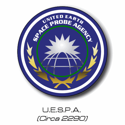
UESPA? In ENT era? Am I missing something here?
Masaki, is this cutaway of NX substantially different from known cutaways?
Posted by Topher (Member # 71) on :
For being a United Earth agency, the UESPA's logo is rather Amero-centric. Posted by Jason Abbadon (Member # 882) on :
Because we ROCK! ...and because no other agencies survived WWIII.
Posted by Reverend (Member # 335) on :
I think that UESPA logo dates back to the original "Cage" pilot, so it can be forgiven for the geography. Poor 60's isolationist yanks didn't know any better...and they're leant soooooo much since. Posted by machf (Member # 1233) on :
quote:Originally posted by Topher: For being a United Earth agency, the UESPA's logo is rather Amero-centric.
Well, it puts Peru at the center (more or less), so I won't complain this time...
Posted by japol (Member # 1149) on :
Reverend -
It's been said that Americans go to war to learn geography. Being slow learners it has taken us 100 years to get through Western Europe and the Arabian peninsula. I guess eventually we'll get to learn the whole globe.
I'm personally sorry about that.
But on the plus side, your logos rock. I've been lurking around watching your lovely work. Thanks for all the effort you've put into this.
Posted by Harry (Member # 265) on :
Wow. You really were spot on on that Mission Operations patch!
The UESPA logo as seen there is basically the same one as in the Encyclopedia. Still the wrong shape though, compared to the actual patch. Although to be fair, that actual globe is very strangely deformed.
Posted by Sarvek (Member # 910) on :
Reverend, you were really on target with all the patches that you have made and some if not all were done from screen captures, those are the challenging ones. Are you planning on making any new revisions based on the new patches seen in the Enterprise 2005 calendar?
Posted by Reverend (Member # 335) on :
No, because I already have.
And here's a new one I just made.
Posted by Reverend (Member # 335) on :
This one killed about 20 mins. TMP Cargo Labels Posted by aneurysm (Member # 906) on :
Shame you spelt LABELS wrong.
Posted by Reverend (Member # 335) on :
Not anymore I didn't.
Posted by Sarvek (Member # 910) on :
Totally awesome work Reverend. I can not wait to see more and great job on the labels. Posted by Jason Abbadon (Member # 882) on :
Have I ever told you that you do damn good work, Rev?
Any SSM-ers: please keep this under your hats: the judging is not untill the end of the months after all (there's sone really nice other entries already).
Posted by B.J. (Member # 858) on :
So that one's yours, huh? Very nice, I love the design. I saw it a few days ago when it was first posted at SSM. I have to ask, though, what's the thing sticking out from the side of the main trunk?
B.J.
Posted by Kazeite (Member # 970) on :
Anti-fog lights Posted by Reverend (Member # 335) on :
precisely what is it that you need Jason?
Posted by Jason Abbadon (Member # 882) on :
Just a logo like the triangular starbase logos you've already made that would reflect that it's for the R&D Facility.
Get as creative as you like: I'll transfer the logo to decal and replace the starfleet emblem with yours, take better pics and mabye make some photoshop composites....the usual.
If I can, I'll have Dave Tomita make the logo into an acrylic base nad mount the station on that instead of the black on it's on now to make a real showpiece.
The thing sticking out of the side is for hazardous materials testing/storage and is ejectable in extreme emergencies (inspired by DS9's pylons). /storage The station is more for new technologies and improving existing tech that dedicated to any longterm starship design project: this is where all those newly-built "NX" ships get tested, rebuilt and tested again by officers that just shakedown starships and vehicles.
Posted by Reverend (Member # 335) on :
How's this? Posted by Jason Abbadon (Member # 882) on :
((Shudder)) VERY cool. I dont know about "support services" though. It's a base for top secret tech...mabye "experimental design" or experimental testing" would work better.
It's bueatiful though! Me am very happy.
Posted by Harry (Member # 265) on :
You could also go for this R&D type insignia...
Posted by Jason Abbadon (Member # 882) on :
Also pretty cool, but I'm big on the red triangle logo design.
It'll look good on the drydock I'm building to go with the station....and on the station itself, of course.
Incredible, no?
Posted by Hobbes (Member # 138) on :
The flag (and logo) of the Starfleet Aviation Command. Granted Starfleet fighter craft are usually meant to give fanboys a hard on, I wanted to make a realistic approach to it.
I'm just posting the logo here. When I make more I'll create another thread about it with backstory and stuff.
Posted by Harry (Member # 265) on :
Aviation? Does that not imply aircraft, and therefore atmospheric craft?
Posted by Hobbes (Member # 138) on :
I asked a guy in an ensign in an E-2C Hawkeye, VAW-120, squadron about that who has been giving me pointers on Naval aviation squadrons. According to him aviation can refer to space as well.
The fighter craft I am designing would be usable in both subspace and atmospheric operations.
Primarily I was at a loss for what to call the squadron command to make it easily a different department of Starfleet starship operations.
I thought about Starfleet Fighter Command. But I assume Starfleet wouldn't use anything militant sounding. Kind of like why the Defiant-class is classified as an escort instead of destroyer, yet Starfleet uses words like cruiser and frigate which don't sound as threatening.
If you can think of a better name that would fit in that space go ahead. I'm open to suggestions.
Posted by Mr. Turnbull (Member # 1323) on :
quote:
Reverend, just thought i'd take this chance to say, WOW.
I've been viewing this topic for a while but just felt the urge to say how impressed i am.
(I know how this may leave me open for a newbie bashing but, meh )
Posted by Hobbes (Member # 138) on :
::Bashes newbie:: Don't quote images like that!
Posted by Harry (Member # 265) on :
'Aviation' is derived from avis, meaning bird. And birds certainly don't live in outer space.
If you don't want to use Fighter Command, what about something like Starfleet Tactical Support?
Posted by Bernd (Member # 6) on :
Here is some raw stuff to keep Reverend busy. Sorry, I was too lazy to remove the spaces from the file names.
quote:Originally posted by Harry: 'Aviation' is derived from avis, meaning bird. And birds certainly don't live in outer space.
What about the Great Bird of the Galaxy?
Posted by Jason Abbadon (Member # 882) on :
quote:Originally posted by Harry: 'Aviation' is derived from avis, meaning bird. And birds certainly don't live in outer space.
Tell it to the Romulans. Posted by Hobbes (Member # 138) on :
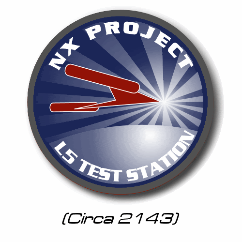
Or the bird in the NX Project logo.
Posted by Jason Abbadon (Member # 882) on :
Or the bird-guys from TAS.
Posted by Wes (Member # 212) on :
quote:Originally posted by Hobbes: Or the bird in the NX Project logo.
Beaten!
Posted by Hobbes (Member # 138) on :
Well if anyone can think of a better name for a command that is in charge of Starfleet's fighter squadrons prehaps Reverend could do a better job at making the top banner.
I'm having a hard time making text follow a path around the circle.
The two stars underneath the wings represent the rank of the SAC commanding officer, a two star Vice Admiral.
Yes I know a Vice Admiral has three stars in the Navy. I wanted to get rid of the whole Rear Admiral Lower Half and Rear Admiral Upper Half. I didn't want to use Commodore since Starfleet phased it out. The Navy uses Commodore as a title for an O-6 Captain that commands a small squadron of ships instead of just one. Whereas Admirals control Carrier Strike Groups and Fleets. So in this case: 1 Star = Rear Admiral, 2 Stars = Vice Admiral, 3 Stars = Admiral, 4 Stars = Fleet Admiral.
Posted by Topher (Member # 71) on :
Just because the rank isn't mentioned doesn't mean that it doesn't exist...
Posted by Jason Abbadon (Member # 882) on :
Hobbes, I like the logo but think you should tone down the feathers a bit: make them more graphic and limit their number to three-four per wing.
It would look less "airforce" nad more "TNG" that way.
Mabye just a slight mod on the TNG communicator pin would work.....it could be the emblem for planetary defense (instead of a logo representing all fighter squadrons everywhere).
Posted by Wraith (Member # 779) on :
quote:Originally posted by Topher: Just because the rank isn't mentioned doesn't mean that it doesn't exist...
And just because the USN does something, it doesn't follow that Starfleet does it.
Posted by Dat (Member # 302) on :
And let's just say that Hobbes is entitled to his own opinion even if he is in a small minority. I personally believe that there are 5 grades of admiral ranks, albeit with slight changes in the Rear Admiral names. I go with Read Admiral Lower Grade (RADML) and Rear Admiral (RADM). Forget the whole lower and upper halves deal.
C4 � Fourth Year Cadet C3 � Third Year Cadet C2 � Second Year Cadet C1 � First Year Cadet
CWO � Chief Warrant Officer WO3 � Warrant Officer Three WO2 � Warrant Officer Two WO1 � Warrant Officer One
MCPOS � Master Chief Petty Officer of Starfleet MCPO � Master Chief Petty Officer SCPO � Senior Chief Petty Officer CPO � Chief Petty Officer PO1 � Petty Officer First Class PO2 � Petty Officer Second Class PO3 � Petty Officer Third Class CMN � Crewman CA � Crewman Apprentice CR � Crewman Recruit
Posted by Bernd (Member # 6) on :
I am uploading the Hur'q now.
Posted by Hobbes (Member # 138) on :
I didn't intend to start a discussion on ranks. Simply I never liked the idea of two different types of Rear Admiral.
Titles like Commodore and Fleet Captain seem to me just that, titles, not ranks.
I've got the basic sketch of the Class 5 Type 19E fighter that will be stationed onboard my ship, USS Pioneer. But that will be started in another thread.
As for the wings in the SAC logo, I know they're a bit modern. I tried making a more angular style, but it didn't look as good.
Posted by Reverend (Member # 335) on :
I think I did something to the effect of a starfleet fighter command logo a while back. Hang on I'll check....
How about this?
Thanks for that Bernd, i did get your e-mail a while back but Outlook is refusing to let me reply to anything. Appologies to all those who are feeling ignored!
As for rank, I vote for Colonel. It would certainly explain Col West's presence in the UFP president's office along with Starfleet's C&C and Admiral Cartwright (the head of SF operations?). It might also tie in with his apparant authority on covert opps and insertion tactics. Which it could be argued that in the trek universe you'd need small fighter sized craft for. Remember to take a page out of the book of Straczynski, in that this is a space organisation, not the navy and it should show historical influences from other formerly planet bound military services.
Posted by Jason Abbadon (Member # 882) on :
wow.
Posted by Reverend (Member # 335) on :
UPDATE
Some new, some reformatted oldies. Posted by Jason Abbadon (Member # 882) on :
Bueatiful...but I still thing "support services" might look better in the same point-size as "Starfleet Operations".
Posted by SoundEffect (Member # 926) on :
That's the way they are Jason. The lengths of the words on each side are the same, not the font sizes.
Posted by Masao (Member # 232) on :
Rev, the planets in the Titan Fleetyards patch seem a bit off. The orange sphere in front looks like it has a nipple at the top. The dark band (looks like a fox tail) on Saturn contrasts too much with the rest of the bright side. With that dark a shadowed half, the planet would also be casting a shadow on the rings. Finally, the shading on the grey moon doesn't match that of the other spheres.
Posted by Jason Abbadon (Member # 882) on :
quote:Originally posted by SoundEffect: That's the way they are Jason. The lengths of the words on each side are the same, not the font sizes.
Yeah, I see what you mean. I'm buying the acryllic next week to transfer the R&D patch onto....itll be an amazing base for the model.
I am very psyched and grateful to Rev for the work he put in.
Thanks again.
Posted by The Captain from M.I.K.E. (Member # 709) on :
quote:Originally posted by Reverend: http://flareupload.pleh.net/uploads/335/Starfightcom.gif
holy shit! Posted by AndrewR (Member # 44) on :
Any Hur'q on the horizon?
Posted by Wes (Member # 212) on :
A bit of ye old 29th century? This one is non-canon, however. Posted by Harry (Member # 265) on :
TEMPORAL DOOOOOM!
Posted by Fleet-Admiral Michael T. Colorge (Member # 144) on :
It makes me wanna build up my USS Relativity model... but alas I don't know much about resin.
Posted by Harry (Member # 265) on :
Federation Star Stations, TMP-era...
Posted by Fleet-Admiral Michael T. Colorge (Member # 144) on :
Hmm, no Star Station India? Wait, that's from TNG. Nice logos either way!!! Keep up the excellent work, like totally.
Posted by Harry (Member # 265) on :
Those three Star Stations are from Ships of the Star Fleet. India is from TNG. So it's totally not a typo.
Posted by Hobbes (Member # 138) on :
So how I figure there would be an outline of Texas for anything named 'Dallas'.
Posted by Harry (Member # 265) on :
Well, it has the colors of the Texan flag. I originally had a white five-pointed star in it too.
Posted by Jason Abbadon (Member # 882) on :
quote:Originally posted by Fleet-Admiral Michael T. Colorge: It makes me wanna build up my USS Relativity model... but alas I don't know much about resin.
You are scratchbuilding it? I know of no Relativity model made for sale though one is in the works.
No one makes the master of the model from resin (generally)- use Blue Foam insulation and carve from there. Posted by Fleet-Admiral Michael T. Colorge (Member # 144) on :
No, it's been created by my friend. She's the one who created it for me in a manner I don't know of.
Posted by Jason Abbadon (Member # 882) on :
She? Huh. I thought I knew all the talent out there. Got a pic of the model? If it's resin I can give you some tips on it's painting and construction. If it's good, she should consider selling the master to SSM or someone that would produce the model as a kit.
Posted by Reverend (Member # 335) on :
I knew I forgot to upload something.
Posted by Fleet-Admiral Michael T. Colorge (Member # 144) on :
Jason, it's a crappy model actually... a reason for which I haven't bothered to build it.
Posted by Jason Abbadon (Member # 882) on :
Hmmm....you'd be shocked how nice a crappy model can turn out with some tweaking.
Still, if you long for the relativity, there should be one available by may of next year.
In 1400th scale (at a guess it'd be 8-9" long).
Rev, the Andromeda patch looks cool but the fried egg look of the galaxy is kinga odd. I really like the addition of the classical figures in there though.
Posted by Masao (Member # 232) on :
Nice work, Harry. My only suggestion would be to have the border of the between the word ring and the inside be the same as the outside of the word ring. For example, add another blue/white edge to the outside. Not essential, though.
Rev: Is that an oyster shell with a pearl
Posted by Reverend (Member # 335) on :
It's supposed to be the Andromeda galaxy, but it looks like someone sneezed on a fried egg. Drawing galaxies iz hard don't you know.
Posted by Jason Abbadon (Member # 882) on :
Yah. I know: I'm just re-learning Illustrator myself. GIve me a few weeks and I'll be able to draw a nice rectangle (if I use the rectangle tool...mabye).
Posted by jesus X (Member # 1201) on :
Jason: dude, I picked up Illustrator in an hour. Of course, I know PS to start with, so it helps, but still I was able to crank these out in a couple nights: http://burntelectrons.org/media/moz-posters/
The PNGs are just previews of the PDFs. They're 2:3 ratios, suitable for printing on 24x36 inch paper.
I didn't make the red dino, I'm not claiming to. I just had to clean it up from the original SVG.
Posted by Reverend (Member # 335) on :
UPDATE
Posted by Sarvek (Member # 910) on :
Awesome work Reverend. I especially like your Colonial Admistration one. It makes me think of the phase: "wagon train to the stars." Keep up the awesome work and I can not wait to see more of your creative works of art. Posted by Dat (Member # 302) on :
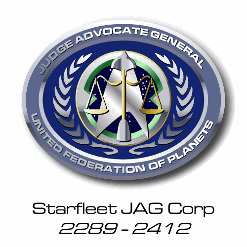
Nice logos Rev. I'd liked to one day see the seal of Starfleet's JAG corp.
Posted by Reverend (Member # 335) on :
Give me a minute.
Posted by Reverend (Member # 335) on :
How's this?
Posted by Sarvek (Member # 910) on :
Amazing. Great work Reverend.
Posted by Hobbes (Member # 138) on :
Is that the Vulcan weapon used in "Amok Time" in the center of the arrowhead?
Posted by Jason Abbadon (Member # 882) on :
Sure looks that way! Nice to see two race's judicial emblems in a Starfleet logo for once!
Posted by Jason Abbadon (Member # 882) on :
quote:Originally posted by jesus X: Jason: dude, I picked up Illustrator in an hour. Of course, I know PS to start with, so it helps, but still I was able to crank these out in a couple nights: http://burntelectrons.org/media/moz-posters/
The PNGs are just previews of the PDFs. They're 2:3 ratios, suitable for printing on 24x36 inch paper.
I didn't make the red dino, I'm not claiming to. I just had to clean it up from the original SVG.
Yeah, I was being silly: I use Illustrator for text and basic imagry to make my model's decals every week: i just dont have the program at home so i cant practice much with it. Posted by jesus X (Member # 1201) on :
quote:Originally posted by Jason Abbadon: Sure looks that way! Nice to see two race's judicial emblems in a Starfleet logo for once!
the Vulcans would demand equality, excelt that would be illogical since they feel they are superior. Posted by Dat (Member # 302) on :
Now that's one great JAG logo!
Posted by AndrewR (Member # 44) on :
quote:Originally posted by Reverend: It's supposed to be the Andromeda galaxy, but it looks like someone sneezed on a fried egg. Drawing galaxies iz hard don't you know.
It looks like something growing on an agar plate after you've sneezed on it and left it incubating at 37`C for a week. Posted by AndrewR (Member # 44) on :
quote:Originally posted by Reverend: UPDATE
Are any of these 'official' - seen in the background somewhere? Sometimes it'd be nice to have the official ones given a little asterix or something! VERY nice work.
*cough* Hur'q *cough*
Andrew
Posted by Harry (Member # 265) on :
So did the baseball team steal the logo from the colonization administration, or vice versa? IMSHO it's perhaps a bit too playful for a government seal.
But you make up for it with the JAG-with-lirpa-logo Posted by Reverend (Member # 335) on :
quote:Is that the Vulcan weapon used in "Amok Time" in the center of the arrowhead?
Yes, a Lirpa I belive it's called. I originally had a standard human style sword, but this weapon occured to me at the last minute. It always reminds me of that classic music score. De-de-de-de-de-de-DE-de-de-de...BBBrrrrAHAH...BBBrrrrAHAH!!!
quote:Nice to see two race's judicial emblems in a Starfleet logo for once!
I'm all about multiculturalism.
quote:Are any of these 'official' - seen in the background somewhere? Sometimes it'd be nice to have the official ones given a little asterix or something! VERY nice work.
Normally I don't like to distinguish since I like my own designs to "blend in". However since you asked, in this instance all the ones on the last page are official, except the JAG and colonial admin logos.
quote:So did the baseball team steal the logo from the colonization administration, or vice versa? IMSHO it's perhaps a bit too playful for a government seal.
The former I'd imagine. I know it doesn't have that Government feel, but I felt that frontier worlds are a little looser when it comes to these things. Aside from that I couldn't think of a suitable abstract symbol to take it's place.
Posted by Hobbes (Member # 138) on :
So ... is that it?
Posted by AndrewR (Member # 44) on :
HUR'Q!
Posted by Reverend (Member # 335) on :
Nope. Posted by Harry (Member # 265) on :
Woah, dude! That's like, so totally ex astris scientia, man! Like, peace from the stars or something! Woah...
Posted by Reverend (Member # 335) on :
Well I was going for the 60's feel.
UPDATE (No Hur'q, stop asking!)
A little extra something. Klingon House Symbols Posted by The Mighty Monkey of Mim (Member # 646) on :
Your "extra" doesn't seem to be working. And out of curiosity, what do you have against the Hur'q? Could it be the same thing you have against the Constitution? Posted by Reverend (Member # 335) on :
Pretty much.
Posted by Jason Abbadon (Member # 882) on :
quote:Originally posted by The Mighty Monkey of Mim: . And out of curiosity, what do you have against the Hur'q? Could it be the same thing you have against the Constitution?
Yeah! Fuck all those ammendments anyway!
Oh wait...
Posted by Topher (Member # 71) on :
That should be "Noble" houses. Unless, of course, they're all houses belonging to Alfred Nobel...
Posted by Reverend (Member # 335) on :
There's just no pleasing some people.
Posted by B.J. (Member # 858) on :
More great work, as usual, Rev! BTW, is that extra spike on the top of the flag version of Gorkon's seal supposed to be there? B.J.
Posted by Reverend (Member # 335) on :
Saw this at SSM yesterday: VERY "Starfleet".
Posted by Harry (Member # 265) on :
So.. that's real!?
The delta is also on the CNSA emblem, and like Ro Aries said, the top part is a Soviet symbol.
Posted by B.J. (Member # 858) on :
I think the new space badge brings the design more in line with other branches of the air force.
See here for some examples. The three on the bottom of the page are the current space badges. If you'll notice, the star on top designates senior level, and the star plus wreath designates command. Without either is standard for everyone else. This seems to be common for all types of badges. (Edit: I've occasionally been having trouble connecting to the AF server, so if the above link doesn't work, try again.)
This page also shows a good comparison of different AF badges.
B.J.
Posted by japol (Member # 1149) on :
Actually, the arrowhead has been used for a while at NORAD. US Space Command (yes, there actually is one) has it in it's sheild:
And yes, the new badge is official... it merely awaits final approval from the brass.
Posted by Hobbes (Member # 138) on :
It's a cool design. It's no surprise those Air Weenies came up with it. The desk jockies of the US military. They seem to spend more time playing in Photoshop then doing any actual work!
Posted by AndrewR (Member # 44) on :
Yeah, why no Hur'q? Too intricate? It doesn't look as intricate as your House of Gorkon seal.
Posted by AndrewR (Member # 44) on :
There was another 'emblem'/'logo' i saw recently might have been part of NASA (it had that red arrow-head they always use) but it had the Earth and behind it, the Moon, Mars and the Sun.
That Airforce Space division logo looks like something from some 1930's Sci Fi program - Flash Gordon or something!
I suppose they DO need to have one now, with the Launch of the X-302's and the X-303/Prometheus.
Posted by Sol System (Member # 30) on :
quote:Van found it rather weird to meet a no-kidding, real-life general from a "Space Force." It was weirder yet that America's Space Force had bases all around the world, with forty thousand service personnel. America's Space Force was twenty years old. Why had he never seen any Space Force soldiers in any war movies? Or TV programs, either. Not even The X-Files.
The Zenith Angle, by Bruce Sterling
Posted by Harry (Member # 265) on :
Space Force and the World of Tomorrow !! Posted by Kobi (Member # 1360) on :
Due to the "New Voyages" Episode I saw the need to recreate the insignia of the Farragut as it was displayed in the "Enterprise Officer's Manual" and the "Uniform Recogniton Manual" (and add the correct registry to the ship)
Posted by Reverend (Member # 335) on :
quote:Originally posted by AndrewR: Yeah, why no Hur'q? Too intricate? It doesn't look as intricate as your House of Gorkon seal.
Oh do be quiet. There's a good chap.
Posted by Jason Abbadon (Member # 882) on :
Rev's just not gonna give you the Hurq emblem: it keeps you comming back or more after all. Posted by AndrewR (Member # 44) on :
That Farragut emblem looks like Charles' 0_o Posted by Kobi (Member # 1360) on :
quote:Originally posted by AndrewR: That Farragut emblem looks like Charles' 0_o
Maybe he used the same reference I did Posted by AndrewR (Member # 44) on :
quote:Originally posted by Jason Abbadon: Rev's just not gonna give you the Hurq emblem: it keeps you comming back or more after all.
He's not going to do it because he's either an anti-Hur'qite or can't do it.
Posted by Reverend (Member # 335) on :
Yes, you're right, I'm totally incapable. Happy now?
Posted by Topher (Member # 71) on :
Its because you want it done so badly that he won't do it. Leave him alone!
Posted by AndrewR (Member # 44) on :
I also did a door, both closed and open , but I never used them as I originally intended...
Posted by Mr. Turnbull (Member # 1323) on :
Nice work there harry, on the Imperial Teran Empire.
Looks 100% accurate
Posted by japol (Member # 1149) on :
So I imagine someone is scrambling to get a nice shot of the NX-02 COLUMBIA patch from "Home."
Posted by The Mighty Monkey of Mim (Member # 646) on :
It wasn't seen distinctly in the episode, but according to Mike Okuda (who is now posting on the TrekBBS along with Rick Sternbach! ) startrek.com will be putting up an image of it soon. He also revealed that Malcolm's buddy's patch from way back in "Silent Enemy" was actually a NASA patch for the new Mission Control Center at the Johnson Space Center.
Okuda's post is here, and an image of the MCC patch is also in the thread.
quote:I believe that Startrek.com will be posting the art for the Columbia patch in the near future. And Trips' friend's diamond-shaped shoulder patch was actually a NASA patch for the new Mission Control Center at the Johnson Space Center, courtesy of Ground Control officer William Foster.
-Mike
-MMoM Posted by Hobbes (Member # 138) on :
I kind of like these. I can't decide which I like more, maybe the NX-02 one.
Posted by Topher (Member # 71) on :
I think the NX-01 got the shaft when it comes to logo coolness factor.
Posted by Lee (Member # 393) on :
Actually, the other designs, while nice, all have too many protrusions to make good shoulder patches.
Posted by Hobbes (Member # 138) on :
I agree, except for the NX-03 one. I could see that as being easily made into a patch.
Posted by Dat (Member # 302) on :
Wouldn't Challenger come before Discovery?
Posted by The Mighty Monkey of Mim (Member # 646) on :
Yes. As a matter of fact, if you wanted to be reeeeeally technical about it, it *could* have come before Columbia as well. But the most sensical scheme would be:
You might throw a Buran and Pathfinder in there just for kicks, as well.
Posted by B.J. (Member # 858) on :
Which brings up a question (for me, anyway) - Is Buran the name of one specific spacecraft, or would it have been the name of their entire line of shuttles, just like Soyuz is the name of the current spacecraft line?
B.J.
Posted by Harry (Member # 265) on :
Buran was the name of the first orbiter. The second was to be called Ptichka, and the third was cancelled before getting a name.
Posted by Kobi (Member # 1360) on :
If named after shuttles, Phoenix should also be a name, not named after Cochrane's warp vessel but EADS Phoenix Posted by AndrewR (Member # 44) on :
quote:Originally posted by Harry: Buran was the name of the first orbiter. The second was to be called Ptichka, and the third was cancelled before getting a name.
Buran translates to Snowflake doesn't it? I've never heard of Ptichka! cool - what does that translate to?
Was there a SUGGESTION for the third Soviet Space Shuttle?
And Enterprise -> Columbia -> Challenger (Space Shuttle Launch Order?) what was next Discovery -> Atlantis -> Endeavor? And was it Endeavor or Endeavour?
In that thread about patches at that TrekBBS board they said that OV-101 was Enterprise, OV-102 was Columbia but Challenger was something-99 - what's up with that was it built before Enterprise?
Posted by AndrewR (Member # 44) on :
quote:Originally posted by B.J.: Oh to hell with it....
I did this just to shut him up. And I did it in POWERPOINT.
B.J.
Shut Me UP!?! Now I won't complement you on your nice picture. D'oh.
Nice, but could be better. Rev would have done a nice one.
Posted by Captain Boh (Member # 1282) on :
I belive Buran translates to Showstorm, but I could be wrong.
Posted by Jason Abbadon (Member # 882) on :
"Showstorm"?!? Sounds like a COBRA operative. Posted by The Mighty Monkey of Mim (Member # 646) on :
quote:Originally posted by AndrewR: And Enterprise -> Columbia -> Challenger (Space Shuttle Launch Order?) what was next Discovery -> Atlantis -> Endeavor? And was it Endeavor or Endeavour?
In that thread about patches at that TrekBBS board they said that OV-101 was Enterprise, OV-102 was Columbia but Challenger was something-99 - what's up with that was it built before Enterprise?
Challenger was originally a structural test article (STA-099) and was later converted into an orbiter. (OV-99) Despite the lower number, it wasn't built before Enterprise, though. The orbiters as launched were as follows:
Me = ["tired, slow"];
Posted by Harry (Member # 265) on :
while (true) { skip; }
Posted by AndrewR (Member # 44) on :
Cool, so do you reckon they should go the 'rollout' order for the ships on Enterprise?
When did Buran launch - before the Endeavour was built? Was Ptichka completed? Is the one now in Gorky Park - or is that Buran?
Andrew
Posted by Dat (Member # 302) on :
The order to NASA was to have two operational space-worthy shuttles. The first was to have been named Constitution but was renamed Enterprise after a letter campaign by Trek fans made President Ford have NASA rename the shuttle. During construction of Columbia, it was decided not to refit Enterprise to space-worthiness. Because of that, they converted STA-099 to space-worthiness and named it Challenger (along with a re-registration) to fulfill the two shuttle requirement.
As for Buran, it was completed and flown by remote in 1986 I believe. It was never flown again because the Soviets found it to be too costly to continue with the project. Ptichka was never completed. Construction never started on shuttle 3. As for Endeavour, it was assembled from replacement parts (yes, you read correctly) and a complete crew cabin from the 1970s (the replacement parts originate from the 1980s). It was completed and launched in 1991 or 1992.
Posted by AndrewR (Member # 44) on :
So why was Enterprise not used as a space-worthy shuttle - they wanted to keep a memento? A way to have a third shuttle? Was the original condition of Challenger akin to what Enterprise was? Enterprise was all along going to be an actual space-flight shuttle? There must have been a reason not to put Enterprise into space?
Are the NASA Space Shuttles - essentially "Enterprise Class"? Posted by Jason Abbadon (Member # 882) on :
I think the "Enterprise" was always the "parts shuttle" that was never fully completed but used to service the others. All the shuttles were made to have swappable modules to some degree.
Posted by Ace (Member # 389) on :
And in addition, for all you ever wanted to know about spacecraft the world over, one of my favorite sites: Encyclopedia Astronautica. Posted by Jason Abbadon (Member # 882) on :
Hell of a lot of linked Trek refrences at Wikipedia.....
None of them seem to involve me directly though. Jerks.
Ever google yourself for images? Lots of scary scary people have my name it seems.
Posted by AndrewR (Member # 44) on :
Thanks for the links everyone!
Remember a while back - someone here was trying to get a Trek wikipedia thing started - that's the first time I had heard of wikipedia... It was self-editable - you know what I mean. Is that what the Trek links... link to? Did that ever get off the ground?
Posted by Harry (Member # 265) on :
Ehh.. yes.
Memory Alpha. We've just moved to a new server to cope with the traffic, so you might say we are 'off the ground'.
Posted by Cartman (Member # 256) on :
"Hell of a lot of linked Trek refrences at Wikipedia....."
Yeah, too many. WP should be restricted to content about the real world, not fictional ones. That's what projects like Memory Alpha are for. I mean, you don't consult a general knowledge printed encyclopedia if you want to know the ins and outs of a Galaxy class starship either.
(Not since 1999 have I consulted a general knowledge printed encyclopedia.)
Posted by Kobi (Member # 1360) on :
quote:Originally posted by Harry: Ehh.. yes.
Memory Alpha. We've just moved to a new server to cope with the traffic, so you might say we are 'off the ground'.
Even though the English version is going well, the Dutch and German ones are still seeking for contributors Posted by AndrewR (Member # 44) on :
WD for getting 'off the ground'!
So does the normal Wikipedia link to Memory Alpha or they are just based on the same 'idea'/'code'/'computer language'/'computer idea thingy whatchamajiga'?
Posted by Sol System (Member # 30) on :
We use MediaWiki, which is the same code as Wikipedia uses. MA is hosted by one of Wikipedia's many developers, allowing us to keep the code up-to-date with regards to Wikipedia.
So we are not part of Wikipedia, but just use the same code. Although the majority of Star Trek-related stuff on Wikipedia now has a link to the related Memory Alpha page Posted by AndrewR (Member # 44) on :
Cool. If I get around to getting of my fat procrastinating arse, I might help out! Posted by Hobbes (Member # 138) on :
I can't remember if i posted this or not, so hopefully not.
My's website is coming up on it's 6th anniversay this month. I've been going through it updating the pages, cleaning them up, adding a little more color. When I started it occured to me that I've never had a logo for my site, I just used the regular UFP seal. I asked the Rev for his help but wasn't sure what I wanted. Eventually I came up with this using that nifty little Constitution-class silhouette. I wanted to give it a compass-like appearance since Star Trek has tried following other nautical traditions.
Posted by B.J. (Member # 858) on :
Looks very cool, Hobbes. I especially like the 3D look for the starfield part. However, my first thought about the ring was that it reminded me of the Stargate. Maybe if you make the 4 points more arrow-like, extending over the edge some it would lose the Stargate feel.
B.J.
Posted by The Mighty Monkey of Mim (Member # 646) on :
Unless of course you want the Stargate feel... Posted by Masao (Member # 232) on :
Yeah, it doesn't look especially compassy. It looks more like a clock, particularly with the intermediate ticks in the position of numbers rather than the positions of compass directions. You might consider putting NSEW at the cardinal points.
Posted by Hobbes (Member # 138) on :
Nothing wrong with that Stargate-feel, though unintentional.
Posted by Reverend (Member # 335) on :
Ok, now that I have a better idea of what you want (and a little free time between colouring comic books). Here's a draft with a more nautical feel. Personally I think this looks more like the symbol for the Federation Naval Patrol than a database about starships. Just to throw a few ideas into the mix and for the benefit of everyone else, this is the first shot I made back when Hobbes originally ask for help. Posted by The Mighty Monkey of Mim (Member # 646) on :
Both look good, but I like the brighter colors of Hobbes' original. Yours looks a little washed out, though I know your goal was a more realistic mettalic look.
The second one is great, but the assymmetry of the lettering makes it look lopsided. I might opt to move "STARSHIP DATALINK" to the center at the top, and shrink "UNITED FEDERATION OF PLANETS" to fit at bottom-center. Alternatively, perhaps the top lettering should read "FEDERATION STARSHIP" and the bottom just "DATALINK," since that would fit better and it *is* the actual name of Hobbes' site. I wonder if using the little Connie instead of the ball might work in this case, as well. And perhaps the red swoosh would add a nice color contrast if you made the outlines on the ellipse black instead of red. But it might be better left alone, as well.
-MMoM Posted by Hobbes (Member # 138) on :
The main thing I disliked about the second logo which was the first Rev made for me was the fact I have no clue what that symbol in the center means.
Basically I wanted to create a logo that was distintive to my site and seeing it alone would you know it as the FSD symbol. I've worked my new logo posted above into many of the header graphics. Like this as the header for my Starship Database class directory. As you can tell, that can be resized small and still easily recognizable.
However, I really love the new logo you made Rev. My only nitpick is change the background color behind the olive branch leaves of the UFP symbol. The main two shades of blue I use on my site is #004477 and #012643. Mostly because I think if I resized it smaller I think the leave or whatever they are would get kind of lost into the gray background color.
Posted by The Mighty Monkey of Mim (Member # 646) on :
quote:Originally posted by Hobbes: The main thing I disliked about the second logo which was the first Rev made for me was the fact I have no clue what that symbol in the center means.
I interpreted it as two computers interlinking and exchanging data, thus datalink.
Posted by Harry (Member # 265) on :
Cold Station 12:
That second word after EARTH reads DENOBULA.
Posted by Reverend (Member # 335) on :
Easy.
quote:I interpreted it as two computers interlinking and exchanging data, thus datalink.
Got it in one.
Next shot. Posted by Reverend (Member # 335) on :
Ok, here's something I'm doing for TrekBBS's November art contest. What I need from you folks is reference regarding the lettering and any possible logos for the Tellarites. I've not been keeping track of "Enterprise" so I don't know what's cropped up since the begining of the Xindi story that might be useful to this effect.
Posted by The Mighty Monkey of Mim (Member # 646) on :
Nothing seen for the Tellarites so far, Rev, but there are upcoming season 4 eps that will feature them and may show something more. Will you be including the independent Proxima/Alpha Centauri colonies as a signer as well, as per tradition and the article from Picard's scrapbook in GEN?
Posted by AndrewR (Member # 44) on :
In DS9 Sisko gives a broad definition of the UFP.
In "Battle Lines" Season 1:
"The Federation is made up of over one hundred planets whose people have allied themselves for mutual scientific, cultural, and defensive benefits."
Posted by AndrewR (Member # 44) on :
I think Alpha Centauri/Proxima colonies should be included. In season 3 Enterprise - Daniels only mentioned Vulcans, Tellerites and Andorians - one could say he didn't say the colonies as they are human colonies?
Posted by Harry (Member # 265) on :
This is the closest we get to Tellarite lettering:
Posted by Kobi (Member # 1360) on :
Don't tell me those ugly lines are now canon Andorian font better go to Cobalt Blue, scroll down to "Toys for Star Trek Gamers" and download Graalek font!
other than that the declaration looks like a very convincible document
Posted by AndrewR (Member # 44) on :
Where do we see 'Andorian' script?
Posted by AndrewR (Member # 44) on :
Re: The Andorian symbol/logo... does that match any known Crop-circle design? Maybe that band of rogue Andorians is to blame for the phenomenon!?! Posted by Reverend (Member # 335) on :
There is some Andorian Script on the Crop Circle/Solar System logo seen on "Enterprise". I just picked a weird looking font that was passably similar.
UPDATE Posted by Jason Abbadon (Member # 882) on :
Someone named "Vanderbuilt" signed for Earth? I hope he was dressed tastefully...
Posted by Reverend (Member # 335) on :
Whoa... too much blue. The prior version was better, I just meant adding blue behind the leaves of the UFP seal.
Posted by Masao (Member # 232) on :
Rev, the human signatures look too much like fonts. You'd be better off scanning or tracing an actual signature. Consider also the use of alternate forms of "signing," such as the fixing of personal seals/signets or thumbprints.
Posted by Wes (Member # 212) on :
I thought Archer signed this?
Posted by Captain Boh (Member # 1282) on :
Is the IDIC the symbol of Vulcan? I thought it was just a Vulcan symbol
Posted by Jason Abbadon (Member # 882) on :
The IDIC is the 22nd century symbol of the Freemasons.
The Vulcans just adopted it because they like the loose robes and secret handshakes.
Posted by Kobi (Member # 1360) on :
Why is it that the Alpha Centauri colonies have a Lambda in their logo??
Posted by DoughBoy05 (Member # 1417) on :
Are you sure that isn't a capital "A"
Posted by Kobi (Member # 1360) on :
quote:Originally posted by DoughBoy05: Are you sure that isn't a capital "A"
Uhm, yes the Latin A is the same as the Greek A(lpha) What we see there is 100% a capital Lambda
Posted by Reverend (Member # 335) on :
quote:Rev, the human signatures look too much like fonts. You'd be better off scanning or tracing an actual signature. Consider also the use of alternate forms of "signing," such as the fixing of personal seals/signets or thumbprints.
Don't worry, those were just placeholder/guides so that I could redo them as freehand vector paths.
quote:I thought Archer signed this?
Funny.
quote:Is the IDIC the symbol of Vulcan? I thought it was just a Vulcan symbol
Seams to be. I've never seen them use any other symbol.
quote:Why is it that the Alpha Centauri colonies have a Lambda in their logo??
Because I'm dyslexic.
UPDATE Posted by The Mighty Monkey of Mim (Member # 646) on :
You might consider using the more period-specific United Earth emblem seen in the recent ENT episode "Home," although now that the Fotopic site is gone I'm unsure of where you'll get a screencap. I think Topher provided some additional ones from that ep, maybe he still can....
Posted by Sarvek (Member # 910) on :
Reverend, here is an image from the Enterprise episode "Home" of the United Earth logo.
What the hell does a single olive branch signify? Only peace for the Western world?
Posted by Reverend (Member # 335) on :
quote:You might consider using the more period-specific United Earth emblem seen in the recent ENT episode "Home,"
*looks at screen cap* Lazy gits. I'll stick with what I've got thanks.
Posted by Odysious (Member # 1180) on :
Here is my take on the United Earth logo seen in the Enterprise episode Home.
This is a first for me so please be kind. I would like to give credit to Rev. I used the olive branch from one if his UFP logos as a template for this one.
Posted by machf (Member # 1233) on :
To me it looks like there are indeed two branches, but the second one is obscured by the globe, as it lies in front of them, not on the same plane (look at the bottom right of the globe).
Posted by Captain Boh (Member # 1282) on :
We get another look at the logo next week. Lets hope for some answers
Posted by Harry (Member # 265) on :
It looks better here than on the podium. Strangely enough, the gold and blue colors are actually consistent with the rare glimpses of an Earth logo in "Where No Man Has Gone Before"...
Posted by Fleet-Admiral Michael T. Colorge (Member # 144) on :
It looks like the reverse of the Federation flag that draped Jadzia's casket.
Posted by Dat (Member # 302) on :
Well, if the logos on the flags are centered along the width of the caskets, then it really does have only one olive branch.
Posted by Kobi (Member # 1360) on :
quote:Originally posted by Dat: Well, if the logos on the flags are centered along the width of the caskets, then it really does have only one olive branch.
It looks like the designer was out of ideas when he/she receicled the ufp flag of the 24th century Posted by The Mighty Monkey of Mim (Member # 646) on :
(For the record, I think it looks fine.)
Posted by Reverend (Member # 335) on :
Make of this what you will but I think it feels a little too obvious and somewhat uninspired. That aside I have to admit that I have no real technical criticisms, just a creative difference.
Posted by The Vorlon (Member # 52) on :
There IS only one.
Posted by Nim' (Member # 205) on :
I haven't watched that ep but I suppose they died from a terrorist attack? By religious fundamentalists? I wonder if there was any eulogy in that ep, containing the word "freedom"?
Posted by Topher (Member # 71) on :
That's a first: actual coffins on Star Trek, rather than torpedo casing...
Posted by Harry (Member # 265) on :
quote:Originally posted by Nim': I haven't watched that ep but I suppose they died from a terrorist attack? By religious fundamentalists? I wonder if there was any eulogy in that ep, containing the word "freedom"?
Actually.. no. Just Soval and Archer agreeing over a closer relationship between Vulcan and Earth, because that's what Forrest was trying to achieve.
Posted by DoughBoy05 (Member # 1417) on :
Did any one get a good look of the mission patch on the Corporal on guard
Posted by Captain Boh (Member # 1282) on :
I think it might have been a modified version of the above United Earth symbol, but I could be wrong
Posted by machf (Member # 1233) on :
quote:Originally posted by The Vorlon: There IS only one.
Yes, and it looks awkward... There seems to be a hint of a circle outline around the other side, though...
Posted by Odysious (Member # 1180) on :
quote:Originally posted by DoughBoy05: Did any one get a good look of the mission patch on the Corporal on guard
From the looks of it, it is the United Earth Logo, olive branch on one side and the lettering United Earth Embassy on the other.
Something like this. I think.....
Posted by DoughBoy05 (Member # 1417) on :
Cool
Posted by AndrewR (Member # 44) on :
So the East, Australasia and Alaska aren't there. Great. So much for UNITED Earth! (And don't quote that line by Beverly about Australia holding out - cause it's past that time and plus it was just a hypothetical by her.)
Posted by DoughBoy05 (Member # 1417) on :
Hey! I can see my house from here!
Posted by Harry (Member # 265) on :
quote:Originally posted by AndrewR: So the East, Australasia and Alaska aren't there. Great. So much for UNITED Earth! (And don't quote that line by Beverly about Australia holding out - cause it's past that time and plus it was just a hypothetical by her.)
Well, it's one step forward of TOS, which only had the Americas on the United Earth badge..
Posted by Sol System (Member # 30) on :
So, what, now the very shape of the Earth is somehow involved in an anti-antipodes conspiracy?
Posted by AndrewR (Member # 44) on :
why of course and you must be smiley-blind.
Posted by Sol System (Member # 30) on :
Oh, if only.
Posted by Reverend (Member # 335) on :
Ok, here's a few new ones and one not so new one.
The "OPSEC" logo was made at the request of Hobbes. I think he wanted something more original but I'm under serious time constraints with my DKA work (15 pages in as many days!) so I took the lazy option.
And yes, the DI letterhead is from an onscreen source. In this case that trusty Picard family album.
Posted by Reverend (Member # 335) on :
UPDATE updated the OPSEC logo with something a little more elaborate.
Posted by B.J. (Member # 858) on :
Hmm... Personally I think that the update looks way too busy. There's too many overlapping elements in there. And I think you need to fix the fill on the gold arrowhead. That radial fill as it is just doesn't look right.
B.J.
Posted by Hobbes (Member # 138) on :
First off, sorry for asking Rev, didn't know you were that busy. Although it wasn't a rush request that I needed today, tomorrow, or even next week.
Anyway, for everyone else, this is what I originally had, even though the text is wrong. It should be more like: Department of Starfleet Intelligence - Operations Section.
After watching shows like Alias, La Femme Nikita, 24 the idea of a Star Trek based covert anti-terrorist intelligence group seemed like it could be a cool idea.
Posted by Reverend (Member # 335) on :
Another update. Scroll up to view.^ I'm not a big fan of having all Americanized logos for the Federation or Starfleet, so I'll try and avoid too many direct correlation with the CIA or NSA or whatever secret agency logos.
Posted by AndrewR (Member # 44) on :
quote:Originally posted by Hobbes: After watching shows like Alias, La Femme Nikita, 24 the idea of a Star Trek based covert anti-terrorist intelligence group seemed like it could be a cool idea.
Team Federation??
*sings* Federation, fuck yeah... Posted by Hobbes (Member # 138) on :
I'll give it another shot. I really like the silvery metallic look like on the olive branch. I'm not sure how to accomplish that with Photoshop.
Posted by Odysious (Member # 1180) on :
I know no ones posted on this thread for a while. But with the latest Enterprise episode we got a pretty good look at the patch for the NX-01.
Here is my receation of it.
Posted by B.J. (Member # 858) on :
Not bad at all! Actually looks pretty close to me. Only two things: you're missing a star near the U in COLUMBIA, and your border needs some anti-aliasing.
Thanks for the comments B.J. The star was there before but I must have deleted it accidentaly when working on it. I also added the anti-aliasing I usually have this on but .... I don't know.
Hope you all like.
Posted by Wes (Member # 212) on :
NX-09!?!?!?
Posted by Dat (Member # 302) on :
And? Who's to say the mirror universe couldn't be up to their 9th NX class ship? It's quite possible their class was started much sooner and the ships were built simultaneously. Besides, with an empire to control, you've got to have the ships and you certainly have the people to force around.
Posted by Sol System (Member # 30) on :
Vulcan, along with its industrial capacity, is under Terran control at this point, isn't it? So there's an easy explanation for Mirror Earth's ship surplus.
Posted by Reverend (Member # 335) on :
It's been a while, but here's some new ones. I know I said I wouldn't but...well it was so easy I thought I might as well. Posted by Odysious (Member # 1180) on :
Good to see you back on this thread Rev and very nice work.
Posted by The Mighty Monkey of Mim (Member # 646) on :
Here are some pics of the Constitution-class U.S.S. Defiant's insignia. (Minor spoilers for ENT "In A Mirror, Darkly").
-MMoM Posted by Masao (Member # 232) on :
Hey, Rev!
I suspect that BART (Bay Area Rapid Transit) might still be around in a few hundred years.
Re MMoM's link: That's an interesting uniform variant on T'Pol.
Posted by Reverend (Member # 335) on :
Pass, I just adapted that sign from a screen grab from...I forget, either the "Harry was never on Voyager episode" or the one with the Bell Riots.
I presumed it had something to do with the white structures that seams to have replaced the roads on the Golden Gate Bridge by the 23rd Century.
The caps from the new ENT episode looks promising, in terms of logos and midriffs . A shame they didn't pull their finger out on that show earlier.
Interestingly, it looks like Okuda himself based the "new" Defiant logo on both Jefferies & FJ's versions of the boomerang. link Posted by AndrewR (Member # 44) on :
Did Guardian 2000 post a link to his page in the Okuda thread on TrekBBS?
Posted by Reverend (Member # 335) on :
Ok, I don't like getting into this kind of thing but this thread over on Art Asylum has been brought to my attention. I assume this is the same "Odysious" that just complimented my on my work so it becomes quite obvious where he's sourcing some of these logos. Now I know my own work when I see it, so I'm afraid it looks like we have a plagiarist in our midst.
Posted by AndrewR (Member # 44) on :
He included his version of the Columbia patch which he posted here.
Posted by Odysious (Member # 1180) on :
quote:Originally posted by Reverend: Ok, I don't like getting into this kind of thing but this thread over on Art Asylum has been brought to my attention. I assume this is the same "Odysious" that just complimented my on my work so it becomes quite obvious where he's sourcing some of these logos. Now I know my own work when I see it, so I'm afraid it looks like we have a plagiarist in our midst.
Hey Rev. I ment no disrespect Rev please beleive that. And if I have caused offence, I am sorry. I love the logos you have designed I think they are great and it has inspired me to try my hand at it.
There are couple of image there that I re-created based on your designs. More specifically the ECS Southern Cross and the ECS North Star. The others are re-created based on screen captures found on the net. If some of the other logos happen to look like yours it maybe because we used similar screen captures.
Again, I am sorry if I caused offence, it was not my intent. I will remove the thread from the AA board to eliminate any further issues this may bring up. Sorry!
Posted by The Mighty Monkey of Mim (Member # 646) on :
quote:Originally posted by Masao: Hey, Rev!
I suspect that BART (Bay Area Rapid Transit) might still be around in a few hundred years.
Re MMoM's link: That's an interesting uniform variant on T'Pol.
Actually, some of Andrew Probert's design sketches for the air tram from TMP included the BART logo on the exterior. I always thought that was a nice touch and wish it would have been kept for the film. As someone (and more specifically a dork) who rides BART from time to time, I enjoy looking out the windows and pretending I'm Kirk on the air tram to SFHQ. Nerd cred!
-MMoM Posted by The Mighty Monkey of Mim (Member # 646) on :
Someone's probably already mentioned this, but as long as I was doing screencaps from "Errand of Mercy" (TOS)...
At least, I think it was intended to be the symbol of the Empire at the time. I suppose it could be re-interpreted now (in view of the more classically-remebered, three-bladed version introduced in season 3 of TOS and used pretty much universally thereafter, including on ENT) as Kor's house emblem. (It also appeared on his sash.) But it was seen on Kang in "Day of the Dove" (TOS) and even on Worf in early TNG. (The same costume piece was used.)
-MMoM
[ March 31, 2005, 02:45 PM: Message edited by: The Mighty Monkey of Mim ]
Posted by The Mighty Monkey of Mim (Member # 646) on :
Wow. This thread is dead. But I remain in denial of this fact.
Anywho, the first closeup of the actual official Columbia NX-02 patch that I've seen can be found here. Same with the Cold Station 12 patch. Perhaps people would like to fine-tune their renditions accordingly?
-MMoM Posted by Captain Boh (Member # 1282) on :
Wow, there is more detail there then I thought
Posted by Sol System (Member # 30) on :
Klingon stationary has an oddly Victorian feel to it. I guess typesetting is also an honorable profession.
Posted by Kobi (Member # 1360) on :
quote:Originally posted by The Mighty Monkey of Mim: Wow. This thread is dead. But I remain in denial of this fact.
Anywho, the first closeup of the actual official Columbia NX-02 patch that I've seen can be found here. Same with the Cold Station 12 patch. Perhaps people would like to fine-tune their renditions accordingly?
-MMoM
What a sneaky script... I hate div layers... but after all it is not too difficult to save the image Posted by Guardian 2000 (Member # 743) on :
quote:Originally posted by AndrewR: Did Guardian 2000 post a link to his page in the Okuda thread on TrekBBS?
Yep. Just a personal thank-you-for-the-coincidence note at the bottom of my overall one.
Posted by AndrewR (Member # 44) on :
Oh remember in another thread around here somewhere - oh the one about the Starship models on the Obs Lounge deck in Nemesis - there are several examples that seem to indicate a Remen logo.
Posted by Captain Boh (Member # 1282) on :
quote:Originally posted by The Mighty Monkey of Mim: Someone's probably already mentioned this, but as long as I was doing screencaps from "Errand of Mercy" (TOS)...
At least, I think it was intended to be the symbol of the Empire at the time. I suppose it could be re-interpreted now (in view of the more classically-remebered, three-bladed version introduced in season 3 of TOS and used pretty much universally thereafter, including on ENT) as Kor's house emblem. (It also appeared on his sash.) But it was seen on Kang in "Day of the Dove" (TOS) and even on Worf in early TNG. (The same costume piece was used.)
-MMoM
Its funny how thats in really clear english
As for the house emblem, the one on the sash looks different enough that it could be called a different emblem.
Posted by Reverend (Member # 335) on :
quote:Originally posted by Masao: Hey, Rev!
I suspect that BART (Bay Area Rapid Transit) might still be around in a few hundred years.
Re MMoM's link: That's an interesting uniform variant on T'Pol.
I've just checked up on it (actually Jorg sent me a screen grab, but I like to make myself look competant) and it looks like "Trans-Francisco" is already around during the Bell riots, so it looks like BART will not be around for long!
Regarding the TOS Klingon stationary, I am aware of it (again thanks to Jorg's exhaustive research) and I did actually incorperate it into my chart of Klingon Nobel Houses a while back. I must remember to prod Dan about updating the logo's page on his site, I don't think that one's on there yet.
Posted by AndrewR (Member # 44) on :
What about the House of Duras?
Posted by The Mighty Monkey of Mim (Member # 646) on :
Hardly noble, that lot.
Posted by AndrewR (Member # 44) on :
Err, yes - I forgot to add that... exception.
Could be in the revised version? Klingon Nobel Houses? Posted by DoughBoy05 (Member # 1417) on :
Anyone got any nice pics or creations of the Lunar mining complex patch from this weeks Enterprise?
Posted by Reverend (Member # 335) on :
Just when you thought it was safe, I get bored and start fiddling with Trek Logos again.
This is based on a fuzzy screen cap from the last episode of ENT. Specifically the bit where you see the signing of the federation charter. This is a redo/retcon of one of my old logos, updated to better reflect the transition from 21st to 22nd century. ...and after that I found I needed to update these old charts. That may be all for now...then again maybe not.
Posted by B.J. (Member # 858) on :
It may take a while, but you always come back around to Trek! Nice to see you back at it!
Posted by Reverend (Member # 335) on :
Ok, two more then bedtime. Posted by Mars Needs Women (Member # 1505) on :
Do you hate your family? Posted by Masao (Member # 232) on :
That Cronus emblem should at least have "Cronus" on it somewhere.
Posted by Reverend (Member # 335) on :
You'd think so, but it wasn't on the original graphic, perhaps it was only supposed to be the mission patch. Anyway I picked the name Cronus because it sounded more interesting than "Earth-Saturn Probe Mission". Maybe later I'll make a proper program insignia to go with it.
Posted by Nim (Member # 205) on :
So evil to give captain Niobe false hope...
Posted by Reverend (Member # 335) on :
Idle hands breeds more logos...apparently. Anyone who wants to draw a big organisational chart of starfleet in logo form, I think I almost have a complete set!
Posted by B.J. (Member # 858) on :
Almost?! Good grief, after taking into account pretty much every branch, including their changes over time, what's left?
Posted by Reverend (Member # 335) on :
DEEP BREATH...Starfleet R&D, Federation Security Council, Starfleet Medical Academy, Starfleet Sciences Division, Federation Diplomatic Corps (23rd & 24th C), Advanced Technologies Division, Starfleet Bureau of Information, Starfleet Exploratory Division, Starfleet Materiel Supply Command, Starfleet Command School and of course Starfleet Tactical Operations (where all the Marines, Grunts, Gropos & Squaddies live).
Posted by Shik (Member # 343) on :
Did you do JAG? Exploration Command? Terraforming Command? Colonization Command? What about a logo just for the Admiralty or the Joint Chiefs?
Posted by Dat (Member # 302) on :
He's done JAG. I think I was the one who questioned him initially on it. And would there really be a Joint Chiefs? It's pretty much a bunch of admirals in one service organization.
Posted by Doctor Jonas (Member # 481) on :
I know he's done Intelligence, too, but can't find it, and I know want to use it (not for republishing). Could anyone point me to it?
Posted by Dat (Member # 302) on :
The most recent version I saved to my hard drive.
Starfleet JAG that's already been done.
Posted by Hobbes (Member # 138) on :
Great to see new logos!
Posted by Reverend (Member # 335) on :
quote:Originally posted by Shik: Did you do JAG? Exploration Command? Terraforming Command? Colonization Command? What about a logo just for the Admiralty or the Joint Chiefs?
Starfleet Exploratory Division is on the list already, I doubt there is such a thing as Terraforming Command. Most likely Terraforming falls under Federation Colonial Administration's authority and where (if) Starfleet gets involved it probably falls to the Planetary Sciences Division.
Speaking of which, I have already done Colonial Administration.
As for the "Joint Chiefs", I don't think they exist either. If you recall ST:VI the President was briefed by the Starfleet "Commander in Chief", Cartwright - whom I assume is Chief of Staff for Starfleet Command - and West - presumably representing Starfleet Tactical Operations.
Remember that in Star Trek the Federation President is NOT the Commander in Chief like the US President is.
Posted by Shik (Member # 343) on :
I was thinking "Joint Chiefs" in terms of the heads of all the departments, but whtvr.
quote:Originally posted by Reverend: I doubt there is such a thing as Terraforming Command. Most likely Terraforming falls under Federation Colonial Administration's authority and where (if) Starfleet gets involved it probably falls to the Planetary Sciences Division.
I still think it sounds silly calling it Terraforming COMMAND. Next thing it'll be Weather Control COMMAND, Flower Arranging COMMAND and Chicken Soup Nozzle Repair COMMAND.
Ok, maybe that's a little harsh, but still, I find it hard to believe that there's a whole branch dedicated to Terraforming. So no logo for them.
Posted by Reverend (Member # 335) on :
...Not exactly anyway. Posted by Babaloo (Member # 2014) on :
Reverend, you do some fantastic work. I'm new to this forum, but what I've seen so far interms of graphics is great. Are you involved in graphics for work, or do you just dabble on your own?
Also, may I ask what software you use to create these wonders?. Maybe I can try my hand at creating something.
Keeps those great creations coming.
Posted by AndrewR (Member # 44) on :
What about the Vulcan Science Academy?
A Logo for Mars?
Starfleet Corps of Engineers?
Is that a lirpa in the middle of those scales?
Federation Archaeology?
Anthropological studies?
Stellar Cartography?
Posted by Reverend (Member # 335) on :
quote:Reverend, you do some fantastic work. I'm new to this forum, but what I've seen so far interms of graphics is great. Are you involved in graphics for work, or do you just dabble on your own?
Also, may I ask what software you use to create these wonders?. Maybe I can try my hand at creating something.
Keeps those great creations coming.
Cheers Babaloo. To answer your questions, no I don't do this sort of thing for a living (yet) and I use Paint Shop Pro X. Though to be honest programs like Adobe Illustrator and Macromedia Freehand are just as good for this sort of work.
quote:What about the Vulcan Science Academy?
A Logo for Mars?
Starfleet Corps of Engineers?
Is that a lirpa in the middle of those scales?
Federation Archaeology?
Anthropological studies?
Stellar Cartography?
1 - I've been thinking about that, but have yet to think of an appropriate design.
2 - As in the Colony? Again, I've thought of that but I've yet to get a good look at that painting on DS9 that it's flag was supposedly based on.
3 - Already done two versions of the corp of engineers, though Dan only has one of them up there, as far as I can see. Anyway, here's the other one.
4 - If a Lirpa is what you call that Vulcan weapon from Amok Time, then yes. If not, then no.
5 - Possible, I do have an ENT era logo from which to extrapolate. Dose anyone know if a specific organisation, museum or institute was mentioned in relation to Xeno-Archaeology? Probably one of the ones Vash was kicked out of. I can only assume that it's have to deal primarily in dead or abandoned worlds since I'm sure most local planetary government would have the right to study their past, or not. Either way I'm sure the Prime Directive extends to the sanctity of a race's right to decide what happens on their own soil.
6 - That's a tricky one. I would have thought Anthropological studies would be done by the various Universities of the Federation (including SF Academy) so it's more of a study subject or profession, not what I'd call a government institution.
7 - Again, that more of a department on a ship...though I suppose there must be some central Starfleet Agency responsible for cataloguing the thousands of survey reports and compiling them into the definitive starmaps of the Federation. Like the Ordinance Survey in the UK, or USGS in the states...Maybe that's exactly what UESPA is doing by the 24th Century? Why else would they still be around?
Posted by Reverend (Member # 335) on :
Scratch that. I just checked MA and apparently Sloan posed as "an assistant directory of the Department of Cartography" in that Bashir on Romulus episode. If memory serves he was in civis so it's not a Starfleet agency.
Posted by AndrewR (Member # 44) on :
Ahhh ok. For Anthropology - I was thinking of the studies on pre-warp civilisations - like in "Who Watches The Watchers" and "Insurrection".
Posted by MinutiaeMan (Member # 444) on :
quote:Originally posted by Reverend: Already done two versions of the corp of engineers, though Dan only has one of them up there, as far as I can see. Anyway, here's the other one.
And that one is added to the collection now. I'm not surprised that I've missed a few, considering how many you've got!
Also re: Sloan; yeah, I got the impression he was working for a civilian department in the Federation hierarchy. Cartography would definitely be equivalent to the USGS...
Posted by MinutiaeMan (Member # 444) on :
Kris, I just had an interesting idea for a small theme you could do...
I was looking at the Federation flag you did, and a couple of things struck me as odd. First, the presence of the words "Starfleet Command" underneath the main name, but let's leave that to the side for the moment. The second thing is that the name is in English. It does seem that English has been adopted as the lingua franca of the Federation, true, but what if there were allowances in the rules for the flag that allowed each member species to make the flag with the name of the Federation in their own local language? Thus, there would be variants of the flag that had, say, Bajoran characters instead of Latin. And for a language like Vulcan, where the typeset is vertically oriented, maybe the characters could be situated to the side of the Federation emblem instead of underneath?
That would be cool to see!
Posted by Reverend (Member # 335) on :
Dan, there are logos on your webpage that even I don't remember!
I think the Starfleet command one was copied from somewhere. Can't remember where exactly, probably one of the "bodies in pho-torp cases" scenes on DS9, maybe not, I don't know!
I was actually thinking on doing a sheet of various flags, standards and banners. I already have some images from the Star Trek Experience and ST:VI that features some flags so I have a starting point. As for doing none English permutations, I can see them being used at embassies, especially on non-member worlds like Quo'nos or outer member worlds that have little or no human presence, like Bajor.
Posted by Reverend (Member # 335) on :
next batch.... Posted by Fabrux (Member # 71) on :
Its the Kurlan naiskos! And Korgano! Run!
But really, kick ass logos.
Posted by Reverend (Member # 335) on :
You're half right ;-)
Posted by Reverend (Member # 335) on :
P.S. could someone double check my latin? I think I'm close in terms of using the right words, though I'm sure I'm way off on the grammar.
Posted by AndrewR (Member # 44) on :
WOW Those are AWESOME!! Well done Rev.
Korgano - is that the character from "Masks"? I liked that episode actually - definately underrated.
The top Diplomatic corps emblem - what is that in the shape of?
Also did we ever manage to work out who all the flags at Khitomer belonged to?
I think I saw something in the Christies auction that helped us work out one of the unknown groups or who was who or something... anyway - are there still unknowns?
LOL Here's a far-out suggestion... Starfleet Catering?? The Galley scene in Star Trek VI - also there was one in TOS and we know there was a Chef in ENT.
Did Guinan's ever have a 'logo'? Maybe it was the shilohette of one of Guinan's hats?? Posted by Reverend (Member # 335) on :
Not EVERYTHING needs a logo! Chefs and stewards are probably just enlisted personnel or cadets that have other duties as well, like security or maintenance, so not really an organisation in and of themselves. I suppose they come under the Starfleet Quartermaster's office, though I think civilians like Guinan and Ben are there purely at the Captain's discretion.
I think we have at least one salor on the board, so perhaps they can further clarify how it works on a ship, I can only speak from my experience working as a civilian clerk in an army office.
quote:The top Diplomatic corps emblem - what is that in the shape of?
No idea. It was a part of the costume of all the federation council members in ST:IV and I think ST:VI as well (possibly Sarek too) so I took it a badge of the diplomatic corps.
The seal design is seen behind the President in ST:VI at Khitomer.
quote:Korgano - is that the character from "Masks"? I liked that episode actually - definately underrated.
Sure but that logo isn't Korgano. The date should give that away. Though it has appeared in a Star Trek episode, even if it's a little stylised.
Posted by Hobbes (Member # 138) on :
quote:Originally posted by Reverend: I think we have at least one salor on the board, so perhaps they can further clarify how it works on a ship, I can only speak from my experience working as a civilian clerk in an army office.
Yes, there is. At shore duty commands there's a galley. There's some military personnel that work there, but most of it is civilians. Now on a ship, it's called a 'mess deck' where you eat, the galley is where the food is cooked by MS's (Mess Management Specialist... although that rating has been retitled CS 'Culinary Specialist'). These are the chefs of the Navy that fall under the Supply Department. There's also the practice of cranking. It's when you make E-1 thru E-4's work the mess deck and wardroom for the MS's for 90 days. It sucks, but everyone had to do it. I went from working in CIC doing electronic warfare to washing dishes on the mess deck to serving officers food in the wardroom.
Posted by Reverend (Member # 335) on :
So no logo for the chef. good.
On the flags front, here's a rough collection of everything I've done so far. clicky
I'm open to anything I might have missed. Not counting the SF command colours, I missed them on purpose for now.
[EDIT: Not to step on toes, but extra-wide images make Baby Jesus cry. -Fab]
[ September 10, 2007, 08:18 PM: Message edited by: Fabrux ]
Posted by Shik (Member # 343) on :
I'd still like to see a possible extrapoltion of what exactly that path was that Riker & LaForge were wearing on their jumpsuits in Phoenix.
Posted by Reverend (Member # 335) on :
Have viable reference material, will extrapolate.
Posted by Reverend (Member # 335) on :
A replacement for the ENT federation logo as I managed to find better reference, Thanks to Bernd and J�rg - The image grabbing maniac. Likewise for the UE gov logo. And another Sector Command logo. Posted by Shik (Member # 343) on :
quote:Originally posted by Reverend: Have viable reference material, will extrapolate.
Well, just take a look at any of the scenes or caps from when Riker is sitting in Phoenix talking to Cochrane & giving him the preflight pep talk. The patch is on Riker's left brest...looks like an airliner in black & a dark yellow circle around it.
Posted by Reverend (Member # 335) on :
Mate, if you want me to draw a specific patch for you, then it's you that dose the leg work. If the material you come up with is good enough, interests me and I happen to be in a good mood with not much else to do, then I MIGHT consider doing you said favour.
Posted by Shik (Member # 343) on :
Noted, logged.
Posted by Reverend (Member # 335) on :
Posted by Reverend (Member # 335) on :
Posted by MinutiaeMan (Member # 444) on :
Slick one!
A suggestion: How about an emblem for the Federation Naval Patrol, referenced in "Thirty Days"?
Posted by Reverend (Member # 335) on :
Ask and you may recieve... Also... ...Based on the stencil seen on most Cardassian ships. Which, believe it or not, is quite different to the Union logo.
P.S. Dan, not sure if you noticed but I did a sneaky 11th hour change to this logo. The logo itself is the same, I just altered the label. One of those nit picky, hair splitting things that us fans love so much.
[ September 21, 2007, 04:02 PM: Message edited by: Reverend ]
Posted by Babaloo (Member # 2014) on :
More excellent work I continue to be amazed
Posted by Mikey T (Member # 144) on :
Nice...
Posted by Hobbes (Member # 138) on :
The Nova Squadron one just gave me a hard on...
Posted by Fabrux (Member # 71) on :
TMI...! Posted by Jason Abbadon (Member # 882) on :
You forgot to put the "COBRA" symbol on the front of Nova Squadron's trainer ships.
Amazing work though. Posted by Reverend (Member # 335) on :
Cobra whatnow?
Posted by Reverend (Member # 335) on :
P.S. with the exception of the KDF logo, all of the last batch are reproductions of real (if obscure) ENT logos. Reference photos courtesy of J�rg, the Image Capture King himself.
P.P.S. That's a bad Hobbes, don't do that or you'll go blind!
P.P.P.S. any of these look familiar to anyone?
Posted by Jason Abbadon (Member # 882) on :
quote:Originally posted by Reverend: Cobra whatnow?
The studio model for the academy trainer (featured in your emblem) has a "COBRA" emblem on the nose- I guess some wiseacre is a G.I. Joe fan. See?
It's even reproduced in the amazing model kit (mastered by SSM's own Alfred Wong). Cool, huh? Posted by Reverend (Member # 335) on :
Oh, I see. A bit lost on me I'm afraid, as I'm pretty sure we didn't have G.I. Joe over here when I was a child. I think there was something called action force, but even so, I was never one for war toys...I mean if I wanted to see tanks, jeeps and helicopters I need only look outside my classroom, growing up on an army camp and all. ;-)
Posted by Mars Needs Women (Member # 1505) on :
I remember seeing that Cobra emblem and wondering why it was there, seeing that it did not fit in with other Starfleet emblems. Could the Trainer have been made from a GI Joe toy.
And Reverend, how was it growing up in Waco. Posted by Reverend (Member # 335) on :
Waco!? Precisely how young do you think I am and what continent do you think I live on?
Though if you must know, those who have seen V for Ventetta will have heard of my home camp. ;-)
Posted by Mars Needs Women (Member # 1505) on :
Ah! I see! In any case I was thinking, how about a Tholian insignia, or maybe one for the Orion Pirates?
Posted by Reverend (Member # 335) on :
Already done the Tholians and I'm not sure if pirates, by definition have a single unified insignia as they're, well, pirates. Arg!
Posted by Jason Abbadon (Member # 882) on :
Maybe you could cross a pair of crystal rods and have a Tholian head in front of them...
Posted by Dat (Member # 302) on :
For Orion pirates!?
Posted by Reverend (Member # 335) on :
Sounds more like the Tholian equivalent of a skull and cross bones than the Orion.
Even so I doubt clich� terran symbology would translate to an alien culture.
Posted by Mars Needs Women (Member # 1505) on :
What about the Omega Directive Symbol(ie just the Omega Symbol).
Posted by Reverend (Member # 335) on :
I think you just answered your own question there.
Posted by Mars Needs Women (Member # 1505) on :
No, I want You to make an Omega Symbol! Honestly I don't know of what symbol to ask for, since you've already made a lot of them.
Posted by Reverend (Member # 335) on :
Yeah, I get it, my point is it's just an omega symbol. I don't even have to draw it since it's in the windows symbols font. Not really worth the effort.
Besides, it's not really a logo, technically it's signage, computer signage at that. Like the "red alert" animation or an LCARS screen.
Posted by Capt_Jason (Member # 2026) on :
Hey Rev, perhaps I have a couple of items for you to consider, if you are not opposed to them being purely "fanon" in origin that is.
Geoffrey Mandel's "The USS Enterprise Officers Manual" suggests that the United Nations Peace Forces was founded in 1994 during the Eugenics Wars. Something which incorporates a bit of the familiar UN elements, but would also contain something decidely military in nature. MOre detail on this one I can provide as we go along.
In the very same manual, a United Nations Committee on Eugenics Research was mentioned as being headed by Stavos Keneclius sometime prior to the mid-1980s. An official UN-esque logo would be nice to see.
Also from the EOM, we learn that the first DY-100 CLass Transport was named Savannah . What I would like to see is development project patch or insignia incorporating this name in it along with the familiar DY-100 registry.
What do you think?
Posted by mada101 (Member # 1285) on :
Hey guys. I took this picture from the Christie's Auction site a while back when they were selling off all the Trek stuff. Maybe it might be of some use to you patch makers, I don't know:
Here's a couple patches to go with the resurrected ASDB projects I'm currently working on. Posted by B.J. (Member # 858) on :
I like the Korolev patch. Especially the way you incorporated the rocket and Sputnik. The integration of the proper Cyrillic version of his name is a nice touch.
....wait a sec. You partially based it on a Soviet stamp commemorating Korlev! Nice work anyway.
I noticed you've started adding a signature to your patches. It's nice and unobtrusive, but won't stop really determined people from swiping your work. Ah, the perils of posting artwork.
Posted by Reverend (Member # 335) on :
Indeed I did base it on that stamp.
As for the signature, I've actually been using it for a while, though mostly just on patches and then only one's that are my designs (as opposed to a reproduction.) I should really put one on the Nova Squad patch and have Dan update it.
Posted by Masao (Member # 232) on :
I based my Starfleet Museum Korolev patch on a different version of the same stamp design! I've always had a soft spot for Soviet graphics.
For yours, I suggest you reverse the colors of the Chief Designer and the hardward so that the former is brighter and more prominent and the latter are more in the background.
Posted by Reverend (Member # 335) on :
How's this? The blue wasn't working for me. Posted by Doctor Jonas (Member # 481) on :
Well, it HAD to be red... It does look better, and breaks with the monotony of all those blue triangles.
So, you had a fortunate coincidence with those patches. Nice to see a "historical progression" there.
Posted by Reverend (Member # 335) on :
Not much of a coincidence. There are only two, maybe three good images of Korolev and that one is the most "historical" looking.
Posted by Axeman 3D (Member # 1050) on :
No surprise there, he was top secret for half his life and before that he was slapped in a gulag in Siberia for being brainy.
I still think you should swap the colours on the Sputnik and Korolyev, he's the main focus and not the satellite.
Posted by AndrewR (Member # 44) on :
quote:Originally posted by Reverend: P.P.P.S. any of these look familiar to anyone?
Hey! They're your logos aren't they?? The Kzin/Tzenkethi one looks very much like your style of doing the logos.
Posted by Reverend (Member # 335) on :
About 10 of them are mine. Not just the recreations either, the Constitution & Enterprise-class logos are my own design and the workerbee one I made has a hhgttg in-joke. Such are the perils of releasing one's work online.
Posted by Masao (Member # 232) on :
quote:Originally posted by Reverend: How's this? The blue wasn't working for me.
The problem is the same; you've only changed the colors. If this class is named after Korolev, he should be the focus, not Sputnik or the rocket. Because you rendered him in the same colors as the background, he sort of disappears. In constrast, Sputnik is drawn with very thick lines and is in natural colors; as a result it pops out of the background.
So, render Sputnik and the rocket in background colors (and with thinner lines) and use other colors for Korolev. OR do everything in the same color, but use thinner lines (or just gradients) for the hardware.
Posted by Reverend (Member # 335) on :
Ah, I get what you're on about now. You're right, that's better.
Posted by Shik (Member # 343) on :
Indeed. It's a matter of "where does the eye go first?"
Posted by Mikey T (Member # 144) on :
My eye went to the guy's forehead.
Posted by Shik (Member # 343) on :
On the first ones, I went to Little Sput first.
Posted by Masao (Member # 232) on :
Much better. You might even move Korolev to the right so that he's more towards the center of the patch. As it is now, the back of Korolev's head is cut off, whereas the body of Sputnik is complete and uncovered. Covering Sputnik slightly with Korolev wouldn't hurt.
Posted by Bernd (Member # 6) on :
Wow. I love the red Korolev. And the arrowhead perfectly fits in the place of hammer and sickle.
Posted by Reverend (Member # 335) on :
Ok, final version of the Korolev patch. Another SFC era specific logo. and just to annoy Masao... Posted by B.J. (Member # 858) on :
I had to flip back & forth to figure out what was different. That slight change in size of Korolev's head and Sputnik is just about perfect, making Korolev the definite focus of the patch.
So what's AD CUSTODIO TERRA mean? To Protect Earth, or something similar?
Posted by Reverend (Member # 335) on :
I sure hope so. Feel free to correct my grammar, latin isn't one of my strong points.
Posted by AndrewR (Member # 44) on :
quote:Originally posted by Reverend: I sure hope so. Feel free to correct my grammar, latin isn't one of my strong points.
Maybe it's From Earth, custard. Posted by B.J. (Member # 858) on :
Somebody call DM. He knows where to find the custard mite.
Posted by Reverend (Member # 335) on :
Well even Earth's custard need protecting. Everyone knows Romulans react to custard like a tribble reacts to Klingons, what do you think started the war in the first place?
Posted by Shik (Member # 343) on :
A poorly thrown pie?
Posted by Reverend (Member # 335) on :
No no, it was thrown pretty good. Hence the shooting and war-ness
Posted by Reverend (Member # 335) on :
And a few more... Posted by B.J. (Member # 858) on :
I like that new SF Academy badge! Looks symbolic, like the Academy is a road to the future, or some cheesy crap like that. And it's nice to see a different take on it other than the usual view of the bridge.
Posted by Mars Needs Women (Member # 1505) on :
I like how Jupiter's ring is represented by the insignia.
Posted by Shik (Member # 343) on :
San Francisco.
Posted by Bernd (Member # 6) on :
Great work!
The correct phrase would be: "AD CUSTODIAM TERRAE"
Posted by Reverend (Member # 335) on :
quote:Originally posted by Bernd: Great work!
The correct phrase would be: "AD CUSTODIAM TERRAE"
Cheers! Now go check my grammar on the Admiralty Seal since I know that can't possibly make any kind of sense.
Anyway, as far as the UESN one goes:-
Fixed. I'm actually of two minds on this one. What do you think looks best; the existing ENT style Earth or the actual UN one Masao uses? Like so. Let the voting begin.
Posted by Fabrux (Member # 71) on :
My vote is with the UN one.
Posted by MinutiaeMan (Member # 444) on :
Ditto.
Posted by Reverend (Member # 335) on :
I'm starting to think so too.
Posted by Masao (Member # 232) on :
I'll go with the UN style too!
Two comments: 1. I like the Academy emblem, but the GG Bridge towers are inaccurate. But you probably know that. 2. On the first version of the UESN patch, the map is cut out behind the letters.
Posted by Reverend (Member # 335) on :
I thought you might.
1. Indeed I do. It's more of an exaggerated or even impressionistic view of the Golden Gate than a literal one. 2. Yeah, that was a quick and dirty way of separating the letters from the map.
I think now that it's grown on me a little I'll go with the UN style one.
Posted by Reverend (Member # 335) on :
Just about to finish off another logo, but I need a little help with the Kanji. So if Masao or any other Japanese speakers would indulge me; which of the following is correct? 星から、知識 or 星々から、知識を If I'm even close with either of these, it should be pretty evident what I'm going for, even if the grammar is off.
Posted by Masao (Member # 232) on :
I'm not much of a hand at proverbs, which might have a special sort of grammar. You'll need someone who's actually fluent.
Edit: The Japanese Wiki translates Ex Luna, Scientia" as "tsuki kara no chishiki" (literally, "knowledge from the moon) and translates "Ex Astris Scientia" as "hoshiboshi kara, chishiki o" (from the stars/heavenly bodies, knowledge [as grammatical direct object]. I'd tend to trust the translation of the original NASA version more, since it might have come from a better source than otaku trekkers, but I kind of like the Trekker version.
Posted by Reverend (Member # 335) on :
Keep in mind I can't actually read Kanji, I've just been translating their meaning, copy/paste style. Most online translators I've tried don't give the Romaji spelling, just a straight English/Kanji translation. Bit of a pain really. So, with that (and the fact that Brits are notoriously monolingual) in mind, what should the Kanji for "hoshiboshi kara, chishiki o" look like?
Cheers in advance.
Posted by Masao (Member # 232) on :
That's the second one in your original post.
Posted by Reverend (Member # 335) on :
ありがとう Posted by Reverend (Member # 335) on :
Not Star Trek I know, but bugger it, I've been watching allot of B5 lately. Posted by Reverend (Member # 335) on :
Posted by B.J. (Member # 858) on :
Nice! I know there's quite a few left to do in that universe yet, so I'll restrain myself from requests for now.
That jewel in the Ranger pin looks a bit flat, though.
Posted by Reverend (Member # 335) on :
That's because it's not a jewel, it's the patch version you see on the shoulder Army of Light uniforms and the banners. It's surprisingly hard to get good reference on the actual pin, all I can find is German replicas on ebay. I prefer to work from primary data sources.
I've avoided doing most of the commonly seen ones for now in favour of the more obscure ones for now. I'll get around the the major races symbols eventually, but for now I'll focus on things not seen clearly so far.
Posted by Lee (Member # 393) on :
Excellent work, Rev.
Posted by Jason Abbadon (Member # 882) on :
[Mr.Burns] Yes.....excellent. [/Mr.Burns]
Posted by Reverend (Member # 335) on :
Posted by MinutiaeMan (Member # 444) on :
"Ugly but well hung." I like it.
Posted by B.J. (Member # 858) on :
I know you're trying to be accurate to what was on the show, but it would be nice (please? ) if you could do a better version of that Starfury patch. The representation of the Starfury on that patch is just piss-poor.
Also, I don't know if this came from the show or not, but the Starfury designation is pretty much accepted as "SA-23E". Does it really say "FA-23E" on the patch used in the show?
Again, excellent work!
Posted by Krenim (Member # 22) on :
This will be the 500th reply to this thread, so I'm locking up Part II and starting Part III.

![[Wink]](wink.gif)
![[Big Grin]](biggrin.gif)
![[Smile]](smile.gif)


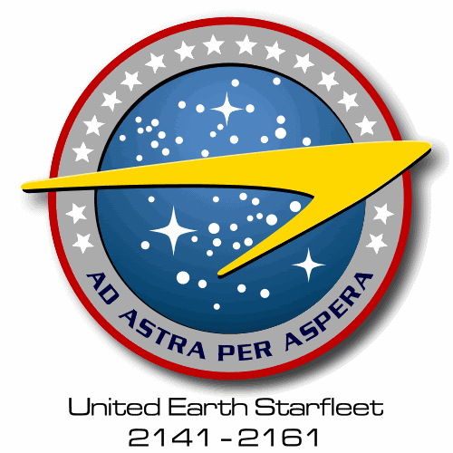
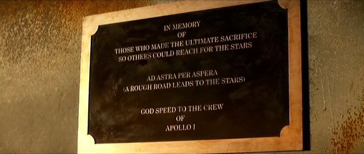


![[Frown]](frown.gif)


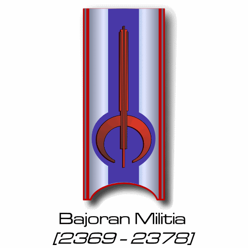
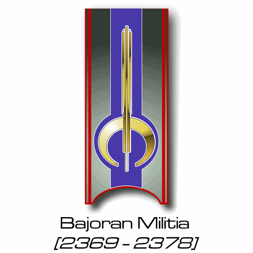


![[Roll Eyes]](rolleyes.gif)
![[Embarrassed]](redface.gif)

![[Razz]](tongue.gif)
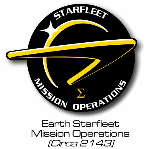


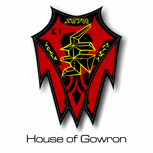
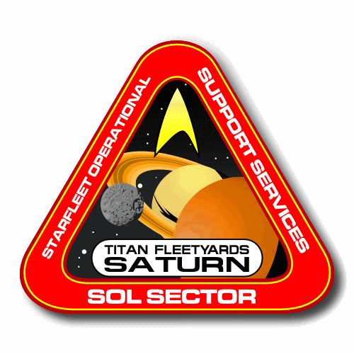

![[Eek!]](eek.gif)