Part III of Reverend's logo thread. You can find Part II here.
Posted by Reverend (Member # 335) on :
quote:Originally posted by MinutiaeMan : "Ugly but well hung." I like it.
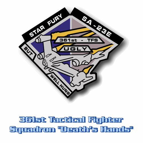
It it of course a reference to the way Furys are launched from rotating stations, no?
quote:Originally posted by B.J. : I know you're trying to be accurate to what was on the show, but it would be nice (please? [Big Grin] ) if you could do a better version of that Starfury patch. The representation of the Starfury on that patch is just piss-poor.
Also, I don't know if this came from the show or not, but the Starfury designation is pretty much accepted as "SA-23E". Does it really say "FA-23E" on the patch used in the show?
I just checked my reference material and you're right, the actual costume piece did indeed say SA-23E. Looks like I was working from an inaccurate reproduction.
As for the Fury rendering, I might tidy it up a bit, but I don't want to stray too far. Bad rendering or no.
P.S. This thread series is now over five years old!
[ August 13, 2008, 10:12 AM: Message edited by: Reverend ]
Posted by Reverend (Member # 335) on :
I'm not dead yet! Posted by Reverend (Member # 335) on :
I'm getting better... Posted by B.J. (Member # 858) on :
Nice! I had forgotten about the Engineering & Maintenance logo. The President's logo looks like a plucked chicken (not your fault).
Where's the Earth Force Science Team logo from? Was that part of the Daedalus mission?
Posted by Reverend (Member # 335) on :
I think you mean Icarus, but no, it's from the science team that nearly got shot down surveying Epsilon III. At least I think. I got the reference from a costume/prop auction photo.
As for the presidential seal...well you can tell why they hardly used it and switched to a big sculpture type thing after season 3. But I suppose it's traditional for thing in B5 to look like plucked chickens. Posted by B.J. (Member # 858) on :
Ah, right. The mission from "A Voice in the Wilderness". Unfortunately, all the caps I could find had what I think was a patch on the front covered with seat belts or from a bad angle.
Posted by Reverend (Member # 335) on :
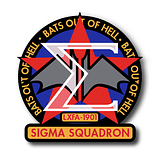
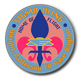
Well thank goodness for prop and costume auctions. Right now I'm trying to get a good look a the patches Ivanona's brother was wearing. I got the Sigma wing patch of (thanks to an ebay reproduction) but can't get a clear look at the squad patch on his other arm or the service patch on his chest.
Posted by Reverend (Member # 335) on :
...and now I just realised I mislabel the "prison security" patch. I thought it's what Sheridan's guards were wearing on Mars, but it looks like they has Mars Division patches. That thing was worn by Major Lianna Kemmer from Presidential security...hmm
Posted by Sol System (Member # 30) on :
What in the world is going on in that Internal Affairs patch? A hula hoop, a lacrosse stick, and, like, an axe stuck inside a big tube or something? "Fair Play and Proper Axe Storage."
Posted by B.J. (Member # 858) on :
I thought it was a riding crop.
Posted by Reverend (Member # 335) on :
...pass.
How about a sports question instead?
Posted by Reverend (Member # 335) on :
It's dry depressing red planets day! Posted by Hobbes (Member # 138) on :
B5 logos... cool man. I have all 5 seasons of the show on DVD.
I love your work man.
Posted by Reverend (Member # 335) on :
Thanks, but I think I need to fix that Narn logo, it's a bit pants.
Posted by Reverend (Member # 335) on :
Got my hands on some better reference material so corrected allot of mistakes and mislabelings.
Too many to post at once (or at twice for that matter) so just clear down your caches and refresh the page for the ones on page 1 and here's some from the old thread...
And some new ones...
Posted by Reverend (Member # 335) on :
And the rest of the updates from the last thread. Posted by Shik (Member # 343) on :
The engine pods on the Thunderbolt patch look a little off. Like they're at a skewed angle. Might just be because of the angle & the cranking.
Posted by Reverend (Member # 335) on :
Yeah, it's a weird disappearing point, but the style suits.
Anyway, I fixed the Narn and did a few more.
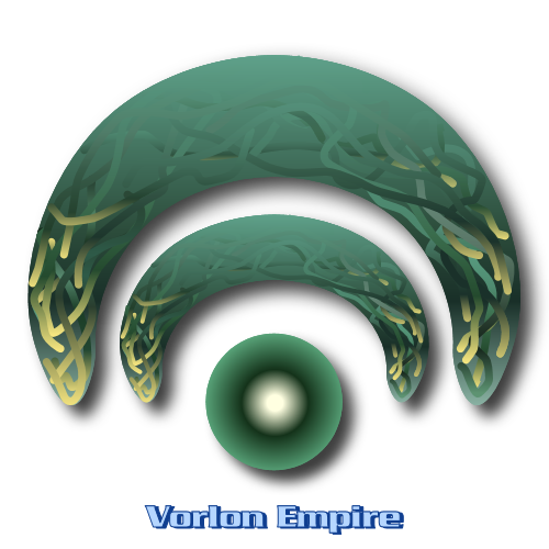
Made a start on the Vorlon one, but it's going to be a bugger getting that done right.
Posted by Shik (Member # 343) on :
"Strategic". Also, I'd hyphenate "off-world".
Always thought it was funny how much the Minbari emblem resembled IDIC.
Posted by Reverend (Member # 335) on :
The typo is fixed, but the original didn't hyphenate 'Off World' and these are supposed to be re-creations, so it'll stay as is.
P.S. another one done. Posted by B.J. (Member # 858) on :
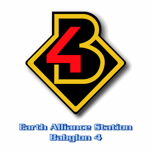
Nice work! Whoever designed the original Starfury & Thunderbolt patches needs to be sacked. When did we see the B1, B2 & B3 logos?
Posted by Reverend (Member # 335) on :
Supposedly they were used in the set dressing for "War Without End" - B4 being built, at least in part from already completed sections and prefab compartments that survived the destruction of the first three stations. The source of my reference materials are supposedly scans from the official magazine, so it's seams authentic enough.
As for the fury patches, they're honestly about on par with some real life aviation patches I've seen, so it's not that terrible. Especially for a bit of background costume that is BARELY visible on screen.
Posted by Reverend (Member # 335) on :
Thanks to Jörg, the screen cap king himself, I've been put in contact with a collector of authentic B5 costume pieces (who is also apparantly mates with someone who worked on the show) and has been kind enough to offer me some nice big reference photos of the actual patches used on the show. So here's the first of the bunch. Much more to come.
Posted by B.J. (Member # 858) on :
Very nice! Was it really spelled "HONOUR" in that Academy one?
Any chance of seeing those reference photos ourselves? Posted by Reverend (Member # 335) on :
*Double checks* No, that's just me being British and not paying attention. Fixed it, just clear your cache & refresh.
As for showing off the reference scans, Like I said these are from a private collector, so I don't think he'd appreciate that. Just trust that I'm very good at reproductions...misspellings aside.
[ October 16, 2008, 12:42 PM: Message edited by: Reverend ]
Posted by Reverend (Member # 335) on :
Need a little help here. Can anyone identify this font? Posted by MinutiaeMan (Member # 444) on :
I tried searching WhatTheFont?, but it didn't provide any precise results.
Posted by Reverend (Member # 335) on :
Yeah I tried that too, hence my appeal for assistance.
Basically it's a a typeface used on some B5 signage and while I can trace the lettering (as I did above) just fine, it's better to have the font.
Anyway, here's some more logos... Posted by CSFSec (Member # 2154) on :
Hello, this is my first post here on Flare Sci-Fi Forums but I'd like to say that I've enjoyed this site for a while and this is my favorite topic. I use many of Reverend's logos as computer desktops so I'd like to say thank you to Reverend for his talented work.
I'll begin by making a request:
Reverend, a while back I noticed in your Space Agencies chart found here: Star Trek Minutiae website that you made a 24th century Starfleet Command seal. I've tried to create one using your work as a template but I could never get it quite right. I could come close but not quite. I was wondering if you could post the Starfleet Command seal. Thanks.
Now to B5. I love the Earthforce Medical Corps seal and I have always felt that EF Medical shouldn't be the only division of Earthforce with it's own seal and was wondering if you could create an Earthforce Security seal. I have always been a big supporter of law enforcement and I love how security personnel were always shown in a good light in both Star Trek and B5. Of course, there is no rush so whenever you get to it will be fine.
The only seals I have created were created by heavily using Reverend's work as a template and I could never get the text wraparound the top of the seal right without borrowing from another seal. However, if anyone wants to see some of them let me know, and with Reverend's permission, I will post them.
Posted by CSFSec (Member # 2154) on :
I forgot to list the seals I've created:
Starfleet Sciences Starfleet JAG (a circular seal as opposed to oval) Starfleet Intelligence (as its own agency) Starfleet Special Operations Starfleet Marine Corps Starfleet MACOs
Like I said, many of these heavily rely on Reverend's work so I'll need his permission prior to posting.
Posted by Reverend (Member # 335) on :
I don't intend to invent any B5 logos. They're all actual logos taken from actual set pieces, graphics or costume pieces. As for EF security, there's already a badge, two division patches and a couple of Mars Pol logos.
Posted by CSFSec (Member # 2154) on :
OK, thanks Reverend. I have created some Earthforce division seals but I once again used your work as a template and want to know if it's okay to post them.
Posted by CSFSec (Member # 2154) on :
Also, do you have an update on the SFC seal? I only ask because you didn't address it in the last post. Thanks again!
Posted by Masao (Member # 232) on :
quote:Originally posted by Reverend: Need a little help here. Can anyone identify this font?
Did you try emailing Geoffrey Mandel through his website? Several years ago I had some questions about TOS font, and he answered them.
Posted by Reverend (Member # 335) on :
quote:Originally posted by Masao:
quote:Originally posted by Reverend: Need a little help here. Can anyone identify this font?
Did you try emailing Geoffrey Mandel through his website? Several years ago I had some questions about TOS font, and he answered them.
Never occured to me, I wasn't aware Mandel worked on B5. Not that it matters so much now, I went and extrapolated the whole alphabet from that sample, now it's just a matter of being bored enough to import it into a font creator program. Posted by Masao (Member # 232) on :
Whoops. Sorry. I thought he had.
Apparently, he applied for the B5 job, but got beat out by Alan Kobayashi (who's also worked for Trek).
I found Kobayashi's cell phone number and email address on this page. Give him a call!
I'll be seeing the new film on Friday and hopefully will notice some new seals/logos that I can get screencaps of in near future and make some requests. I have noticed one already that looks very similar to one of Reverend's seals.
Just thought I'd point these out to everyone!
Posted by Blue387 (Member # 2157) on :
Not working, no hotlinking, CSF.
Posted by CSFSec (Member # 2154) on :
Hm, they seemed to work when I uploaded them. OK, I guess just go to http://movies.trekcore.com/gallery/ then click on "Star Trek Screencaps" next to a picture of the new crew from the film. There will be a file called "pre-release screencaps." Just click that and your be able to find the screencaps I tried to link to.
The first one is of some hanger bay containing multiple shuttlecraft. On the walls you will notice the Starfleet logo I was talking about.
The second one is a picture of Spock talking to Uhura in the same hangerbay. The Starfleet logo is larger and you can see it better.
The third one is when Kirk rides up to where the Enterprise is being built. The logo's really small in that one.
Posted by Reverend (Member # 335) on :
It's been a while and I've done a bunch more logos.
And while I'm at it, I've begun a chart of the various EF uniforms, though it's still sketchy in places and I'm not 100% sure what some of them are for. Posted by Babaloo (Member # 2014) on :
Always a pleasure to see what you've come up with Reverend.
Posted by The Ginger Beacon (Member # 1585) on :
Did the Thieves Guild nick their logo from the Cardassians, or was it the other way around?
Posted by Reverend (Member # 335) on :
Well they are thieves, yes?
Posted by Jason Abbadon (Member # 882) on :
The Theives Guild logo just needs clovers and horseshoes...I always thought Lucky got that gold via nefarious means.
Posted by Jason Abbadon (Member # 882) on :
The Theives Guild logo just needs clovers and horseshoes...I always thought Lucky got that gold via nefarious means.
Posted by Reverend (Member # 335) on :
Come again?
Posted by Reverend (Member # 335) on :
Done a few more this week, mainly focusing on the ship logos: -
I've also been making an attempt to figure out a map of exactly where the sectors (Blue, Red, Green etc.) begin and end. So far I've found two different maps that appeared onscreen as well as the one on the Security Manual. If anyone knows of any other variations, I'd be very appreciative! Oh and I've also been continuing to dabble with the rank insignias. Posted by B.J. (Member # 858) on :
You've been busy! I'm not sure what all those insignias mean, but they look good. Odd looking star they used on them, though.
As for the map, I can't say any of them look quite right to me, but I assume you're just cataloging the variations for the wiki? I found one here that looks similar to the "Signs & Portents" one, but not quite. Not sure where that one came from. There's another here (scroll down), but it looks fan-made, and honestly looks even more wrong to me. Since you're familiar with the wiki, I assume you've seen this screencap too? One last map I found looks to be made for an RPG, but actually makes the most sense out of all of them to me. It's on this page, just scroll to the bottom and download the zipped PDF.
Posted by Reverend (Member # 335) on :
I should probably say that the insignia inside the grey boxes are my own conjecture, just to fill in the gaps.
For now I'm cataloguing the "official" versions; I do have my own particular version of what I think it should really be, but I'd rather not release that until I'm done collating data and have a complete idea.
There are a few complications, mainly to do with the grey, brown and yellow sectors. With Grey sector, on the graphics it has a habit of either disappearing entirely, switching places with brown or being relegated to the zero-G sections, which contradicts "Grey 17 is Missing" among others where Grey sector (or at least part of it) has gravity and thus must be in the carousel. I think part of the brown/grey confusion stems from the cramped industrial nature of both areas, though Brown sector has been seen to contain businesses, hotels and an open marketplace. Brown sector, aside from switching with Grey half the time, keeps being refereed to as being synonymous with Downbelow, though there have been several instances where a "Downbelow" area has been seen to be in other sectors. Yellow sector is something else entierly, in that it's never mentioned on screen (as far as I can tell) and the background info seems to consistently have it encompassing the fusion reactor and sometimes the support structure, all the way down to the forward cargo stabilisers. Either way, strictly a zero-G area, however, in 'TKO', the Mutai and the surrounding area has yellow sector markings, which is a bit of a problem.
Posted by Reverend (Member # 335) on :
Just two more this time. The Vorlon one might not look like much but it was a complete bugger getting all the tendrils right. I've got the Starfury squad patches done, I just need to figure out which "wing" patch each one corresponds to. Posted by Reverend (Member # 335) on :
All ship logos this time: - It can be tough finding good reference for these things! Still have the Heracles, Hermes, Cortez, Apollo, Churchill, Excalibur and Gideon's old Explorer on the "to-do" list, with a question mark next to the Cadmus & Persephone.
Posted by Reverend (Member # 335) on :
I realise there's only about three people who still visit this place, but still... Posted by MinutiaeMan (Member # 444) on :
Cool! Where'd you get the Technomage sigil from?
Posted by The Ginger Beacon (Member # 1585) on :
Ohh. That's fired up some very dormant grey cells! Nice.
Posted by Reverend (Member # 335) on :
quote:Originally posted by MinutiaeMan: Cool! Where'd you get the Technomage sigil from?
Crusade. It was on one of the data screen in 'Well of Forever', when they were linking up Galen's ship with the Excalibur's computer, IIRC.
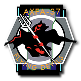
Note for the trivia inclined: The Sigma logos were worn by Ivanova's brother in the prequel movie and if you watch the delete scenes from 'Sleeping in Light' you can see it on display in General Ivanova's office (along with her old Starfury helmet, a statue of Shokalla and Marcus's old Denn'bok - originally intended for Sakai.)
Posted by Fabrux (Member # 71) on :
Ahh, B5. How I miss thee...
Hm. B5 re-imagining? Posted by MinutiaeMan (Member # 444) on :
quote:Originally posted by Fabrux: Hm. B5 re-imagining?
BURN THE HERETIC!!!!!
Though I wouldn't mind seeing the show get the TOS Remastered treatment. Even though it's so recent a show, the early CGI is rather... primitive, to say the least. Compare "Midnight on the Firing Line" to "In the Beginning" (or heck, the "Lost Tales" DVD), and the changes are quite startling.
Posted by Reverend (Member # 335) on :
Well if WB ever want to release the show on BluRay, then that's exactly what they'll have to do. No amount of post production fiddling can make the existing effects footage suitable for HD. The resolution of the original renders are what you're stuck with and as it is it was just barely OK for DVD.
Posted by Reverend (Member # 335) on :
Anyone care to participate in a little experiment?
I recently designed a new logo for the B5 Wikia, but the admin had a terrible time trying to upload the thing. No matter what he did he kept seeing the old one in it's place (even after a cache clear) and for my part, it appears to alternate between my new one and the old one, apparantly at random.
So if anyone has a spare 2 mins, have a look here, click around a few random articles and see if the logo on the left stays the same or if it changes at all. I'm curious to see if this is a bug with the wikia or just our caches playing silly buggers.
Posted by Sean (Member # 2010) on :
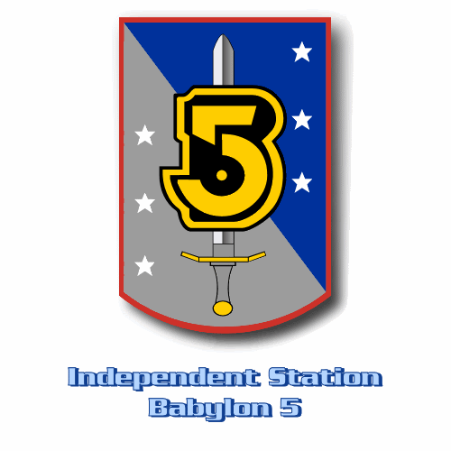
Clicked around a bit, and the only logo I get is a blue and silver crest shield, with a 5 impaled on a sword.
Posted by Makotokat (Member # 1041) on :
Same here. Seemed stable
Posted by Fabrux (Member # 71) on :
Yeah, the logo is stable here too. I'd say its a cache thing.
Posted by Reverend (Member # 335) on :
Thanks, though I should probably have said that this is what the new logo is supposed to be: -
While we're at it, have a look at the flight wings here and tell me if they're all the same style or if two of them don't match. No matter how many time I clear my cache I still see the older version of two of them!
Posted by Babaloo (Member # 2014) on :
quote:Originally posted by Reverend: I realise there's only about three people who still visit this place, but still...
I'm always checking in to see if you've come up with any more great logos. Thanks for these, I was beginning to go through withdrawl. :)
Posted by Reverend (Member # 335) on :
Keep in mind they're just reproductions, I very rarely come up with anything original.
Posted by CSFSec (Member # 2154) on :
Reverend, is the Earth Alliance Security seal an original because I don't remember seeing it in the show? In any case, the EA Security seal is my second favorite seal that you've posted, with my favorite being your Starfleet Security seal that you created a while back.
Babaloo, I also check this website regularly (at least once a week) to see if anything new is posted.
So, great work Reverend, reproductions or not, your work is always of the highest quality and I use a lot of your seals as wallpaper so thanks.
Posted by Reverend (Member # 335) on :
I see a pattern emerging with your favourites. Though yes, the EA Security logo was seen on screen in the 5th season. I forget the name of the episode, but it's the one where they arrest Lyta.
Posted by CSFSec (Member # 2154) on :
The name of the episode is "Wheel of Fire."
Anyway, I was wondering if you've done a recreation of the ISN logo yet? Thanks.
Posted by Fabrux (Member # 71) on :
quote:Originally posted by MinutiaeMan:
quote:Originally posted by Fabrux: Hm. B5 re-imagining?
BURN THE HERETIC!!!!!
Though I wouldn't mind seeing the show get the TOS Remastered treatment. Even though it's so recent a show, the early CGI is rather... primitive, to say the least. Compare "Midnight on the Firing Line" to "In the Beginning" (or heck, the "Lost Tales" DVD), and the changes are quite startling.
In that vein, I've started watching B5 again. Just finished season 2. Posted by Reverend (Member # 335) on :
While you're at it, think you can keep an eye out for this logo? Like here for example: - I've seen it in customs but have yet to spot it anywhere else and I'm trying to figure out when they switched it for the old one. The only other place I've seen it crop up is on the old cancelled Sierra game's website, so I'm presuming it's official.
Posted by Fabrux (Member # 71) on :
Hm. Well, I'll look in season 3 but its probably the new one all season. The sets got spruced up a bit and presumably after the IA is formed there wouldn't be any League logos anywhere...
Posted by Jason Abbadon (Member # 882) on :
quote:Originally posted by Fabrux: In that vein, I've started watching B5 again. Just finished season 2.
Be sure to post in when the Shadows and Vorlons become candyasses at the end of season 3. Posted by AndrewR (Member # 44) on :
Wasn't that the end or mid-way through season 4.
P.S. I miss B5. Enjoying the show each week - a lot of it before the internet spoiled everything.
Posted by Jason Abbadon (Member # 882) on :
I think that's season 3's finale- along with that cringworthy "Get out of our galaxy" line. Posted by Reverend (Member # 335) on :
It worked, didn't it? Posted by Fabrux (Member # 71) on :
All right so there's a scene in 3x02 in the departure area and the League logo is visible. Its the one you've posted...
Posted by Reverend (Member # 335) on :
Ok, so at least as early as that. At some point I'll check if it crops up late in season 2, but I doubt it. I know for a fact the old logo was still used in 'Fall of Night', which is a fair way into Season 2.

![[Wink]](wink.gif)


![[Big Grin]](biggrin.gif)


![[Frown]](frown.gif)


![[Smile]](smile.gif)


![[Eek!]](eek.gif)
![[Razz]](tongue.gif)