posted
Hell no! Yours is much more interesting and imaginative. Frankly, I'm a little disappointed they didn't try to contact us about using it. They used Masao's station design, after all
-------------------- “Those people who think they know everything are a great annoyance to those of us who do.” — Isaac Asimov Star Trek Minutiae | Memory Alpha
Registered: Nov 2000
| IP: Logged
posted
Memory Alpha's a giant target for starships.
-------------------- Justice inclines her scales so that wisdom comes at the price of suffering. -Aeschylus, Agamemnon
Registered: Aug 2002
| IP: Logged
quote:Originally posted by MinutiaeMan: Hell no! Yours is much more interesting and imaginative. Frankly, I'm a little disappointed they didn't try to contact us about using it. They used Masao's station design, after all
Really? I was never very happy with it. But that's often the case when something is done by committee for people who don't really know what they want in the first place. I shouldn't complain too much, it only took 10 mins.
Seriously, just because it's simple doesn't mean it's boring or no good. I like the logo you did because it's memorable and relatively simple, but not a clichéd triangle like most Starfleet logos tend to be. It's different.
-------------------- “Those people who think they know everything are a great annoyance to those of us who do.” — Isaac Asimov Star Trek Minutiae | Memory Alpha
Registered: Nov 2000
| IP: Logged
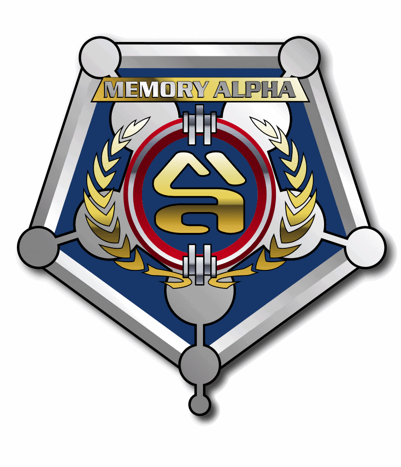
Not sure I like my new idea anyway... What do you think? Too busy? Too much like an inverted sheriff's badge? Hmm...
While I'm on the subject is there any way to retrieve my old login password? I forgot it and I'm pretty sure the e-mail it's attached to is the one that fell into a black hole and slipped into an alternate universe or something, so the usual way won't work.
posted
That's way too busy. You have at least 5 elements, all of which are themselves complex. You have a metallic wreath, a schematic of the library, a beveled pentagonal border, a typographic logo on a 3-stripe-bordered shield with some little greebly doohickies, and the name on a metallic plate.
-------------------- When you're in the Sol system, come visit the Starfleet Museum
Registered: Oct 1999
| IP: Logged
posted
You're down to four elements, which is better.
That metallic treatment makes the letters hard to read. The metal on metal doesn't help. If you look at the logo at the size of the thumbnail, the letters are pretty unreadable. I suggest trying without a pentagonal shield in the center. Instead put the letters on the blue background. I'm also getting kind of a Mickey Mouse vibe from the shield and the top large ears.
I'm thinking that the smaller satellite domes were latter additions, so the original plan, and the logo, should have only the larger domes.
-------------------- When you're in the Sol system, come visit the Starfleet Museum
Registered: Oct 1999
| IP: Logged
posted
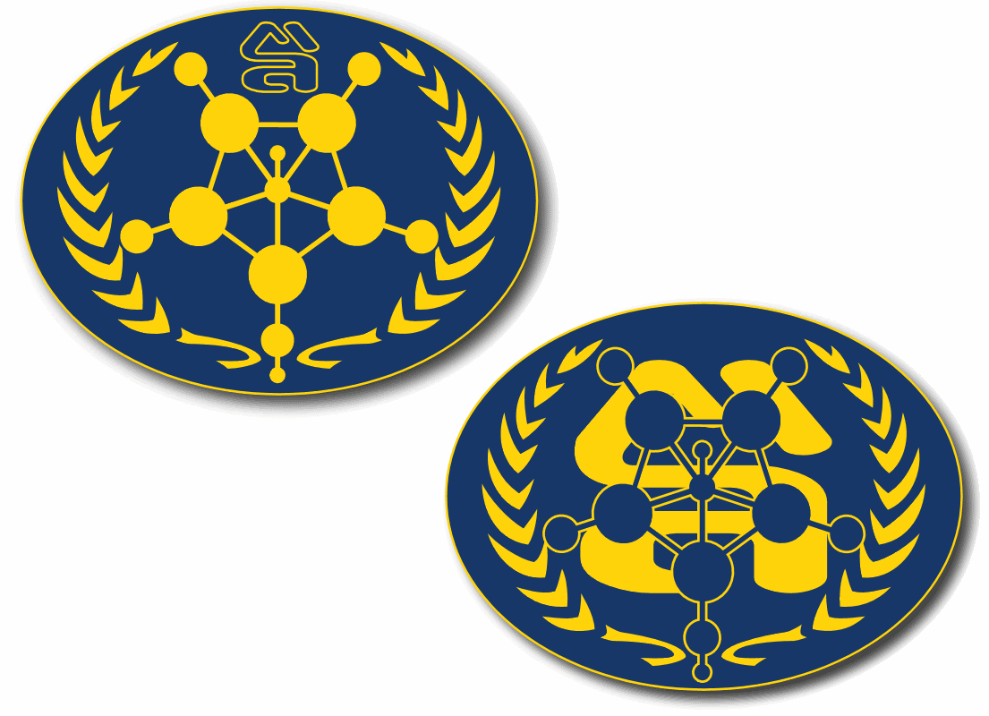
I'm kinda glad there are now two different logos. I he had used our logo, while undoubtedly cool, it would've sort of been a free-for-all for everyone else to use that logo too. It's now clear that MA the website is a different thing than MA the TOS library.
That said, we have thought about updating the logo to contain some newly canon elements...
IMO, the two most recognizable elements are the polygonal shape and the "MA" letter forms.
That'd negate the whole point of using the building!
quote:Originally posted by Masao: You're down to four elements, which is better.
That metallic treatment makes the letters hard to read. The metal on metal doesn't help. If you look at the logo at the size of the thumbnail, the letters are pretty unreadable. I suggest trying without a pentagonal shield in the center. Instead put the letters on the blue background. I'm also getting kind of a Mickey Mouse vibe from the shield and the top large ears.
I'm thinking that the smaller satellite domes were latter additions, so the original plan, and the logo, should have only the larger domes.
Just a thought, but I wondered how these arrangements might look... Or failing that there's the LCARS Vista edition. I think I'm zeroing in on it now.


![[Wink]](wink.gif)
![[Razz]](tongue.gif)


 Printer-friendly view of this topic
