Oh come on, they're not THAT bad! Posted by Shik (Member # 343) on :
Join the club. It's bee almost a week since I posted my UP3 writeup & nothin'.
Posted by Reverend (Member # 335) on :
To tell you the truth I only finished reading that last night and I don't feel that I'm qualified to give any useful input.
Posted by Shik (Member # 343) on :
I AM wondering, though, why the Rigel one has Asian characters in it? And I think it would be "Miyamoto." But I'm not the Japanese speaker here.
Posted by Reverend (Member # 335) on :
Acording to my info Miamoto is what the Japanese call the star Rigel.
Posted by Masao (Member # 232) on :
I don't know Japanese star names, but the first two kanji are can be read "Genji" or Minamoto family/clan. The "Tale of Genji" is regarded as the world's first novel, written more than a thousand years ago, about playboy known as the "shining prince" and heir to the Genji clan, or the Minamoto family. The third kanji is that for star or planet. The type face is a bit thin. I'll see if I can find you somtthing a bit fatter and more stylish. Also, I can see, very faintly, an Arab name behind it.
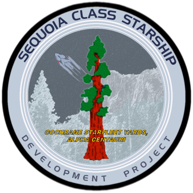
For Sequoia, I think the ship is a bit weak looking, especially compared with ships on your more recent patches. Also, the tree doesn't make such an interesting central image. Maybe some Cherokee script or a picture of Sequoya himself?
The Surak patch looks unbalanced since you have a color pic of Surak on one side and a very low contrast dark blue IDIC symbol on the other.
Posted by Reverend (Member # 335) on :
After about an hour of research this is the best I could come up with.
I'm no linguist (I can barely manage English) so there is a good possibility that I've made a mistake, one way or another.
Oh and I replaced that old ship drawing too.
Posted by AndrewR (Member # 44) on :
Very nice - some suggestions though!
I say ditch the ship and the 'streak'.
Leave the trees but have stars in the background as if it's a starry night -- i.e. slowly fading as it goes 'down' the patch towards the trees.
The bottome writing looks a little too softened - not crisp like the top writing.
Very nice though. Did you do those sequoia's from scratch?
Andrew
Posted by Reverend (Member # 335) on :
There seams to be some confusion on just how Sequoia/Sequoyah is spelt I have done another version, this time with the man's own handwriting.
If someone who knows better than me (or knows someone who knows) it'd be handy to know which if any of these are correct.
Andrew: like it or not the ship, the swoop and the tree are pre-requsites of the chap who came up with the ship's design so it's something I have to work around. Plus adding stars would only clutter the patch.
Posted by Masao (Member # 232) on :
I don't read or write Cherokee, but I think that signature is shoe-horned in there pretty tightly. Maybe have the script thicker and put in the center of the swoop? I just noticed there were other trees lurking in the background; they don't really add much except clutter, I think.
Rev, do you want some Kanji for the Rigel emblem?
Posted by Fleet-Admiral Michael T. Colorge (Member # 144) on :
Hey Reverend, any chance you can make the Nova Class Development Logo? I just bought the Starcrafts model and I wanted to use a logo instead of the resin Starfleet Arrowhead.
Posted by Masao (Member # 232) on :
I did a bit of digging and found that Rigel is sometimes called Genji boshi in Japanese (as your emblem says) and is taken to represent the Minamoto (Genji) clan (whose color was white), who fought a war about 1000 years ago against the Taira (Heike) clan (whose color was red), represented by the reddish Betelgeuse (Heike boshi).
quote: I don't read or write Cherokee, but I think that signature is shoe-horned in there pretty tightly. Maybe have the script thicker and put in the center of the swoop? I just noticed there were other trees lurking in the background; they don't really add much except clutter, I think.
It's not exactly his signature, it's just something I assembled form a scan of his original hand written alphabet so it doesn't look very natural. I think I'll go with the typed font instead, but set into the background and in a more subdued colour.
The background trees are something that I added to give the patch a sense of depth or forced perspective, you may have noticed that those "swoops" don't have the same impact it they don't have anything to curve behind. However I am thinking about subduing their colours even more and doing away with the gradients.
quote: Rev, do you want some Kanji for the Rigel emblem?
What did I get wrong?
quote: Hey Reverend, any chance you can make the Nova Class Development Logo? I just bought the Starcrafts model and I wanted to use a logo instead of the resin Starfleet Arrowhead.
As I told Griffworks if you want a custom patch then it won't be for free. However if you're patient then I may get around to doing something for the Nova sometime in the next few years, but I have to say it's not exactly high on my agenda.
quote: I did a bit of digging and found that Rigel is sometimes called Genji boshi in Japanese (as your emblem says) and is taken to represent the Minamoto (Genji) clan (whose color was white), who fought a war about 1000 years ago against the Taira (Heike) clan (whose color was red), represented by the reddish Betelgeuse (Heike boshi).
I'm pretty sure that I checked over this with Masaki last year and I'm pretty sure he OKed it. So are you conforming that it's correct or is there still something that doesn't make sense?
UPDATE
I think it's starting to look a little better now.
Posted by Fleet-Admiral Michael T. Colorge (Member # 144) on :
How much are you charging then?
Posted by The_Tom (Member # 38) on :
I'm a little puzzled with the fanbase's obsession with emulating the GCS's rounded triangle-style logo. Surely there can be a bit more variation?
Posted by Masao (Member # 232) on :
I was offering some more expressive kanji. The one you've used is a bit dull. How about something that looks like it done with a brush rather than a computer?
In regards to the names, I was pointing out that your "miamoto" should be "minamoto" with an "n."
What bugs me slightly about the Sequoia patch is that tree. It is supposed to be the central element, but then is half covered by the text below. But since it is so long and thing I don't know how you could shorten it without making it even thinner. I'm not sure what the focus of the patch is.
Posted by SoundEffect (Member # 926) on :
quote:Originally posted by The_Tom: I'm a little puzzled with the fanbase's obsession with emulating the GCS's rounded triangle-style logo. Surely there can be a bit more variation?
Well, the triangular form is used throughout Starfleet for such logos. The Galaxy Class Development Project, as you mentioned, the logo of Starfleet Academy, the logo of Earth Station McKinley, to name a few. Sure there can be variation, but the triangle is established, so it's a logical starting point for other such logos.
Posted by Capt_Spencer (Member # 312) on :
quote: Andrew: like it or not the ship, the swoop and the tree are pre-requsites of the chap who came up with the ship's design so it's something I have to work around.
Damn right... ^_^ And I appreciate that, Kris.
The_Tom brought up an interesting point, however - my original patch for this class was circular, with a few extra rings if I recall... It rather suggested a cross-section of a tree, showing its age-rings. I made the Korolev a rounded-triangle patch, but I just thought the circle better suited Sequoia.
I like what you've done but if you're not busy drawing Nova patches, see how a round Sequoia patch would look sometime?
Jas
p.s. - here's my original: Posted by Capt_Spencer (Member # 312) on :
btw - I did that before I had PSP and text-along-curve... @_@
Posted by AndrewR (Member # 44) on :
quote:Originally posted by Capt_Spencer:
quote: Andrew: like it or not the ship, the swoop and the tree are pre-requsites of the chap who came up with the ship's design so it's something I have to work around.
Damn right... ^_^ And I appreciate that, Kris. {snip}[/IMG]
Sheesh! It was just a friggin' suggestion. Considering you weren't getting any comments at the START of the thread...
Posted by Capt_Spencer (Member # 312) on :
hehe...
Oh hey AR, not to hijack this thread, but could you sketch over what you meant about the Mariner prototype's nacelles? It would just be easier for me to revise them in one shot if I got it straight from the horse's mouth.
Jas
Posted by Reverend (Member # 335) on :
quote: I like what you've done but if you're not busy drawing Nova patches, see how a round Sequoia patch would look sometime?
Well I've kinda set a precedent with my work and I'm determined to keep all my Post-Antares patches triangular.
What I can do however is this.
Posted by Masao (Member # 232) on :
This actually looks better than the triangual patch. In particular to darker background with the mass of trees and the sky above is better. Maybe you could keep the layout but make it triangular, including the text along the edge?
Posted by AndrewR (Member # 44) on :
Look above Masao - he told me "Nein!".
Posted by Reverend (Member # 335) on :
It's workable, now that I've had a proper look at the original concept.
Oh and Masao, yes I would love some calligraphy style Kanji. I would try and find a font for it myself but not knowing anything about the Japanese language it would involve endless random key punching, trying to find the symbols I need. That Cherokee bit took me ages to sort out!
Posted by AndrewR (Member # 44) on :
Oh it's Cherokee! But why the number 4??
I like the patch - but maybe have the 'base' of the tree below where we can't see it so we don't have any sort of size comparisons between it and the ship.
And the text that is yellow - is still blurry.
Posted by Spike (Member # 322) on :
quote:Originally posted by AndrewR: Oh it's Cherokee! But why the number 4??
The "4" is Cherokee for "se".
Posted by Ryan McReynolds (Member # 28) on :
As you may know, American Indians had no written forms for their languages. One Cherokee, whose name escapes me, invented a writing system for his language that is used above. Some of the letters are from the Roman alphabet, some are Arabic numbers, some are modifications of either, and some he just made up.
Posted by Spike (Member # 322) on :
quote:Originally posted by Ryan McReynolds: One Cherokee, whose name escapes me, invented a writing system for his language that is used above.
Sequoia invented it.
Posted by Reverend (Member # 335) on :
quote:Originally posted by Spike:
quote:Originally posted by AndrewR: Oh it's Cherokee! But why the number 4??
The "4" is Cherokee for "se".
I don't suppose you can tell me if the rest is correct? Or which spelling of Sequoia/Sequoyah is the proper one? Or for that matter what his name means? All I can think of at the minute is "Has tree named after him" and "Writes alot" Posted by Spike (Member # 322) on :
Sequoia means "Guessed it".
Here's a chart of Cherokee letters and according to this page, there are three possible spellings: Sequoya, Sequoia, and Sequoyah.
Posted by Capt_Spencer (Member # 312) on :
Nice work, Kris. I do prefer the new night sky / forest look over the multiple sequoias.
I'll have to send you a new sketch of the ship sometime, though. Posted by Reverend (Member # 335) on :
I shouldn't worry too much about the appearance of the ship on the development patch since I have a rule that if a patch does show the ship's design then that design must not represent the final appearance of said class but an earlier concept that was around when the patch was drawn. See my Antares, Constitution and enterprise class patches which all conform to this rule.
Posted by Reverend (Member # 335) on :
I'm just about to start work on revamping the Surak-Class patch so to keep the thread warm I thought I'd share an WIP image of the Iso I'm in the process of drawing.
This is of course based directly off one of Rick Sternbach's original concept sketches for the T'Pau.
![[Wink]](wink.gif)
![[Razz]](tongue.gif)
![[Big Grin]](biggrin.gif)

![[Smile]](smile.gif)


![[Roll Eyes]](rolleyes.gif)

