posted
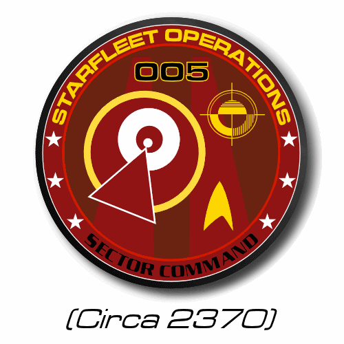
A replacement for the ENT federation logo as I managed to find better reference, Thanks to Bernd and J�rg - The image grabbing maniac. Likewise for the UE gov logo. And another Sector Command logo.
Shik
Starship database: completed; History of Starfleet: done; website: probably never
Member # 343
posted
quote:Originally posted by Reverend: Have viable reference material, will extrapolate.
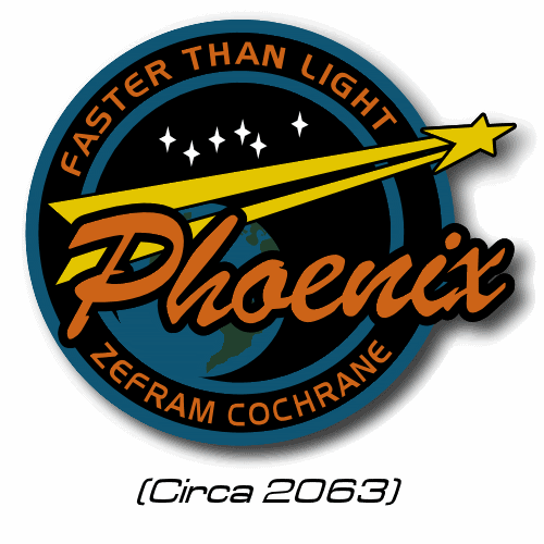
Well, just take a look at any of the scenes or caps from when Riker is sitting in Phoenix talking to Cochrane & giving him the preflight pep talk. The patch is on Riker's left brest...looks like an airliner in black & a dark yellow circle around it.
-------------------- "The French have a saying: 'mise en place'—keep everything in its fucking place!"
Registered: Jun 2000
| IP: Logged
posted
Mate, if you want me to draw a specific patch for you, then it's you that dose the leg work. If the material you come up with is good enough, interests me and I happen to be in a good mood with not much else to do, then I MIGHT consider doing you said favour.
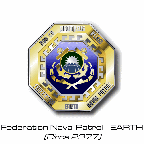
A suggestion: How about an emblem for the Federation Naval Patrol, referenced in "Thirty Days"?
-------------------- “Those people who think they know everything are a great annoyance to those of us who do.” — Isaac Asimov Star Trek Minutiae | Memory Alpha
Registered: Nov 2000
| IP: Logged
posted
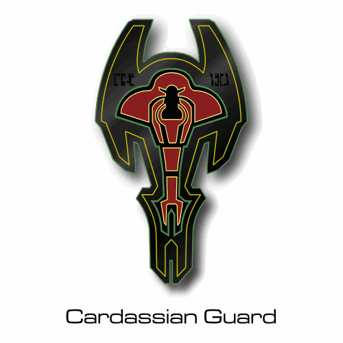
Ask and you may recieve... Also... ...Based on the stencil seen on most Cardassian ships. Which, believe it or not, is quite different to the Union logo.
P.S. Dan, not sure if you noticed but I did a sneaky 11th hour change to this logo. The logo itself is the same, I just altered the label. One of those nit picky, hair splitting things that us fans love so much.
-------------------- "It speaks to some basic human needs: that there is a tomorrow, it's not all going to be over with a big splash and a bomb, that the human race is improving, that we have things to be proud of as humans." -Gene Roddenberry about Star Trek
Registered: May 1999
| IP: Logged
posted
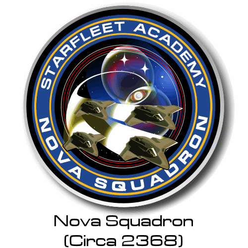
The Nova Squadron one just gave me a hard on...
-------------------- I'm slightly annoyed at Hobbes' rather rude decision to be much more attractive than me though. That's just rude. - PsyLiam, Oct 27, 2005.
Registered: May 1999
| IP: Logged
posted
You forgot to put the "COBRA" symbol on the front of Nova Squadron's trainer ships.
Amazing work though.
-------------------- Justice inclines her scales so that wisdom comes at the price of suffering. -Aeschylus, Agamemnon
Registered: Aug 2002
| IP: Logged
posted
P.S. with the exception of the KDF logo, all of the last batch are reproductions of real (if obscure) ENT logos. Reference photos courtesy of J�rg, the Image Capture King himself.
P.P.S. That's a bad Hobbes, don't do that or you'll go blind!


 Topic Closed


![[Frown]](frown.gif)
![[Wink]](wink.gif)


 Printer-friendly view of this topic