I can't remember if i posted this or not, so hopefully not.
My's website is coming up on it's 6th anniversay this month. I've been going through it updating the pages, cleaning them up, adding a little more color. When I started it occured to me that I've never had a logo for my site, I just used the regular UFP seal. I asked the Rev for his help but wasn't sure what I wanted. Eventually I came up with this using that nifty little Constitution-class silhouette. I wanted to give it a compass-like appearance since Star Trek has tried following other nautical traditions.
-------------------- I'm slightly annoyed at Hobbes' rather rude decision to be much more attractive than me though. That's just rude. - PsyLiam, Oct 27, 2005.
Registered: May 1999
| IP: Logged
posted
Looks very cool, Hobbes. I especially like the 3D look for the starfield part. However, my first thought about the ring was that it reminded me of the Stargate. Maybe if you make the 4 points more arrow-like, extending over the edge some it would lose the Stargate feel.
posted
Yeah, it doesn't look especially compassy. It looks more like a clock, particularly with the intermediate ticks in the position of numbers rather than the positions of compass directions. You might consider putting NSEW at the cardinal points.
-------------------- When you're in the Sol system, come visit the Starfleet Museum
Registered: Oct 1999
| IP: Logged
posted
Nothing wrong with that Stargate-feel, though unintentional.
-------------------- I'm slightly annoyed at Hobbes' rather rude decision to be much more attractive than me though. That's just rude. - PsyLiam, Oct 27, 2005.
Registered: May 1999
| IP: Logged
posted
Ok, now that I have a better idea of what you want (and a little free time between colouring comic books). Here's a draft with a more nautical feel. Personally I think this looks more like the symbol for the Federation Naval Patrol than a database about starships. Just to throw a few ideas into the mix and for the benefit of everyone else, this is the first shot I made back when Hobbes originally ask for help.
posted
Both look good, but I like the brighter colors of Hobbes' original. Yours looks a little washed out, though I know your goal was a more realistic mettalic look.
The second one is great, but the assymmetry of the lettering makes it look lopsided. I might opt to move "STARSHIP DATALINK" to the center at the top, and shrink "UNITED FEDERATION OF PLANETS" to fit at bottom-center. Alternatively, perhaps the top lettering should read "FEDERATION STARSHIP" and the bottom just "DATALINK," since that would fit better and it *is* the actual name of Hobbes' site. I wonder if using the little Connie instead of the ball might work in this case, as well. And perhaps the red swoosh would add a nice color contrast if you made the outlines on the ellipse black instead of red. But it might be better left alone, as well.
-MMoM
-------------------- The flaws we find most objectionable in others are often those we recognize in ourselves.
Registered: Jun 2001
| IP: Logged
posted
The main thing I disliked about the second logo which was the first Rev made for me was the fact I have no clue what that symbol in the center means.
Basically I wanted to create a logo that was distintive to my site and seeing it alone would you know it as the FSD symbol. I've worked my new logo posted above into many of the header graphics. Like this as the header for my Starship Database class directory. As you can tell, that can be resized small and still easily recognizable.
However, I really love the new logo you made Rev. My only nitpick is change the background color behind the olive branch leaves of the UFP symbol. The main two shades of blue I use on my site is #004477 and #012643. Mostly because I think if I resized it smaller I think the leave or whatever they are would get kind of lost into the gray background color.
-------------------- I'm slightly annoyed at Hobbes' rather rude decision to be much more attractive than me though. That's just rude. - PsyLiam, Oct 27, 2005.
Registered: May 1999
| IP: Logged
quote:Originally posted by Hobbes: The main thing I disliked about the second logo which was the first Rev made for me was the fact I have no clue what that symbol in the center means.
I interpreted it as two computers interlinking and exchanging data, thus datalink.
-------------------- The flaws we find most objectionable in others are often those we recognize in ourselves.
Registered: Jun 2001
| IP: Logged
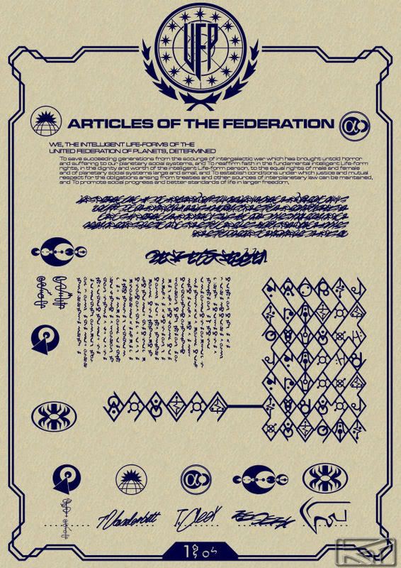
posted
Ok, here's something I'm doing for TrekBBS's November art contest. What I need from you folks is reference regarding the lettering and any possible logos for the Tellarites. I've not been keeping track of "Enterprise" so I don't know what's cropped up since the begining of the Xindi story that might be useful to this effect.
posted
Nothing seen for the Tellarites so far, Rev, but there are upcoming season 4 eps that will feature them and may show something more. Will you be including the independent Proxima/Alpha Centauri colonies as a signer as well, as per tradition and the article from Picard's scrapbook in GEN?
-------------------- The flaws we find most objectionable in others are often those we recognize in ourselves.
Registered: Jun 2001
| IP: Logged


 Topic Closed


![[Big Grin]](biggrin.gif)

![[Razz]](tongue.gif)


 Printer-friendly view of this topic